My Design Framework:
Strategy, Clarity, and the Power of Connection
Strategy, Clarity, and the Power of Connection
Every project is unique; however, my approach is grounded in human-centered design thinking, collaboration, and leading with clarity. I see design as a process of creative problem-solving, guided by empathy, insight, and continuous iteration.
While tools and deliverables may vary, one principle always holds true: Content and context drive design. Business goals, user needs, brand voice, and real-world constraints govern the final outcome.
Design is a continual process of refinement, and is flexible by nature. However, my process often follows these five core stages:
➡️ Discover: Research, listening, and truly understanding the core problem.
➡️ Define: Strategy, planning, and concept development to align stakeholders.
➡️ Design: Visual exploration, interaction, and detailed refinement of the solution.
➡️ Develop: Prototyping, engineering collaboration, and validation with users.
➡️ Deliver: Launch, gathering feedback, and driving continuous iteration.
To successfully guide a project through these stages, I rely on principles of Design Leadership. This means knowing when to lead with a clear vision and when to step back, listen, and create space for others’ ideas. It’s about guiding teams toward shared understanding, making decisions with intention, and keeping both users and business goals at the center of every choice.
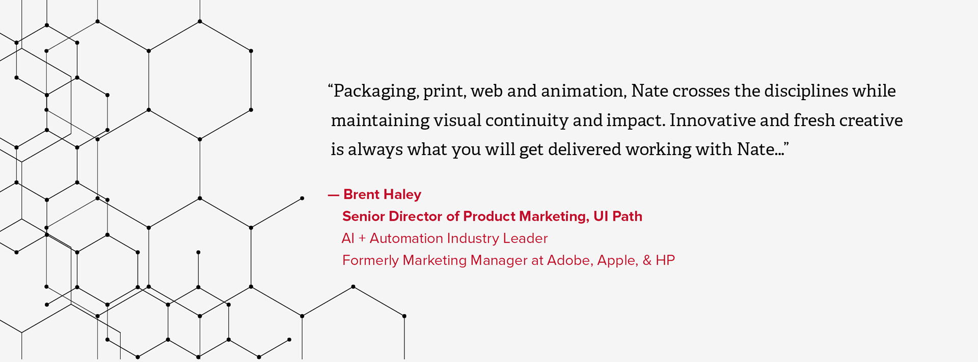
Because my work covers UX, visual, brand, and storytelling, I consider myself a design generalist. Driven by curiosity, I have always valued working interdisciplinarily to solve problems across various mediums and environments. This dedication to connecting disciplines is what keeps my skills sharp.
My process draws on this extensive experience, providing a unique perspective on how things function across print, digital, motion, and physical spaces. This cross-disciplinary fluency allows me to view projects holistically, quickly identifying and solving systemic problems where siloed thinking often fails. This ensures cohesion across the entire user journey, minimizing costly gaps and accelerating time-to-market.
✅ Ready to apply this framework to your challenges? Let's start a conversation.