

Quick Summary / TLDR
➡️ Problem: FitNest needed a clear, organized, and scalable “My Account” system to support personalization, accessibility, integrations, billing, and user preferences — all while avoiding the clutter and guessing game that hurts many fitness apps.
➡️ Role: I led UX strategy, information architecture, and UI design for the full Account hub, using competitive analysis and persona-driven needs to guide decisions.
➡️ Solution: Designed a modular, intuitive Account system with simple navigation, streamlined settings, rich profile controls, and built-in accessibility options.
➡️ Impact: While not a shipped product, the system earned strong feedback for clarity, polish, and real-world viability — and demonstrated my ability to design scalable product foundations.
⬇️ Read the full story to see how it all came together. ⬇️

Intro / Background
FitNest Plan is a concept fitness app created during my UX Design capstone at UT Austin. The goal of the program was to produce an MVP-caliber product — something polished enough to feel real, while still scoped for early-stage validation. That meant every screen needed to be user-centered and functional, even if it wasn’t fully engineered or production-ready. The My Account system reflects a balance of concept, thoughtful structure, and high-fidelity visuals, without the heavy edge-case depth of a market-ready release.
Earlier in the project, our research uncovered a core insight: people are interested in using AI for fitness, but only when it feels personal, human, and trustworthy. That insight informed the AI-powered onboarding flow I designed in the main FitNest case study.
However, personalization doesn’t stop at onboarding. To support real fitness habits, users need a clean, intuitive space to manage their settings, preferences, integrations, and personal data. That’s where the My Account system comes in.
For this portion of the project, I extended one of our primary personas (i.e., Ashley Baker) into the account scenarios. Ashley values clarity and structure. She wants control over her health data, integrations, notifications, and profile settings. The Account hub needed to support her goals without creating cognitive overload.
This companion UX case study explores a key question:
How do you design an Account experience that feels simple, intuitive, and trustworthy — especially for users managing personal health information?
How do you design an Account experience that feels simple, intuitive, and trustworthy — especially for users managing personal health information?

The Problem
Many apps bury essential account settings behind confusing menus or poorly labeled categories. Through early exploratory research and competitive audits, a clear pattern emerged: Users often struggle not because the features don’t exist, but because they’re hidden where no one expects them to be. Common issues include:
➡️ Mislabeled or ambiguous categories that made it unclear where certain settings lived
➡️ Inconsistent menu logic, forcing users to hunt across multiple areas
➡️ Settings are buried several levels deep or placed in unrelated or unintuitive locations
➡️ Account hubs treated as an afterthought, resulting in cluttered, disjointed layouts
➡️ Inconsistent menu logic, forcing users to hunt across multiple areas
➡️ Settings are buried several levels deep or placed in unrelated or unintuitive locations
➡️ Account hubs treated as an afterthought, resulting in cluttered, disjointed layouts
For FitNest, the Account experience needed to be or feel:
✅ Simple & Intuitive
✅ Scalable & Modular
✅ Privacy-forward & Trustworthy
✅ Scalable & Modular
✅ Privacy-forward & Trustworthy
The challenge was designing an information architecture that grouped settings in a way that matched user expectations, not platform convenience. This meant avoiding the maze of nested menus that plague many fitness apps and creating a structure that felt organized, calm, and trustworthy.
The key challenges or pain points were:
❌ Preventing clutter and cognitive overload common in account dashboards
❌ Creating clear, predictable menu categories with labels that match mental models
❌ Designing a system that can scale over time without reorganizing everything
❌ Ensuring accessibility and preference controls are easy to find and not tucked away
❌ Making sensitive areas feel secure and transparent
❌ Creating clear, predictable menu categories with labels that match mental models
❌ Designing a system that can scale over time without reorganizing everything
❌ Ensuring accessibility and preference controls are easy to find and not tucked away
❌ Making sensitive areas feel secure and transparent

Research Goals + Methodologies
While the onboarding flow relied heavily on user interviews and surveys, the Account system was shaped through competitive audits. I analyzed how three leading mobile fitness apps structured their account settings, preferences, and data controls:
Strava®
➡️ Clear labeling and well-defined sections
➡️ Strong separation between performance metrics and privacy settings
➡️ Informed the structure of FitNest’s Fitness & Health Record section
➡️ Clear labeling and well-defined sections
➡️ Strong separation between performance metrics and privacy settings
➡️ Informed the structure of FitNest’s Fitness & Health Record section
MyFitnessPal®
➡️ Robust nutrition and daily goal preferences
➡️ Inspired the way FitNest handles dietary controls and habit-based messaging
➡️ Robust nutrition and daily goal preferences
➡️ Inspired the way FitNest handles dietary controls and habit-based messaging
Nike Training Club®
➡️ High visual clarity and clean navigation
➡️ Influenced the design of the main Account landing screen
➡️ High visual clarity and clean navigation
➡️ Influenced the design of the main Account landing screen
Key Insights (from earlier user research)
Even though no new surveys or interviews were conducted, I drew from the initial discovery research patterns:
Even though no new surveys or interviews were conducted, I drew from the initial discovery research patterns:
✅ Simplicity — Users want uncluttered, low-friction settings that make sense at a glance
✅ Trustworthiness — Billing, privacy, and health data must feel safe and transparent
✅ Accessibility — Key controls (font size, notifications, contrast) must be included
✅ Integrations — Users rely on Apple Health, Strava, and wearables; syncing is essential
✅ Fast & Easy — People want a “set it and forget it” approach with minimal taps
These insights directly shaped the Account architecture — organizing it into clear, predictable, intuitive categories that align with user expectations. To keep the Account system fast and frustration-free, I followed the UX convention often referred to as the “three-click (or tap) rule.” While not a strict requirement, the idea behind it remains valuable: Users should be able to find what they need quickly, without feeling lost or forced through unnecessary screens. I designed the entire Account architecture so every screen is reachable within three taps or fewer, ensuring clarity, predictability, and a sense of steady progress toward the user’s goal.

My Role
➡ UX designer / IA architect / Creative director
➡ Defined the MVP structural model, content, and grouping for all Account subsections
➡ Designed high-fidelity wireframes and templates for all screens
➡ Built a consistent visual system aligned with the FitNest brand
➡ Designed the FitNest logo and app icon
➡ Tools used: FigJam, Figma, Google Forms, Google Sheets, Google Meet
Beyond the Account hub, my contributions extended to the onboarding system and leading the research framework for the overall FitNest app concept.
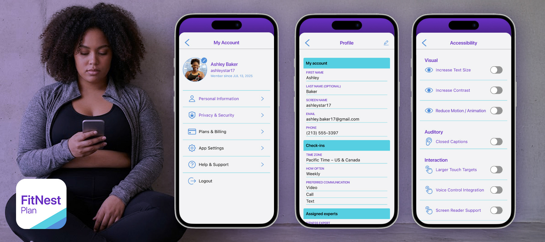
Above:
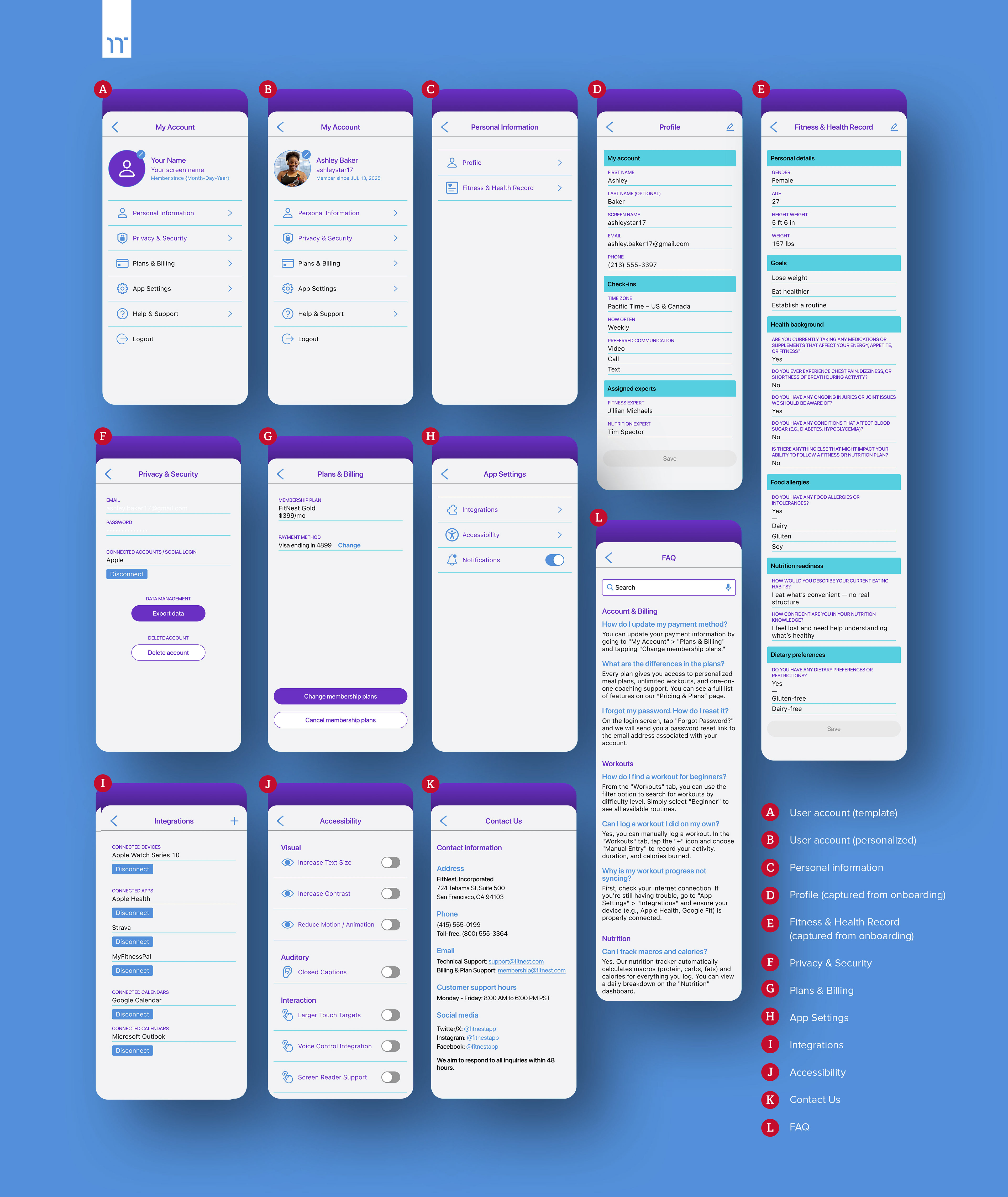
A clean, modular My Account home — The landing screen introduces the user with a warm, personal touch and intuitive menu categories. Everything a user might want is visible within one scroll.
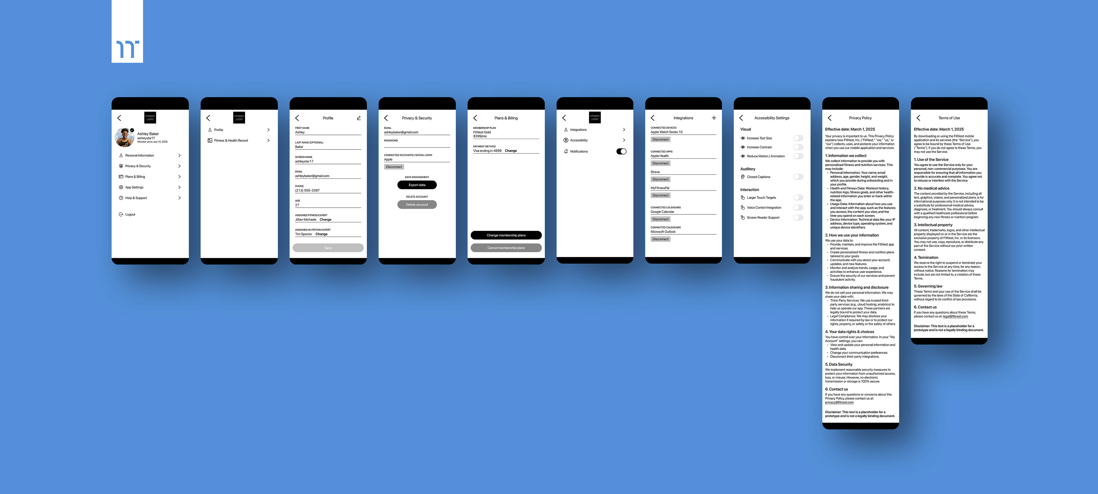
Profile & Personal Information — Structured for clarity, with clear sections for contact info, time zone, preferences, and assigned experts.
Fitness & Health Record
A dedicated hub for health history, allergies, goals, medications, and physical limitations — designed to personalize the AI training engine.
Plans & Billing — A transparent approach with: Membership level • Price • Payment method • Easy upgrade/downgrade paths • Clear cancellation options
Integrations — Supports major providers. Large touch targets and labeling make it easy to connect/disconnect apps.
Accessibility — Users often ignore accessibility until they need it. This section is surfaced clearly and written in plain, friendly language: Larger text • Higher contrast • Reduced motion • Larger touch targets • Screen reader support • Voice control integration
Help & Support — A support experience modeled after the highest-performing apps: Searchable FAQ • Contextual categories • Friendly microcopy • Clear contact options with expected response times
Privacy & Security — A dedicated section with clear: Password controls • Data export • Account deletion • Social login management
A clean, modular My Account home — The landing screen introduces the user with a warm, personal touch and intuitive menu categories. Everything a user might want is visible within one scroll.
Profile & Personal Information — Structured for clarity, with clear sections for contact info, time zone, preferences, and assigned experts.
Fitness & Health Record
A dedicated hub for health history, allergies, goals, medications, and physical limitations — designed to personalize the AI training engine.
Plans & Billing — A transparent approach with: Membership level • Price • Payment method • Easy upgrade/downgrade paths • Clear cancellation options
Integrations — Supports major providers. Large touch targets and labeling make it easy to connect/disconnect apps.
Accessibility — Users often ignore accessibility until they need it. This section is surfaced clearly and written in plain, friendly language: Larger text • Higher contrast • Reduced motion • Larger touch targets • Screen reader support • Voice control integration
Help & Support — A support experience modeled after the highest-performing apps: Searchable FAQ • Contextual categories • Friendly microcopy • Clear contact options with expected response times
Privacy & Security — A dedicated section with clear: Password controls • Data export • Account deletion • Social login management
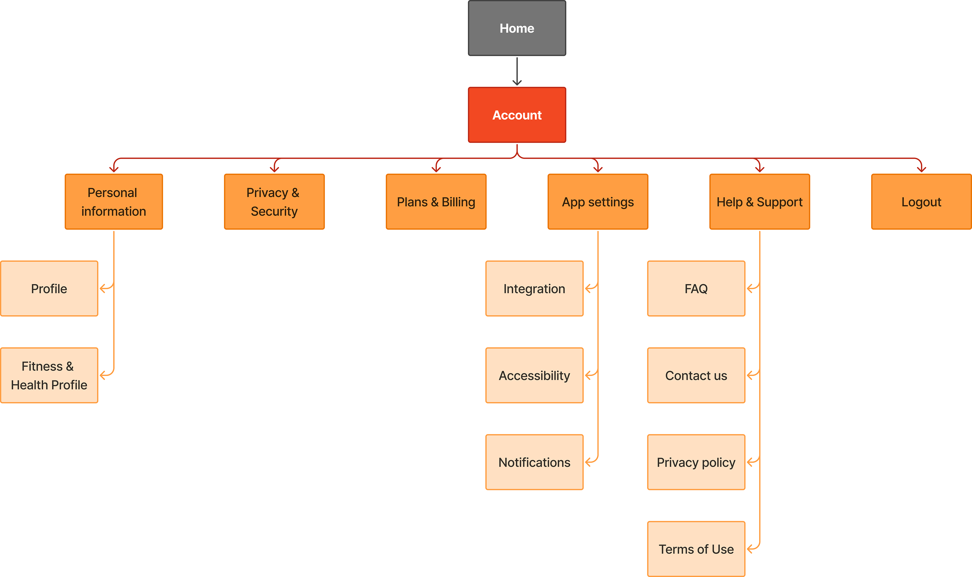
Below: Low-fidelity wireframes and IA map for the My Account hub.

This click-through prototype highlights the app’s visual design, flow, and key screens. Most interactions are guided for presentation purposes, with some elements intentionally limited or non-functional.

Challenges + Learnings
Designing the Account system reinforced how essential it is to make dense information feel digestible and approachable. I had to structure complex personal data (i.e., billing, health history, integrations, privacy) in ways that felt natural and easy to navigate, even for first-time users. It also highlighted the importance of designing accessible components early in the process rather than treating accessibility as an add-on.
Throughout the work, I focused on ensuring every screen felt visually and behaviorally consistent with the rest of the app, maintaining a unified experience across all flows. Finally, the project demonstrated the need for scalability; the system had to flex and grow with potential future features such as additional wearables, plan tiers, or new expert services without requiring a redesign of the entire architecture.

Impact + Results
While FitNest Plan was not built or released, the “My Account” system received strong feedback during critique sessions:
💬 "Sharp screens. Loved the visual design!"
💬 "This looks and feels real world."
💬 "Really clean. Really thoughtful. Very polished."
💬 "This looks and feels real world."
💬 "Really clean. Really thoughtful. Very polished."
These screens also demonstrated my ability to design:
✅ Scalable product foundations
✅ Clear IA for complex systems
✅ Cohesive UX patterns aligned with a brand
✅ High-fidelity visuals that feel market-ready
✅ Clear IA for complex systems
✅ Cohesive UX patterns aligned with a brand
✅ High-fidelity visuals that feel market-ready

Postface: Because FitNest was a capstone project, the Account system was not user-tested beyond peer review. If the project were developed further, the next phase would focus on validating the architecture and expanding the depth of each sub-category screen. For example, Accessibility settings would evolve from simple on/off toggles into more robust, customizable controls. This would allow users to fine-tune each setting rather than choosing only “enabled” or “disabled.” But for an MVP-level foundation, the current system establishes a solid baseline.
Future validation would include:
➡️ Card Sorting / Reverse Card Sorting — To validate menu structure, grouping, and labeling.
➡️ Usability Testing — To measure how quickly users can find key settings and identify friction points.
➡️ A/B Testing Accessibility Placement — To test discoverability and placement of high-importance items such as Accessibility and Privacy
➡️ Usability Testing — To measure how quickly users can find key settings and identify friction points.
➡️ A/B Testing Accessibility Placement — To test discoverability and placement of high-importance items such as Accessibility and Privacy
These methods would help refine the information architecture, validate naming conventions, and ensure the Account system remains scalable, intuitive, and inclusive for all users.
