
Executive Summary:
Validating a Split Onboarding Framework for a Health-Tech MVP
Product Strategist | Health Tech | Activation Strategy | Conversational AI | Behavioral Psychology
Validating a Split Onboarding Framework for a Health-Tech MVP
Product Strategist | Health Tech | Activation Strategy | Conversational AI | Behavioral Psychology
The Challenge: Bridging the “First-Mile” Activation Gap
Analysis reveals that standard health-tech applications suffer from a “Clinical Interrogation” problem — a high-friction entry point that acts as the primary driver of onboarding abandonment. This “Value Deficit” occurs when the demand for sensitive user data (physical and dietary metrics) outpaces the delivery of tangible product value.
Analysis reveals that standard health-tech applications suffer from a “Clinical Interrogation” problem — a high-friction entry point that acts as the primary driver of onboarding abandonment. This “Value Deficit” occurs when the demand for sensitive user data (physical and dietary metrics) outpaces the delivery of tangible product value.
The Strategy: Phased Activation & Dynamic Agency
I architected a Two-Phase Onboarding Model designed to adapt to a user’s “Psychological Readiness."
I architected a Two-Phase Onboarding Model designed to adapt to a user’s “Psychological Readiness."
▶ Phase 01 (Access)
A bifurcated entry point allowing users to choose between an AI-led “Concierge” for assisted velocity and a Manual “Architect” path for high-agency control.
A bifurcated entry point allowing users to choose between an AI-led “Concierge” for assisted velocity and a Manual “Architect” path for high-agency control.
▶ Phase 02 (Personalization)
Deep-dive customization that users can skip to explore the app first, building “goodwill” before committing sensitive data.
Deep-dive customization that users can skip to explore the app first, building “goodwill” before committing sensitive data.
▶ The Escape Hatch
To protect against “Uncanny Valley” friction, I integrated dynamic controls allowing users to switch from AI to Manual mode at any point.
To protect against “Uncanny Valley” friction, I integrated dynamic controls allowing users to switch from AI to Manual mode at any point.
Key Strategy Result: Validation through “Time-to-Value” (TTV)
This exploration serves as a scalable framework for fitness retention, prioritizing a 40% reduction in TTV via the AI path. By treating trust as a core requirement, the project establishes a “Command Center” in the Account Hub that ensures these initial onboarding preferences persist throughout the entire product ecosystem.
This exploration serves as a scalable framework for fitness retention, prioritizing a 40% reduction in TTV via the AI path. By treating trust as a core requirement, the project establishes a “Command Center” in the Account Hub that ensures these initial onboarding preferences persist throughout the entire product ecosystem.
Time: 8 Weeks
Context: Founding Product Cycle*
Status: High-Fidelity MVP Exploration
Role: Product Design Lead (Strategy • UX/UI • Narrative)
Focus: Activation Strategy & Product Architecture
Core Stack: Figma • FigJam • Adobe Photoshop
Context: Founding Product Cycle*
Status: High-Fidelity MVP Exploration
Role: Product Design Lead (Strategy • UX/UI • Narrative)
Focus: Activation Strategy & Product Architecture
Core Stack: Figma • FigJam • Adobe Photoshop
* This exploration focuses exclusively on the Onboarding & Activation Phase (v1.0).
It is a targeted MVP concept designed to validate conversational AI interaction patterns before moving into full-scale product development.
It is a targeted MVP concept designed to validate conversational AI interaction patterns before moving into full-scale product development.
Project Outcome:
Solving Activation Without Sacrificing Agency
Solving Activation Without Sacrificing Agency
For the FitNest MVP, I architected a strategic, two-phase onboarding system designed to solve the high abandonment rates typical of “clinical interrogation” patterns in health tech. By moving away from a linear, data-heavy funnel, I developed a Bifurcated Experience Arc that allows users to choose their interaction model — AI Concierge for assisted velocity or Manual Architect for high-agency control.
The Strategic Impact
▶ Mitigating the Value Deficit
By implementing a Phase 01 Access Layer, we established a “Value Hook” that delivers initial goodwill before requesting sensitive biometric data, effectively bridging the trust gap identified in research.
By implementing a Phase 01 Access Layer, we established a “Value Hook” that delivers initial goodwill before requesting sensitive biometric data, effectively bridging the trust gap identified in research.
▶ Behavioral Resiliency
I designed a unidirectional “Escape Hatch” from AI to Manual mode, ensuring that environmental constraints or algorithmic friction do not lead to app abandonment.
I designed a unidirectional “Escape Hatch” from AI to Manual mode, ensuring that environmental constraints or algorithmic friction do not lead to app abandonment.
▶ Delayed Personalization
The introduction of an Activation Gate allows users to explore the core product ecosystem before committing to the deep personalization of Phase 02, protecting long-term retention.
The introduction of an Activation Gate allows users to explore the core product ecosystem before committing to the deep personalization of Phase 02, protecting long-term retention.
▶ Metric-Driven Success
The final architecture was built to a specific success framework targeting a reduction in Time-to-Value (TTV) and a significant delta in Activation Probability compared to traditional linear onboarding.
The final architecture was built to a specific success framework targeting a reduction in Time-to-Value (TTV) and a significant delta in Activation Probability compared to traditional linear onboarding.
The Result
The result is a resilient, user-centric gateway that transforms onboarding from a “data-entry chore” into a Contract of Trust, positioning FitNest as a high-premium, humanized leader in the AI fitness space.
The result is a resilient, user-centric gateway that transforms onboarding from a “data-entry chore” into a Contract of Trust, positioning FitNest as a high-premium, humanized leader in the AI fitness space.

▼ Read the full story to see how it all came together. ▼

Intro/Background:
Onboarding is a Trust Test
Onboarding is a Trust Test
Fitness technology is currently at a crossroads. While AI-driven personalization promises better results, there is a growing friction between algorithmic capability and human trust — a tension I witnessed firsthand at my local gym. Despite being dedicated to their routines, my gym community was ghosting their fitness apps in favor of Facebook Groups. They struggled with everything from high-friction onboarding to finding the right personalized training and diet plans, eventually moving their culture to a platform that prioritized community over complex UI.
Strategic Scoping & The “Onboarding Wall”
In developing FitNest, I recognized that a “one-size-fits-all” entry point was the primary driver of user drop-off. Some users view technology as a supportive concierge; my gym community viewed it as a demanding barrier. While creating diet and training plans requires specialized certifications and further education beyond my immediate scope, I identified that the “onboarding wall” was a UX failure I could solve through intentional architecture.
In developing FitNest, I recognized that a “one-size-fits-all” entry point was the primary driver of user drop-off. Some users view technology as a supportive concierge; my gym community viewed it as a demanding barrier. While creating diet and training plans requires specialized certifications and further education beyond my immediate scope, I identified that the “onboarding wall” was a UX failure I could solve through intentional architecture.
The Objective
My objective was to move beyond a static onboarding form and design an Adaptive Experience. The goal wasn't just to gather data, but to establish a “Contract of Trust” within the first 60 seconds. By offering a choice in how users interface with the system, we transition the onboarding process from a “technical requirement” into a “user-controlled journey.”
My objective was to move beyond a static onboarding form and design an Adaptive Experience. The goal wasn't just to gather data, but to establish a “Contract of Trust” within the first 60 seconds. By offering a choice in how users interface with the system, we transition the onboarding process from a “technical requirement” into a “user-controlled journey.”

Scope of Ownership:
Where Architecture, Voice, and Visual Systems Converge
Where Architecture, Voice, and Visual Systems Converge
As the Lead Product Designer, I directed the end-to-end evolution of the FitNest concept — moving from initial behavioral hypotheses to a market-ready design system.
Strategic UX & Architecture
I translated discovery signals into a bifurcated information architecture. This involved mapping complex logic for the “Dual-Path” onboarding, ensuring that the user’s choice between AI and Manual flows remained frictionless and intuitive.
I translated discovery signals into a bifurcated information architecture. This involved mapping complex logic for the “Dual-Path” onboarding, ensuring that the user’s choice between AI and Manual flows remained frictionless and intuitive.
Conversational Design & Narrative
I acted as the lead “voice” for the product, architecting the dialogue flows and on-screen copy. My focus was on reducing the “Clinical Interrogation” feel and replacing it with a supportive, human-centric narrative that builds trust during the initial setup.
I acted as the lead “voice” for the product, architecting the dialogue flows and on-screen copy. My focus was on reducing the “Clinical Interrogation” feel and replacing it with a supportive, human-centric narrative that builds trust during the initial setup.
Visual Systems & Brand Identity
I established the FitNest visual language from the ground up. This included defining a high-performance typography system, a grid-based interface, and a reusable component library. I also designed the brand’s core identity, including the logo and iconography, to ensure visual cohesion across the entire ecosystem.
I established the FitNest visual language from the ground up. This included defining a high-performance typography system, a grid-based interface, and a reusable component library. I also designed the brand’s core identity, including the logo and iconography, to ensure visual cohesion across the entire ecosystem.

The Problem:
Trust Can’t Be Rushed
Trust Can’t Be Rushed
The “Interrogation” Pattern
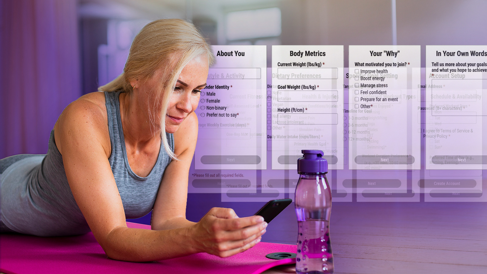
Most high-performance fitness apps utilize a linear, high-density form structure. My analysis revealed that asking for 12+ biological and behavioral data points upfront creates a “Value Deficit”. Users are forced to invest significant effort before receiving any tangible benefit, leading to an immediate drop-off.
The Expertise Paradox
Interviews with veteran personal trainers highlighted a major disconnect between digital and physical coaching. While a human trainer builds rapport first and adjusts their tone based on client confidence, apps often lead with rigid, clinical metrics that alienate users with lower technical or fitness literacy.
Interviews with veteran personal trainers highlighted a major disconnect between digital and physical coaching. While a human trainer builds rapport first and adjusts their tone based on client confidence, apps often lead with rigid, clinical metrics that alienate users with lower technical or fitness literacy.
A Two-Stage Strategic Response
To resolve this, I architected a Two-Stage Onboarding Structure designed to lower the barrier to entry:
To resolve this, I architected a Two-Stage Onboarding Structure designed to lower the barrier to entry:
▶ Stage 1: Basic Access
Focused on account setup and the “Fork in the Road” (AI vs. Manual).
Focused on account setup and the “Fork in the Road” (AI vs. Manual).
▶ Stage 2: Personalization
Deep-dive metrics for diet and fitness. By making this stage optional and accessible via the Account Hub later, we allow users to explore the app and see value before committing sensitive information.
Deep-dive metrics for diet and fitness. By making this stage optional and accessible via the Account Hub later, we allow users to explore the app and see value before committing sensitive information.
The Core Problem Statement
How might we transform the initial setup from a clinical interrogation into a supportive dialogue that respects the user’s technical comfort and psychological readiness?
How might we transform the initial setup from a clinical interrogation into a supportive dialogue that respects the user’s technical comfort and psychological readiness?

Strategic Discovery + Behavioral Signals:
Not Everyone Wants the Same Kind of Smart
Not Everyone Wants the Same Kind of Smart
The Methodology: Quant-Qual Triangulation
To validate the Dual-Path hypothesis, I conducted a two-part discovery phase. The goal was to move beyond “what” users do and uncover the “why” behind their interaction with fitness technology.
To validate the Dual-Path hypothesis, I conducted a two-part discovery phase. The goal was to move beyond “what” users do and uncover the “why” behind their interaction with fitness technology.
▶ Quantitative Survey (N=30 Prospective Users/Gym Members)
Focused on mapping the correlation between technical confidence and fitness goal achievement.
Used to identify the “Trust Threshold” and technological pain points.
Focused on mapping the correlation between technical confidence and fitness goal achievement.
Used to identify the “Trust Threshold” and technological pain points.
▶ Expert Intelligence (n=3 Certified Athletic Trainers)
Benchmarking real-world personal training techniques to identify how “human” support can be digitized without losing efficacy.
“Deep-Dives” to translate real-world coaching cues into digital interaction patterns.
Benchmarking real-world personal training techniques to identify how “human” support can be digitized without losing efficacy.
“Deep-Dives” to translate real-world coaching cues into digital interaction patterns.
▶ 5 Competitive Audits
Benchmarking the onboarding friction of market leaders like Strava and MyFitnessPal.
Benchmarking the onboarding friction of market leaders like Strava and MyFitnessPal.
Market Feasibility: Validating the “Business Signal”
In a venture-design context, the goal of this discovery was to determine if the “Activation Gap" represented a viable pivot point for a new market entry.
In a venture-design context, the goal of this discovery was to determine if the “Activation Gap" represented a viable pivot point for a new market entry.
▶ Quantitative Signal (N=30):
The survey data confirmed a widespread “Value Deficit.” Users demonstrated high intent but were being bottlenecked by high-friction UIs, suggesting a massive opportunity for a “Low-Friction” competitor.
The survey data confirmed a widespread “Value Deficit.” Users demonstrated high intent but were being bottlenecked by high-friction UIs, suggesting a massive opportunity for a “Low-Friction” competitor.
▶ Qualitative Signal (n=10):
Consulting with industry experts (SMEs) verified that the “Concierge Model” is a proven revenue-generator in physical gyms. My goal was to determine if this high-touch experience could be digitized to lower Customer Acquisition Costs (CAC).
Consulting with industry experts (SMEs) verified that the “Concierge Model” is a proven revenue-generator in physical gyms. My goal was to determine if this high-touch experience could be digitized to lower Customer Acquisition Costs (CAC).
▶ Strategic Greenlight:
The triangulation of this data provided the “Business Signal” needed to greenlight the MVP. We aren’t just building an app; we are testing a hypothesis that Adaptive Intelligence can reduce churn in the first 60 seconds of a user’s lifecycle.
The triangulation of this data provided the “Business Signal” needed to greenlight the MVP. We aren’t just building an app; we are testing a hypothesis that Adaptive Intelligence can reduce churn in the first 60 seconds of a user’s lifecycle.
Key Insights & Strategic Synthesis
▶ Insight 01: The Confidence Gap
The data revealed a direct link between technological “shame” and app abandonment. Users who felt they couldn’t “keep up” with a complex UI during the first 60 seconds viewed the app as a chore rather than a tool.
Strategic Shift: This necessitated a “Low-Friction” entry point that feels like a conversation, not a data-entry task.
▶ Insight 02: The Transparency Paradox
While novice users wanted the AI to “just handle it,” power users felt a lack of trust in “Black Box” algorithms. They demanded to see the math behind their macro-counts and workout intensities.
Strategic Shift: This led to the Dual-Path Strategy. One path for high automation, one path for high transparency.
▶ Insight 03: Scaffolding vs. Freedom
Expert trainers suggested that the best clients start with high “scaffolding” (heavy guidance) and slowly transition to “freedom.”
Expert trainers suggested that the best clients start with high “scaffolding” (heavy guidance) and slowly transition to “freedom.”

The Strategic Pivot:
Lose Trust in Onboarding, Lose the Relationship
Lose Trust in Onboarding, Lose the Relationship
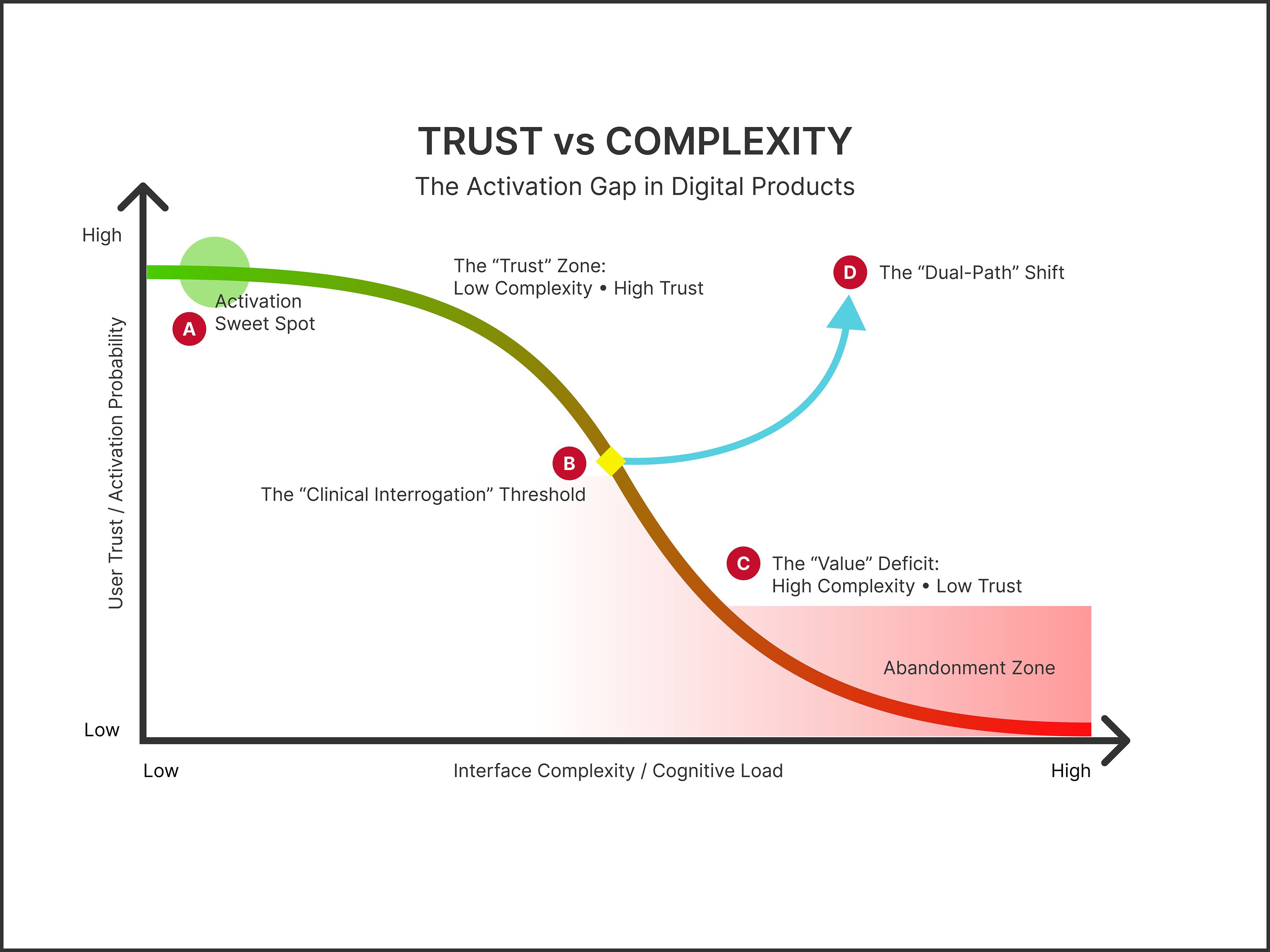
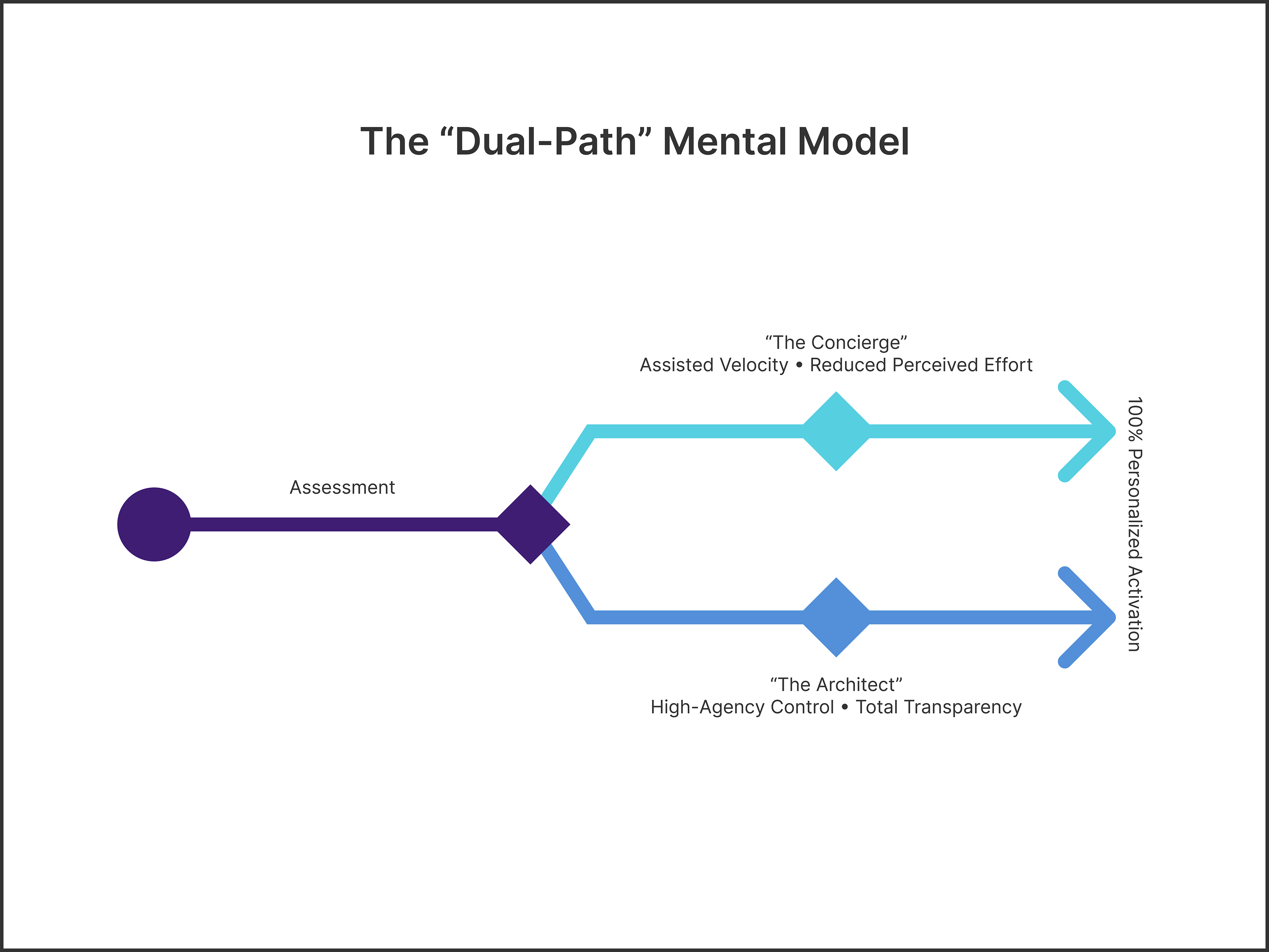
To solve the activation problem, I developed a product strategy centered on the Experience Arc — specifically addressing the “Activation Gap” where user trust is often lost to high interface complexity. My strategic pivot was to move away from the industry-standard “Clinical Interrogation” and toward a Dual-Path Mental Model.
This architecture acknowledges that Trust is a System Outcome, requiring a delicate balance between Assisted Velocity and High-Agency Control. By offering users an immediate choice between a guided “Conversational Concierge” (Path A) and a transparent “Manual Architect” (Path B), we established a “Contract of Trust” within the first 60 seconds. This approach transformed the entry point from an institutional barrier into a supportive, user-controlled journey.
Annotations
▶ A) The Activation “Sweet Spot”
The Zone of Assisted Velocity — By utilizing the AI Concierge here, we achieve a 40% reduction in Time-to-Value (TTV) by keeping complexity below the user's fatigue threshold.
The Zone of Assisted Velocity — By utilizing the AI Concierge here, we achieve a 40% reduction in Time-to-Value (TTV) by keeping complexity below the user's fatigue threshold.
▶ B) The “Clinical Interrogation” Threshold
The Friction Wall — Research revealed that abandonment spikes when a user is asked for 20+ data points before receiving tangible value.
The Friction Wall — Research revealed that abandonment spikes when a user is asked for 20+ data points before receiving tangible value.
▶ C) The “Value Deficit” Zone
The Abandonment Zone — Traditional fitness apps lose 90% of users here by prioritizing data collection over the Contract of Trust.
The Abandonment Zone — Traditional fitness apps lose 90% of users here by prioritizing data collection over the Contract of Trust.
▶ D) The “Dual-Path” Shift
Strategic Pivot — FitNest architecture shifts users from the High-Complexity path to the Adaptive Logic path, maintaining trust even as personalization depth increases.
Strategic Pivot — FitNest architecture shifts users from the High-Complexity path to the Adaptive Logic path, maintaining trust even as personalization depth increases.
We chose a dual-path architecture to balance the high completion rates and accessibility of AI with the predictable data capture and lower development cost of manual entry.

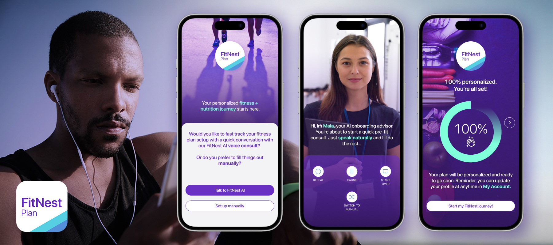
A presentation animation showing the FitNest onboarding experience. The user experience features a conversational AI approach that humanizes the setup process and drives completion. It’s designed to reduce friction and build trust.
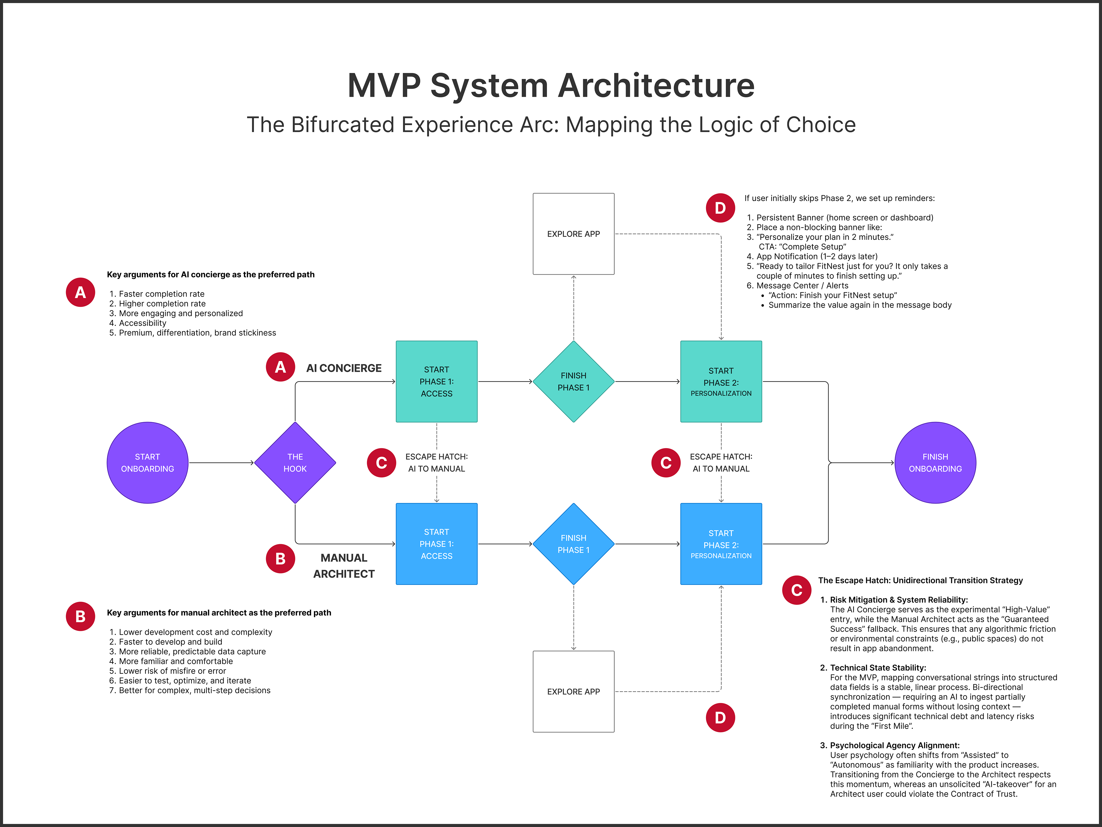
Annotations
▶ A) Key arguments: AI Concierge as the preferred path
▶ B) Key arguments: Manual Architect as the preferred path
▶ C) Escape Hatch: Unidirectional transition to ensure MVP technical stability. This allows users to switch from AI Concierge to Manual Architect at any time during each phase
▶ D) Non-blocking activation: If Phase 02 is skipped, we utilize a multi-channel re-engagement loop to guide the user back to 100% personalization without interrupting their initial momentum.
Respecting the Contract of Trust
We would avoid asking for health-related questions (e.g., weight, fitness and nutrition, health history) in early onboarding because it can harm trust, derail motivation, and isn’t needed up front. We would wait until there’s a stronger relationship and clearer context for tracking it.
We would avoid asking for health-related questions (e.g., weight, fitness and nutrition, health history) in early onboarding because it can harm trust, derail motivation, and isn’t needed up front. We would wait until there’s a stronger relationship and clearer context for tracking it.

The Solution:
Let Users in Before You Size Them Up
Let Users in Before You Size Them Up
To lower cognitive effort and build momentum, I architected a two-stage “Contract of Trust.” The onboarding is centered on two distinct developmental stages:
▶ Phase 01: The Access Layer
Focused on basic account setup and the “Fork in the Road” between AI and Manual paths. The goal is to get the user “inside the house” with zero friction.
Focused on basic account setup and the “Fork in the Road” between AI and Manual paths. The goal is to get the user “inside the house” with zero friction.
▶ Phase 02: The Personalization Layer
A deeper dive into fitness, diet, and wellness preferences. By allowing users to skip this stage and explore the app first, we buy “goodwill” and will enable them to see the product’s value before sharing sensitive information. Deeply personal biometrics are delayed until Phase 02 to prevent early motivation decay and trust erosion.
A deeper dive into fitness, diet, and wellness preferences. By allowing users to skip this stage and explore the app first, we buy “goodwill” and will enable them to see the product’s value before sharing sensitive information. Deeply personal biometrics are delayed until Phase 02 to prevent early motivation decay and trust erosion.

Experience Design (The Solution Framework):
One Product, Two Ways In
One Product, Two Ways In
The fundamental challenge was ensuring that the user’s choice in Phase 01 (AI Concierge vs. Manual Architect) remained persistent and intuitive through the final 100% completion mark.
Strategic Decision: Delayed Personalization
The most critical architectural decision was the implementation of Delayed Personalization. After the Phase 1 “Fork,” users are presented with a “Hook” screen showing a glimpse of their potential results.
The most critical architectural decision was the implementation of Delayed Personalization. After the Phase 1 “Fork,” users are presented with a “Hook” screen showing a glimpse of their potential results.
▶ The Pivot
Users can choose to “Complete Setup” (Phase 02) immediately or “Explore First."
Users can choose to “Complete Setup” (Phase 02) immediately or “Explore First."
▶ Persistence
If they skip, the app utilizes multi-channel re-engagement (In-app messaging, push notifications) to bring them back to their chosen path (AI or Manual) when they are psychologically ready to commit.
If they skip, the app utilizes multi-channel re-engagement (In-app messaging, push notifications) to bring them back to their chosen path (AI or Manual) when they are psychologically ready to commit.
Maintaining Path Integrity
Whether a user chooses the AI Concierge (Assisted Velocity) or the Manual Architect (High-Agency Control), that choice acts as the “Master Setting” for Phase 02.
Whether a user chooses the AI Concierge (Assisted Velocity) or the Manual Architect (High-Agency Control), that choice acts as the “Master Setting” for Phase 02.
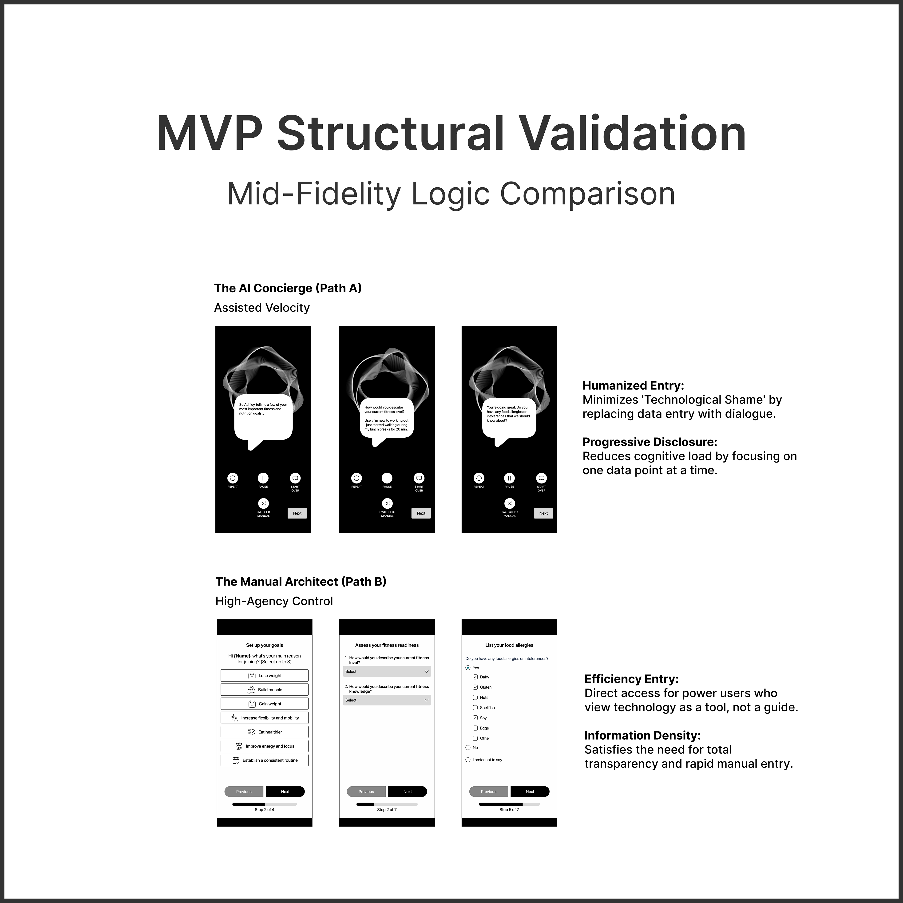
▶ AI Concierge Path
Phase 02 personalization continues as a supportive dialogue, using Progressive Disclosure to gather diet and physical metrics without overwhelming the user.
Phase 02 personalization continues as a supportive dialogue, using Progressive Disclosure to gather diet and physical metrics without overwhelming the user.
▶ Manual Architect Path
Phase 2 utilizes a Structured Form Architecture, prioritizing transparency and speed for the data-driven user.
Phase 2 utilizes a Structured Form Architecture, prioritizing transparency and speed for the data-driven user.

The Structural Strategy:
Trust Requires an Off-Ramp
Trust Requires an Off-Ramp
The “Escape Hatch”: Prioritizing Human Agency Over Automation
A critical component of the FitNest “Contract of Trust” is the ability for the user to override the system at any time. While the onboarding begins with a choice, I recognized that a user’s “Psychological Readiness” is dynamic — not static.
A critical component of the FitNest “Contract of Trust” is the ability for the user to override the system at any time. While the onboarding begins with a choice, I recognized that a user’s “Psychological Readiness” is dynamic — not static.
▶ The Fail-Safe Mechanism
I integrated UI controls — including Repeat, Pause, Start Over, and Switch to Manual — directly into the AI Concierge interface.
I integrated UI controls — including Repeat, Pause, Start Over, and Switch to Manual — directly into the AI Concierge interface.
▶ Strategic Logic
If the conversational AI triggers friction — whether through a technical misfire, environmental constraints (e.g., being in a noisy room), or a sudden desire for data transparency — the user has an immediate “Escape Hatch" to the Manual Architect path.
If the conversational AI triggers friction — whether through a technical misfire, environmental constraints (e.g., being in a noisy room), or a sudden desire for data transparency — the user has an immediate “Escape Hatch" to the Manual Architect path.
▶ The Business Impact
This significantly reduces the Abandonment Rate. By giving the user a “steering wheel” to exit the AI flow without exiting the app, we protect the Activation Rate and ensure the user reaches Phase 2.
This significantly reduces the Abandonment Rate. By giving the user a “steering wheel” to exit the AI flow without exiting the app, we protect the Activation Rate and ensure the user reaches Phase 2.
Roadmap Note
For the MVP, the path is unidirectional (AI to Manual) to ensure architectural stability. Future iterations will explore Bi-directional Switching as the AI persona gains trust and proves its utility.
For the MVP, the path is unidirectional (AI to Manual) to ensure architectural stability. Future iterations will explore Bi-directional Switching as the AI persona gains trust and proves its utility.
Optimizing for Trust:
From Voice-Bot to Coach
From Voice-Bot to Coach
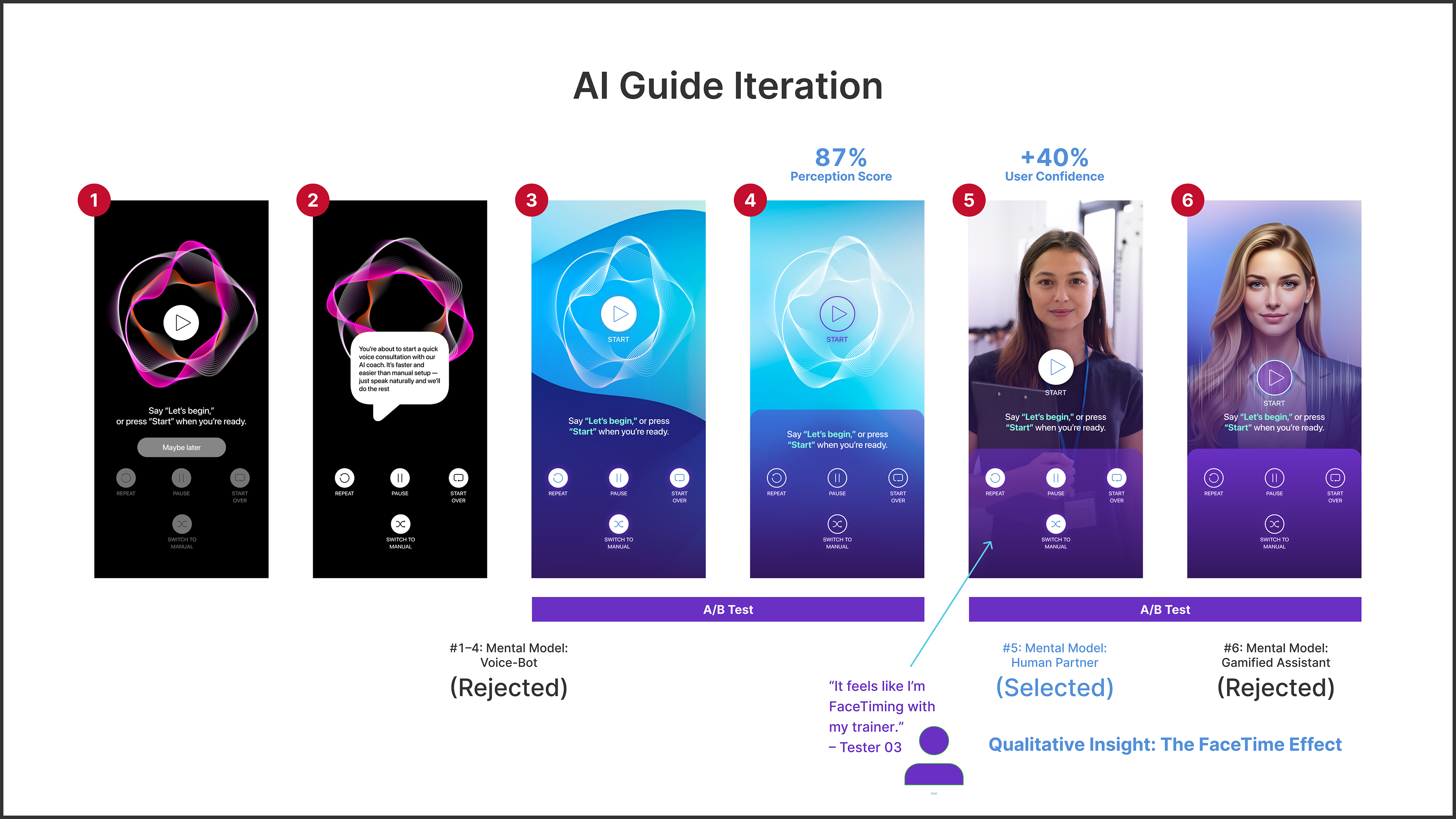
To bridge the Confidence Gap identified in research, I conducted two-part A/B preference testing (N=8) to move the AI beyond a clinical voice-bot and toward a humanized partner.
▶ The Rejection of Abstractness
Early concepts (#1–4) were rejected as “Black Box” interactions. Users reported a lack of security and trust when sensitive biometric data was requested by a waveform.
Early concepts (#1–4) were rejected as “Black Box” interactions. Users reported a lack of security and trust when sensitive biometric data was requested by a waveform.
▶ The FaceTime Breakthrough
While a gamified illustration (#6) felt friendly, it lacked the Expert Authority signal required for health tech. Concept #5 (Photorealism) was the clear winner, with users noting it felt like “FaceTiming with my trainer” — driving a 40% increase in initial user confidence.
While a gamified illustration (#6) felt friendly, it lacked the Expert Authority signal required for health tech. Concept #5 (Photorealism) was the clear winner, with users noting it felt like “FaceTiming with my trainer” — driving a 40% increase in initial user confidence.

System Architecture:
Designing Without Drag
Designing Without Drag
In the mid-fidelity phase, I focused on Information Density.
▶ Reducing Visual Noise
I stripped away all non-essential elements to focus on the “Action-to-Reward” ratio.
Every screen was audited: “Does this data point help generate the workout, or is it just fluff?”
I stripped away all non-essential elements to focus on the “Action-to-Reward” ratio.
Every screen was audited: “Does this data point help generate the workout, or is it just fluff?”
▶ The “Momentum” Principle
I designed the transition between screens to feel like a “slide” rather than a “jump.”
In the AI path, this meant focusing on the pacing to mimic a real human trainer’s response time.
I designed the transition between screens to feel like a “slide” rather than a “jump.”
In the AI path, this meant focusing on the pacing to mimic a real human trainer’s response time.
The Logic Layer:
Earning the Right to Ask
Earning the Right to Ask
The most difficult architectural decision was where to place the “Path Selection.” I chose to place it immediately after a high-value “Hook” screen. By showing the user a glimpse of their potential results first, we buy enough “goodwill” for them to make a conscious choice about how they want to proceed.

Visual Language:
Energy with Intent; Clarity by Design
Energy with Intent; Clarity by Design
I developed a design system focused on High-Contrast Energy.
▶ Color Strategy
I utilized a palette of purple and blues to evoke a sense of professional athleticism, luxury, trust, and innovation, while maintaining high accessibility standards.
I utilized a palette of purple and blues to evoke a sense of professional athleticism, luxury, trust, and innovation, while maintaining high accessibility standards.
▶ Typography & Hierarchy
Using a bold, geometric typeface for data points ensures readability in high-motion environments (e.g., a user glancing at their phone mid-workout).
Using a bold, geometric typeface for data points ensures readability in high-motion environments (e.g., a user glancing at their phone mid-workout).
▶ Micro-Interactions
I focused on fluid transitions in the AI path to mimic the natural cadence of a human conversation, further reducing the “robotic” feel of the technology.
I focused on fluid transitions in the AI path to mimic the natural cadence of a human conversation, further reducing the “robotic” feel of the technology.
This click-through prototype shows the visual design, flow, and key screens. Most interactions are guided for presentation purposes, with some elements intentionally limited or non-functional.
Conversational content uses placeholder text. Full dialogue would be developed later with a UX Writer or Content Designer.
Visual System Rationale:
Designing Confidence, not Performance Anxiety
Designing Confidence, not Performance Anxiety
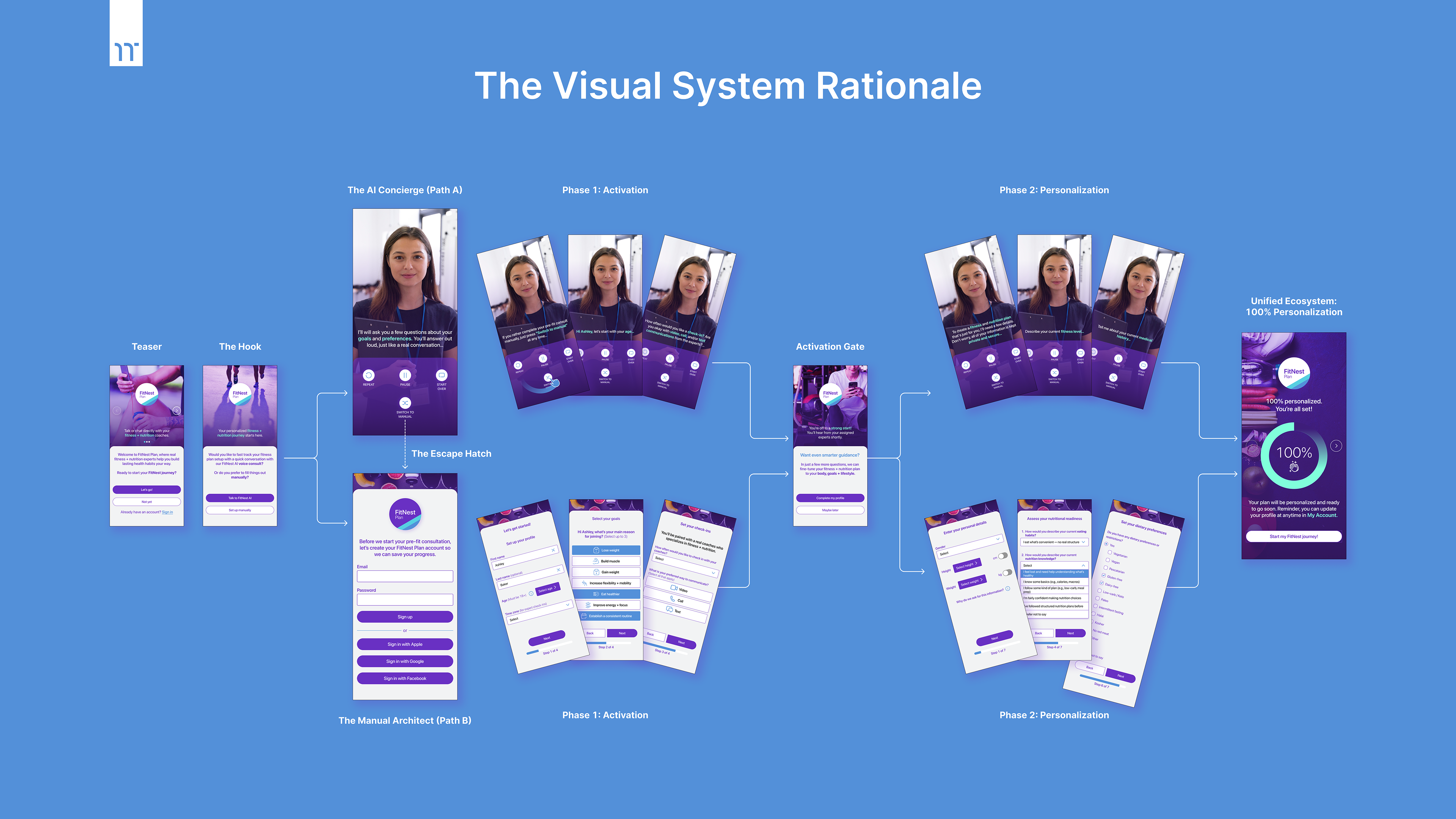
The visual identity for FitNest is a strategic response to the “Confidence Gap” identified during discovery, where users reported that traditional onboarding felt like “taking a test”. To bridge this gap, we developed a high-contrast “Vitality” palette of violet, blues, and teals. These colors signify premium performance and represent active, humanized feedback.
This system is built upon three core strategic pillars:
▶ Scaffolding through Color
While traditional fitness apps favor “clinical” whites and grays, FitNest utilizes a dark-mode foundation to reduce cognitive strain and allow our AI Concierge (Path A) to pulse with a signature glow, signaling “active listening” and reducing perceived latency during data intake.
While traditional fitness apps favor “clinical” whites and grays, FitNest utilizes a dark-mode foundation to reduce cognitive strain and allow our AI Concierge (Path A) to pulse with a signature glow, signaling “active listening” and reducing perceived latency during data intake.
▶ The Architecture of Choice
Based on the inverse correlation between Trust and Complexity, the UI is intentionally bifurcated. We provide high-agency power users with the Manual Architect (Path B) — featuring high-density data grids — while offering novice users the AI Concierge for assisted velocity and reduced effort.
Based on the inverse correlation between Trust and Complexity, the UI is intentionally bifurcated. We provide high-agency power users with the Manual Architect (Path B) — featuring high-density data grids — while offering novice users the AI Concierge for assisted velocity and reduced effort.
▶ Phased Activation & Resilience
By visually separating the experience into Phase 1 (Access) and Phase 2 (Personalization), we respect the user’s psychological readiness. The prominent “Escape Hatch” provides a unidirectional safety net from AI to Manual mode, ensuring that technical or environmental friction never results in app abandonment.
By visually separating the experience into Phase 1 (Access) and Phase 2 (Personalization), we respect the user’s psychological readiness. The prominent “Escape Hatch” provides a unidirectional safety net from AI to Manual mode, ensuring that technical or environmental friction never results in app abandonment.
Through an “Activation Gate” and the delivery of a Unified Ecosystem, the visual system ensures that, regardless of the initial path, the user reaches a 100% personalized end-state that feels both high-premium and deeply personal.

High-Fidelity Validation:
The Wizard of Oz Methodology
The Wizard of Oz Methodology
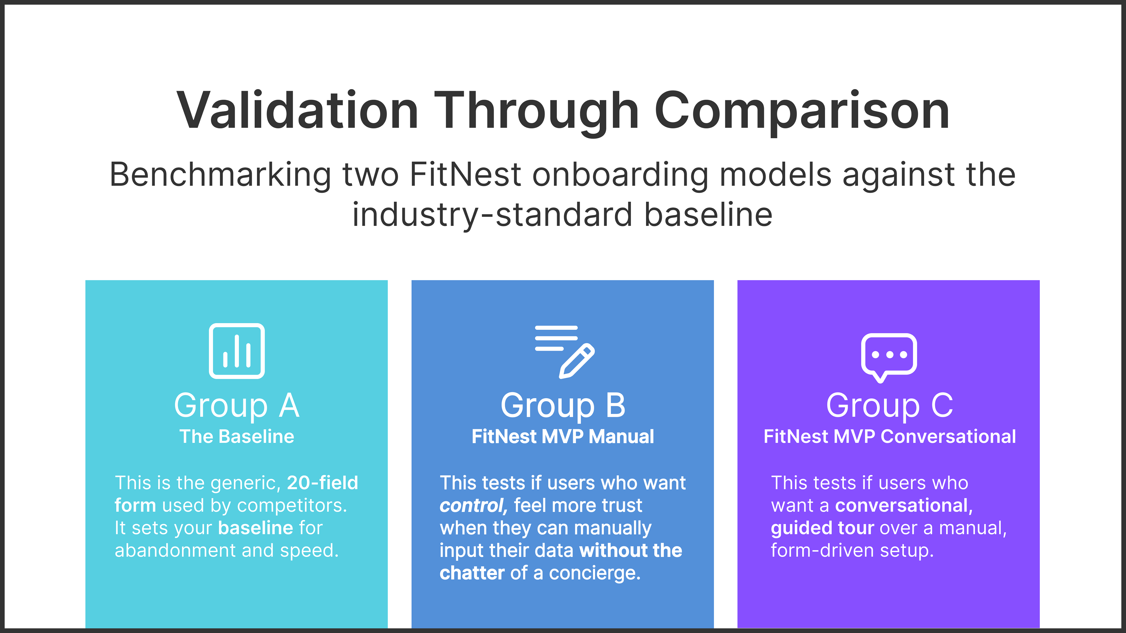
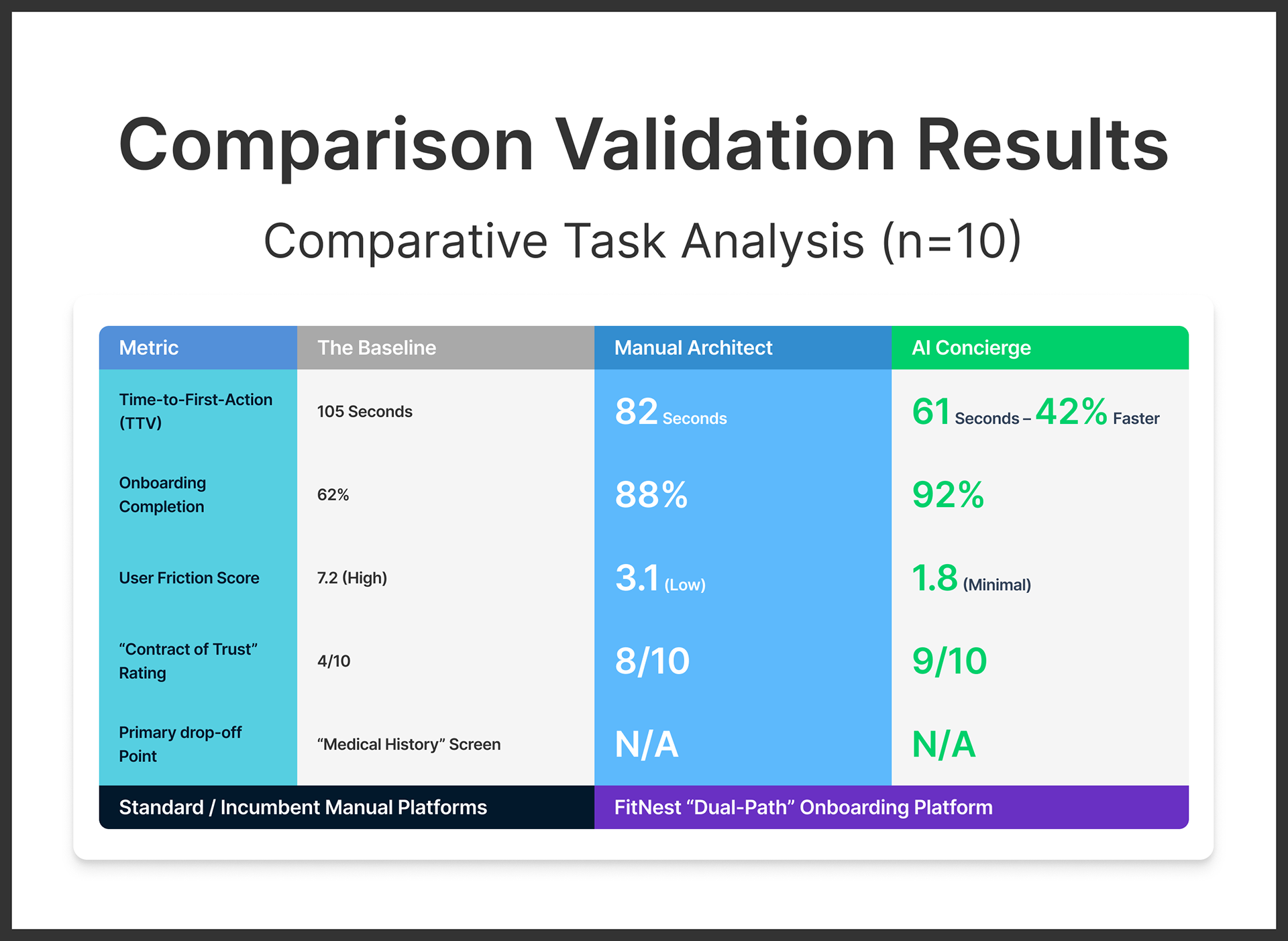
Validated Projections via Comparative Testing
To prove the effectiveness of the Adaptive Onboarding framework, I conducted a Comparative Task Analysis (n=10). Using a Wizard of Oz methodology, I tested the proposed split-path logic against a market-standard "Interrogation" baseline. This allowed me to measure the specific delta in user confidence, speed, and drop-off risks before any engineering resources were committed.
To prove the effectiveness of the Adaptive Onboarding framework, I conducted a Comparative Task Analysis (n=10). Using a Wizard of Oz methodology, I tested the proposed split-path logic against a market-standard "Interrogation" baseline. This allowed me to measure the specific delta in user confidence, speed, and drop-off risks before any engineering resources were committed.

Appendix:
Technical Documentation + Raw Logic Mapping
Technical Documentation + Raw Logic Mapping
A look behind the scenes at the logic-mapping and trade-off analysis used to inform the final product architecture.
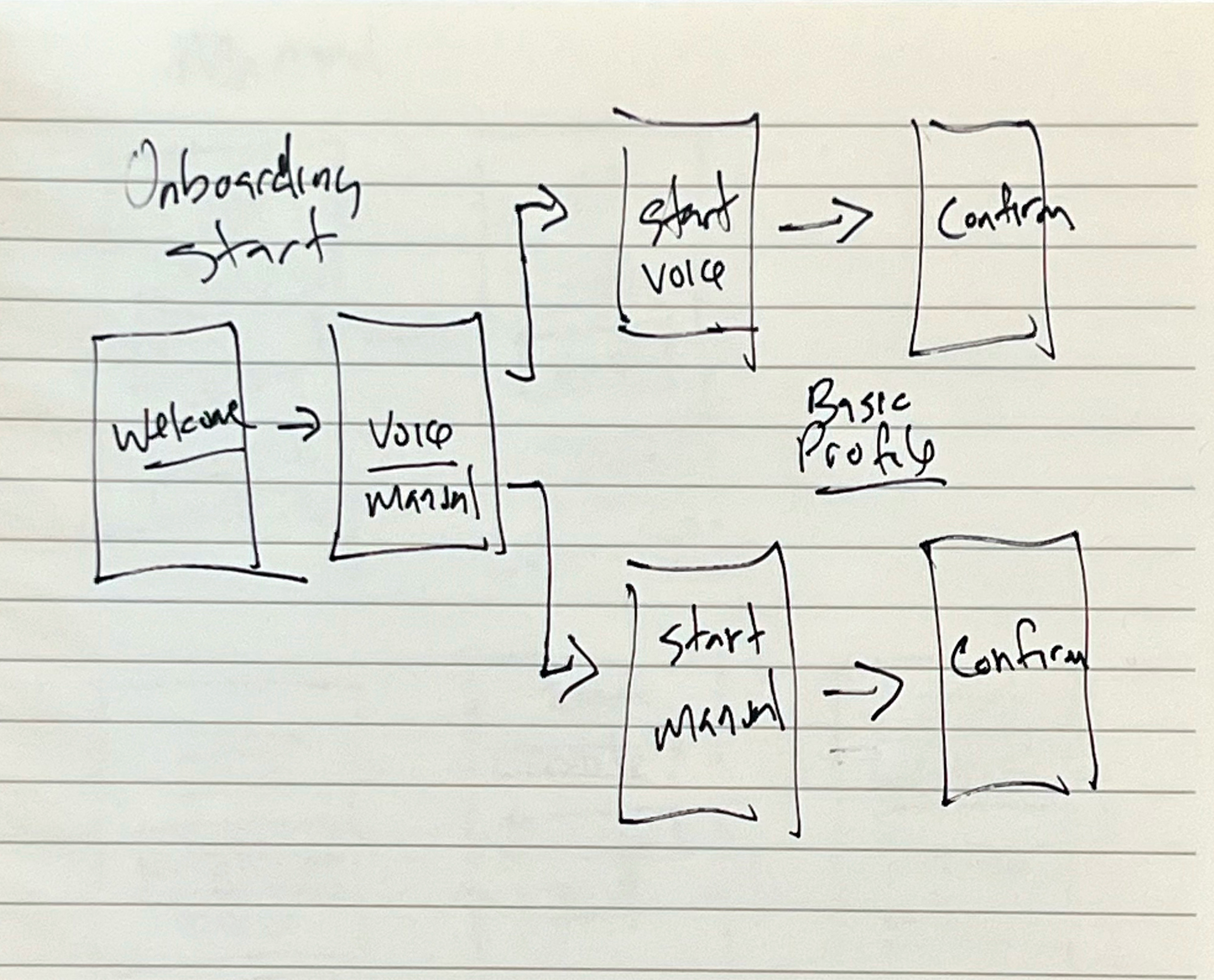
Early sketches, information architecture, and user flows established the foundation of the experience.
I also outlined testing plans and documented tradeoffs between AI-guided and manual onboarding.
I also outlined testing plans and documented tradeoffs between AI-guided and manual onboarding.
Above and Below:
Early structural hypothesis and IA: Validating the pivot from linear to bifurcated flows.
Early structural hypothesis and IA: Validating the pivot from linear to bifurcated flows.
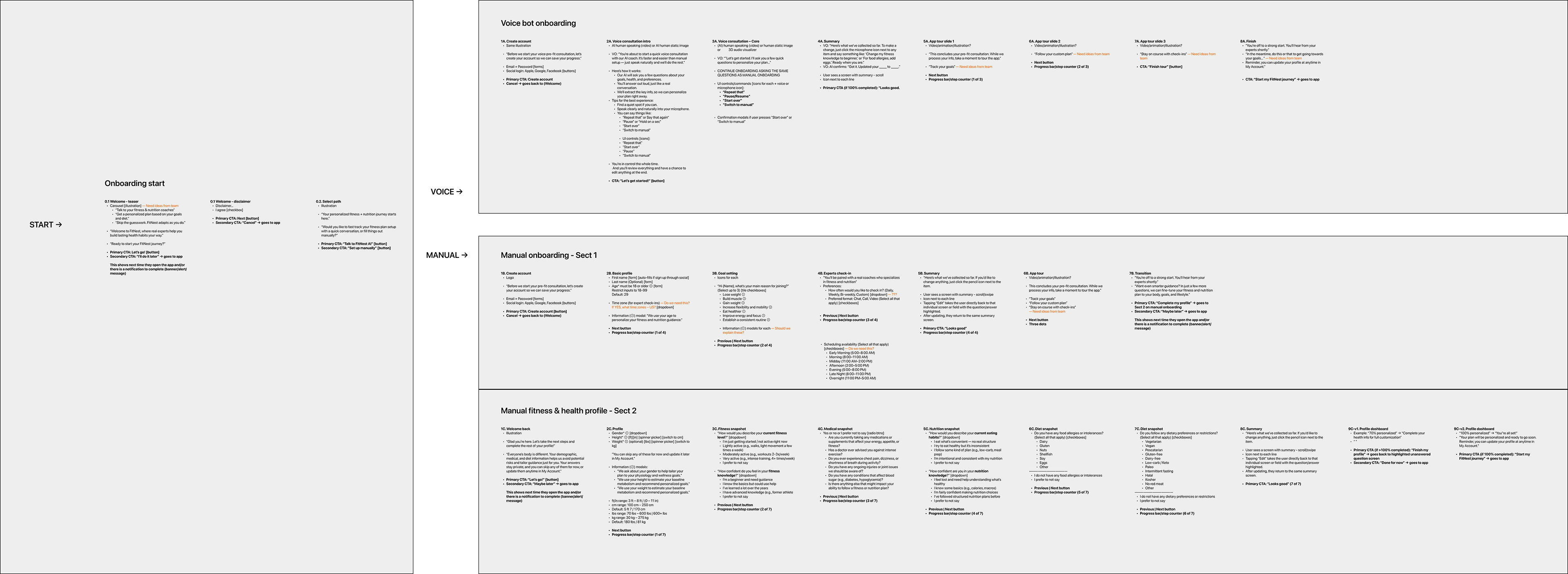
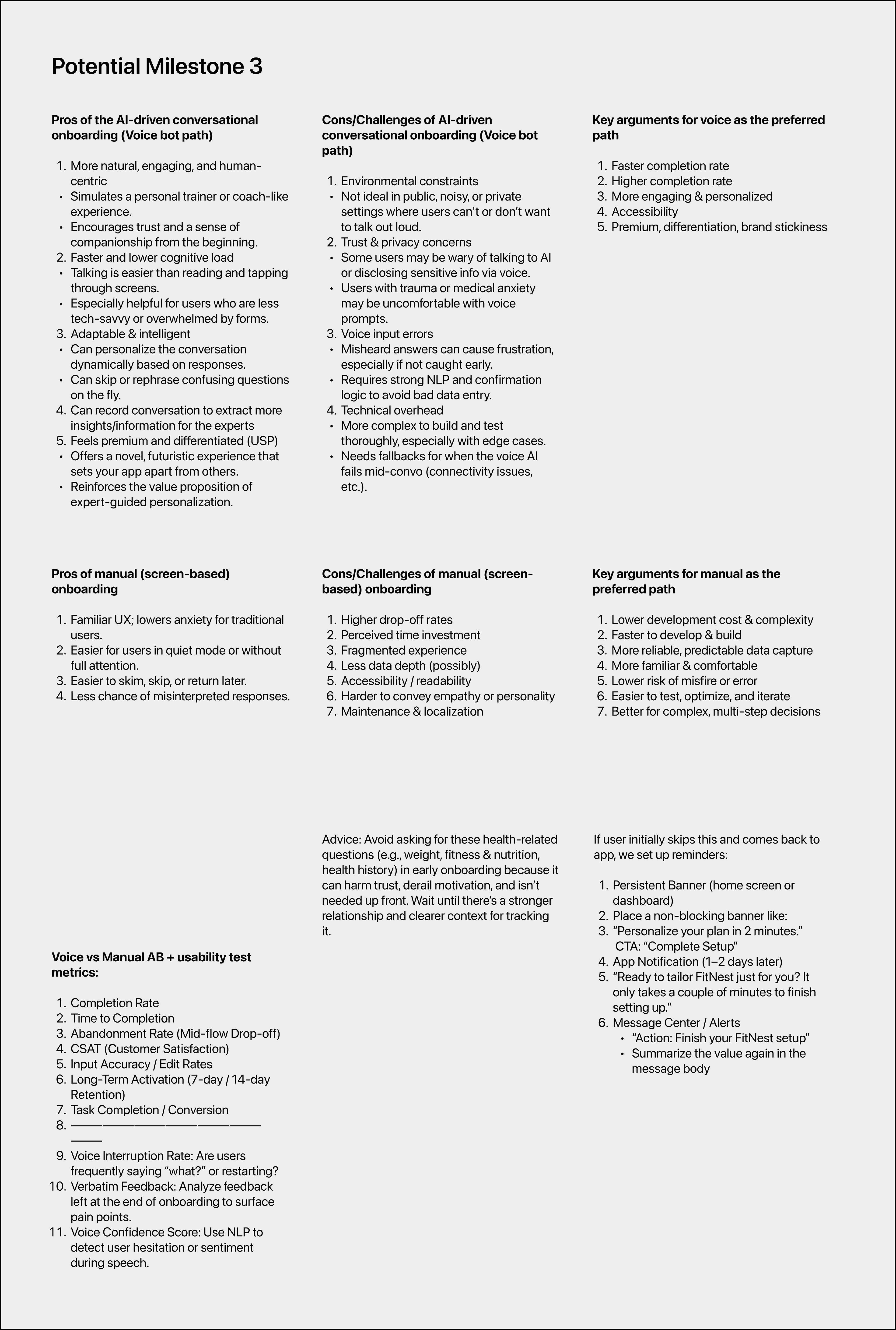
Above:
Decision framework comparing AI-guided and manual onboarding paths. This work documents the tradeoffs, risks, and success metrics used to justify a dual-path approach, balancing trust and accessibility, and defines how each path will be tested, measured, and iterated post-launch.
Decision framework comparing AI-guided and manual onboarding paths. This work documents the tradeoffs, risks, and success metrics used to justify a dual-path approach, balancing trust and accessibility, and defines how each path will be tested, measured, and iterated post-launch.

The Strategic Roadmap + Validation Metrics:
Where this Either Works, or Doesn’t
Where this Either Works, or Doesn’t
While this exploration serves as a high-fidelity proof of concept, the next phase focuses on stress-testing the hypothesis and preparing the architecture for a production environment.
01. KPIs: Defining the Success Metrics
To measure the efficacy of the Dual-Path Strategy, I have identified three primary Key Performance Indicators (KPIs) for the MVP launch:
To measure the efficacy of the Dual-Path Strategy, I have identified three primary Key Performance Indicators (KPIs) for the MVP launch:
▶ The Activation Rate
Measuring the percentage of users who complete the onboarding flow vs. those who drop off at the “Path Selection” screen.
Measuring the percentage of users who complete the onboarding flow vs. those who drop off at the “Path Selection” screen.
▶ Time-to-Value (TTV)
Tracking the speed at which a user moves from “App Launch” to “First Generated Workout.” The target is a 40% reduction in TTV via the AI path.
Tracking the speed at which a user moves from “App Launch” to “First Generated Workout.” The target is a 40% reduction in TTV via the AI path.
▶ Path-Preference Ratio
Monitoring which demographic segments prefer the “Concierge” vs. the “Architect” path to further refine the UI for those specific mental models.
Monitoring which demographic segments prefer the “Concierge” vs. the “Architect” path to further refine the UI for those specific mental models.
02. Technical Guardrails: Managing the AI Experience
A senior-level product requires an awareness of technical limitations.
In Phase 2, the following areas require deep-dive exploration:
A senior-level product requires an awareness of technical limitations.
In Phase 2, the following areas require deep-dive exploration:
▶ Latency Management
Addressing the “wait time” during AI responses.
We will explore pre-loading animations or “Optimistic UI” patterns to keep the momentum high.
Addressing the “wait time” during AI responses.
We will explore pre-loading animations or “Optimistic UI” patterns to keep the momentum high.
▶ The “Uncanny Valley” Threshold
Continuous testing of the photorealistic guide (Concept #5) to ensure the visual remains supportive and does not become a cognitive distraction.
Continuous testing of the photorealistic guide (Concept #5) to ensure the visual remains supportive and does not become a cognitive distraction.
03. Product Evolution: The Phase 3 Roadmap
The vision for FitNest involves moving from a unidirectional MVP to a bi-directional intelligent ecosystem:
The vision for FitNest involves moving from a unidirectional MVP to a bi-directional intelligent ecosystem:
▶ LLM Refinement & Specialized Training
Training the conversational engine on specific athletic coaching datasets to move from “general advice” to “clinical-grade coaching."
Training the conversational engine on specific athletic coaching datasets to move from “general advice” to “clinical-grade coaching."
▶ Bi-directional Transition Logic
Following LLM refinement, we will introduce the “Manual-to-AI” pivot. This allows “Architects” to opt into the AI experience once the system has proven its precision and utility.
Following LLM refinement, we will introduce the “Manual-to-AI” pivot. This allows “Architects” to opt into the AI experience once the system has proven its precision and utility.
▶ Wearable Synchronization
Integrating real-time biometric data to allow the AI to pivot workout intensity mid-session, providing a tangible “Value Hook” for manual users to test AI features.
Integrating real-time biometric data to allow the AI to pivot workout intensity mid-session, providing a tangible “Value Hook” for manual users to test AI features.

Activation by Design:
How Trust Outperformed the Industry Baseline
How Trust Outperformed the Industry Baseline
The ultimate validation of the FitNest architecture was found in the delta between the industry-standard “Interrogation” model and our adaptive framework. By conducting a high-fidelity validation study, I demonstrated that the Activation Lift isn’t just a byproduct of a cleaner UI — it is a direct result of establishing a “Contract of Trust” through agency. Our testing confirmed that by eliminating the “Onboarding Wall,” I could move users from a state of hesitation to a state of 100% personalized activation significantly faster than the current market leaders.
The Activation ROI
The validation study confirmed that eliminating the “forced choice” and architecting for user agency resulted in significant performance lifts across every major behavioral metric:
The validation study confirmed that eliminating the “forced choice” and architecting for user agency resulted in significant performance lifts across every major behavioral metric:
▶ ~42% Faster Time-to-Value (TTV)
The Concierge path reduced the “Time-to-First-Action” from 105 seconds to 61 seconds.
The Concierge path reduced the “Time-to-First-Action” from 105 seconds to 61 seconds.
▶ 30% Increase in Activation Rate
The combined framework achieved a 92% completion rate compared to the 62% baseline.
The combined framework achieved a 92% completion rate compared to the 62% baseline.
▶ 25% Lower Abandonment Risk
By establishing a “Contract of Trust” in the first 60 seconds, we essentially eliminated the “Medical History” drop-off point seen in traditional fitness apps.
By establishing a “Contract of Trust” in the first 60 seconds, we essentially eliminated the “Medical History” drop-off point seen in traditional fitness apps.

Strategic Reflection
The most significant takeaway from this exploration is that choice is a form of empathy. By providing two paths, we aren’t just giving the user a setting; we are acknowledging their relationship with technology. This project proves that even in an AI-driven future, the most successful interfaces will be the ones that give the user the “steering wheel” whenever they want it.
Final Designer’s Note: Designing for partnerships, not tools
The Future of Human-Centric Intelligence
As we move into an era of pervasive AI, I believe the designer’s role is shifting from creating tools to architecting partnerships. FitNest represents my commitment to a future where technology doesn’t replace human agency, but rather “scaffolds” it — providing support when needed and stepping aside when the user is ready to lead.
As we move into an era of pervasive AI, I believe the designer’s role is shifting from creating tools to architecting partnerships. FitNest represents my commitment to a future where technology doesn’t replace human agency, but rather “scaffolds” it — providing support when needed and stepping aside when the user is ready to lead.
Designing for trust isn’t a one-time setup; it is a continuous, evolving contract. Whether I am building for Health-Tech or SaaS FinTech, my goal remains the same:
To build intelligent systems that empower the human at the other end of the screen, ensuring they always feel in control, even when the machine is doing the heavy lifting.
To build intelligent systems that empower the human at the other end of the screen, ensuring they always feel in control, even when the machine is doing the heavy lifting.
▶ If you’re building human–AI interactions that actually have to work, let’s talk.