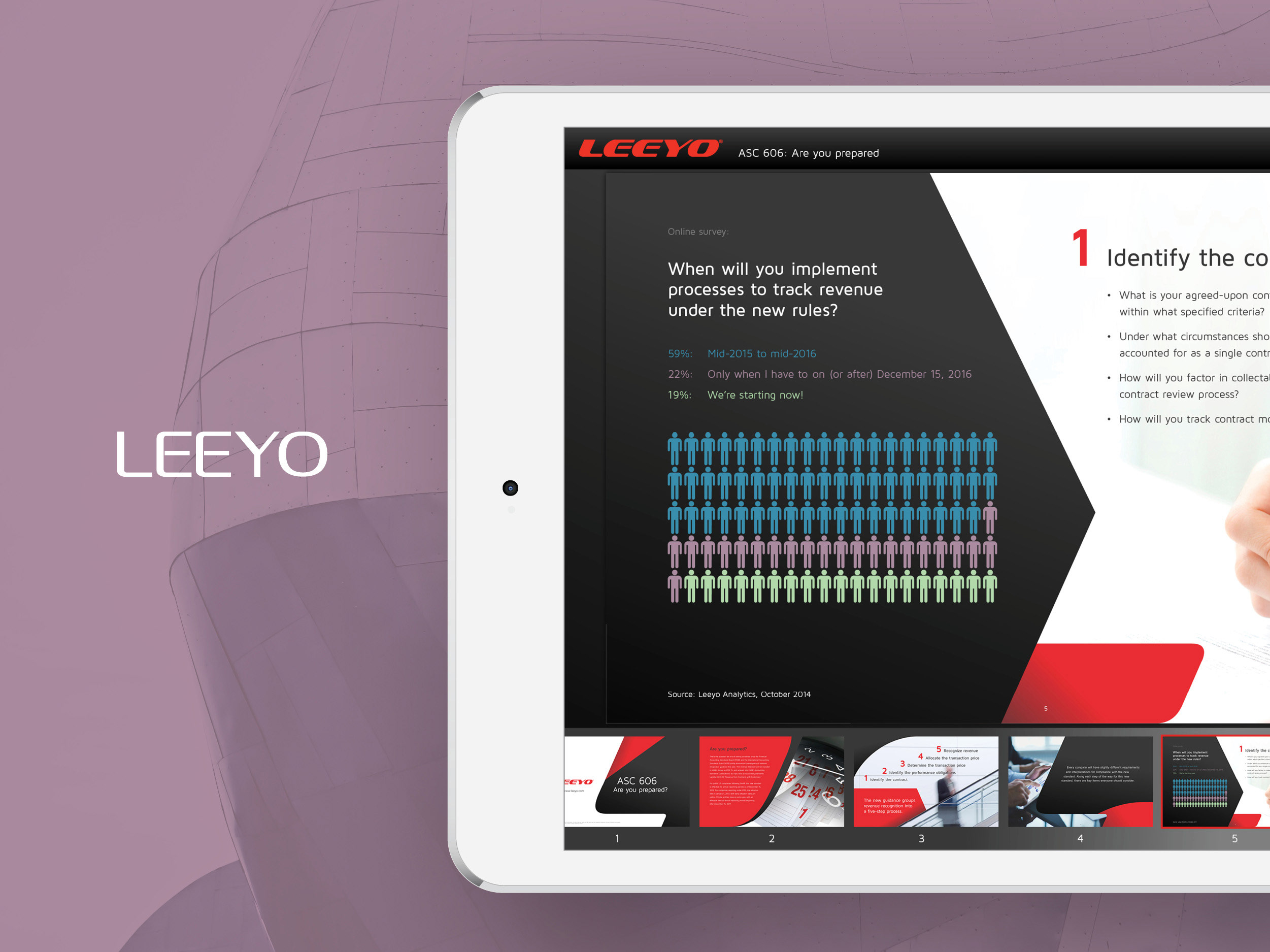
The Opportunity
Adobe is a company that is always at the tip of the spear in technology and innovation. This same mindset thrives in its marketing teams as they constantly look to find new ways of leveraging technology and resources out there to better position itself in the battlefield. I know this because I used to work in-house as a Designer for about six years, supporting Corporate and Product Marketing, and Sales. We were always pushing how to use its own technology through annual global solution campaigns. And years later after leaving Adobe, I’m called on as vendor to work with their internal BUs to create the new sales tools in support of Sales enablement.
Adobe is a company that is always at the tip of the spear in technology and innovation. This same mindset thrives in its marketing teams as they constantly look to find new ways of leveraging technology and resources out there to better position itself in the battlefield. I know this because I used to work in-house as a Designer for about six years, supporting Corporate and Product Marketing, and Sales. We were always pushing how to use its own technology through annual global solution campaigns. And years later after leaving Adobe, I’m called on as vendor to work with their internal BUs to create the new sales tools in support of Sales enablement.
Currently, I’ve been partnering a lot with the Adobe Document Solutions group since about 2010. Having been an employee, I understand Acrobat (their flagship product in their Document Cloud suite) and its history within the company. So it's a natural fit for me as a vendor to be called on as a design resource when the team needs outside help.
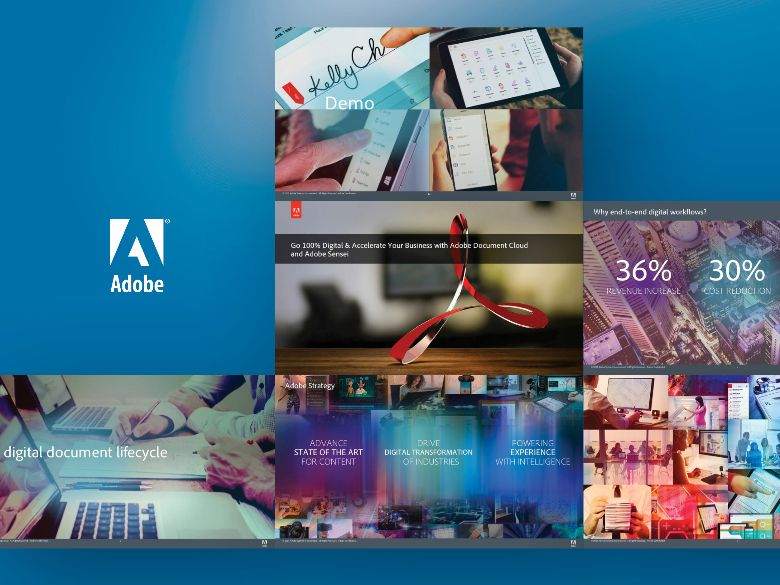
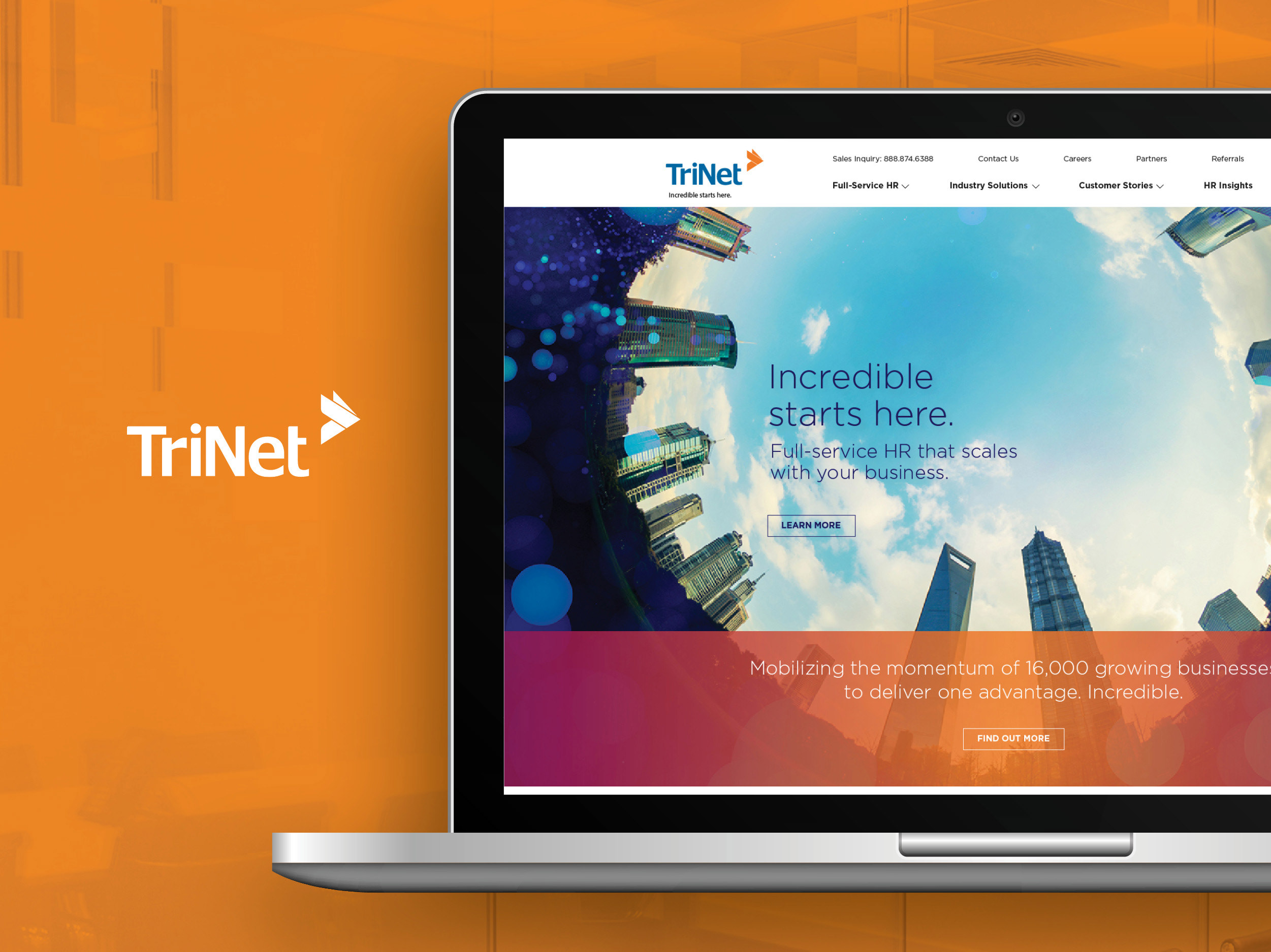
The project here was to create an internal app (called the Acrobat Messaging Kit) that would be used by Sales and Marketing. For that, Adobe turned to me to create the self-contained app that would house all of the marketing information and data points to help get the right product into the hands of its customers.
The Services
Creative strategy
Art direction
Design: Product apps, web design
Design (not shown): Numerous presentations and keynotes, interactive demos, advertising, illustrations, event conference signage and swag, collateral, posters
Tools: Photoshop, Illustrator, InDesign, Acrobat, HTML/CSS, Javascript, PowerPoint, Keynote
The Partnership
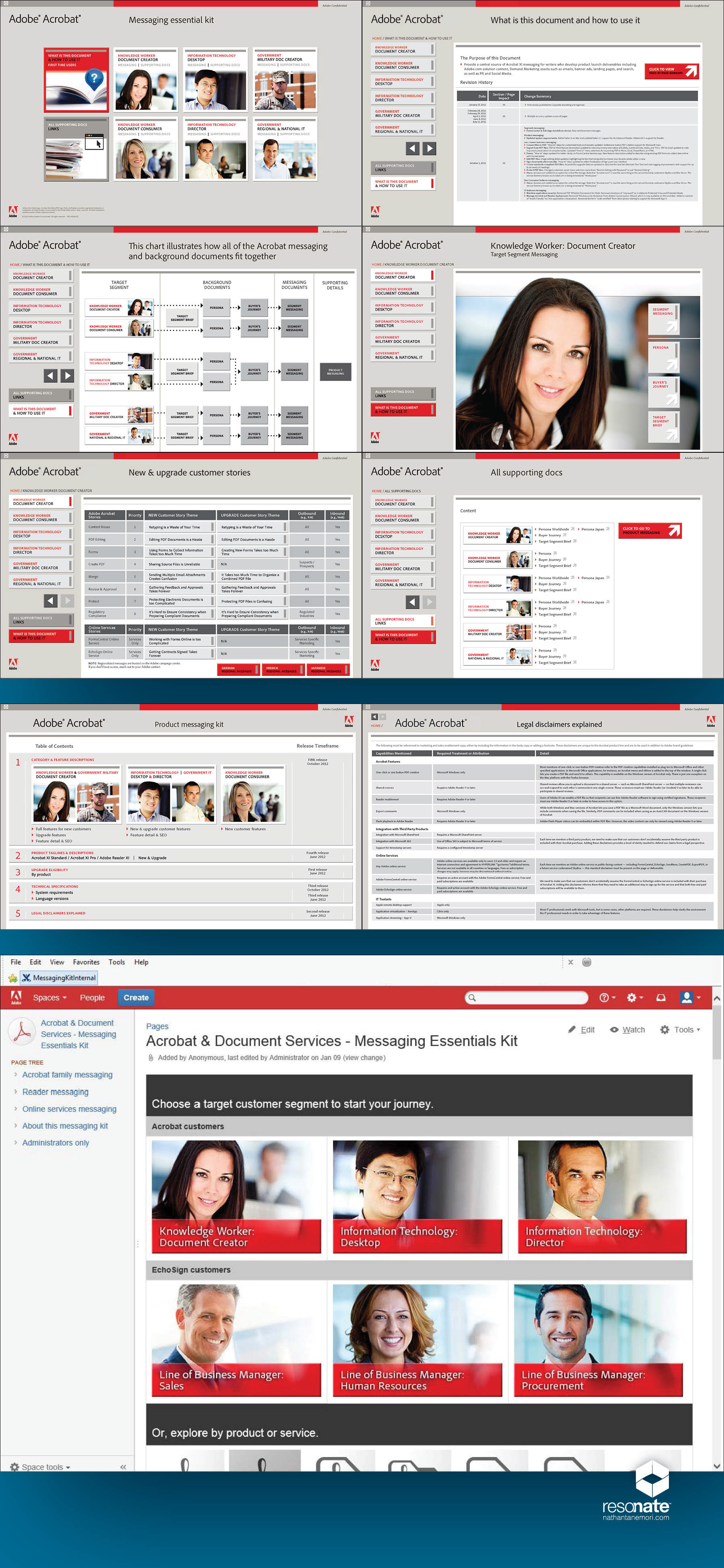
The 116 screen interactive application—complete with navigation and clickable links—was PDF-based requiring some additional programming such as javascript. The primary app (top) took about three months to complete. And a smaller secondary or supplementary app (middle) was created thereafter and took only a few weeks to produce since the base architecture and design system had been established.
The 116 screen interactive application—complete with navigation and clickable links—was PDF-based requiring some additional programming such as javascript. The primary app (top) took about three months to complete. And a smaller secondary or supplementary app (middle) was created thereafter and took only a few weeks to produce since the base architecture and design system had been established.
Since this was an internal use only app, there wasn't as strong of a need to be as sleek and creatively designed up as if it were a B2C product. Although it still had to adhere to brand standards, it didn't need to be as refined since it was mostly table- and text-driven content.
The Result
This app was a first of its kind for the group—and possibly the company at the time. The Acrobat Messaging Kit found much success and met its objectives in finally having a product or centralized sales tool that contained all of the Acrobat family marketing information. However, it became difficult to manage new content and screens, as well as getting people to stay updated to the latest rev. The app also became overly bloated in file size through these updates over the course of the year or so making it much more difficult for remote employees or those under low bandwidth to download.
This app was a first of its kind for the group—and possibly the company at the time. The Acrobat Messaging Kit found much success and met its objectives in finally having a product or centralized sales tool that contained all of the Acrobat family marketing information. However, it became difficult to manage new content and screens, as well as getting people to stay updated to the latest rev. The app also became overly bloated in file size through these updates over the course of the year or so making it much more difficult for remote employees or those under low bandwidth to download.
The solution to this new problem was to create a wiki-based internal microsite (bottom) that would effectively serve the same purpose. However, being HTML/CSS and web-driven, it was much easier to manage updates and keep the file size to a minimum for faster deployment to the field. The microsite took about a couple of months to create.