
Project Overview:
Leadership Narratives Designed to Move — Visually and Strategically
Executive Presentation | Communication at Scale | Motion Design | System Adaptation
Leadership Narratives Designed to Move — Visually and Strategically
Executive Presentation | Communication at Scale | Motion Design | System Adaptation
The problem
At LinkedIn, executive presentations are treated as product work. They power launches, shape strategy, and drive alignment at the highest levels.
When multiple launches and leadership moments converged, demand exceeded available design capacity. The challenge was not whether these decks mattered. It was how to deliver high-stakes, executive-ready storytelling at speed without sacrificing precision, credibility, or system consistency.
Time + Team
Breakdown: ~2 weeks per deck (my design contribution)
Visual & Motion Design Lead (me) • Program Manager • Copywriter • Chief of Staff • Executive Sponsor (SVP)
Breakdown: ~2 weeks per deck (my design contribution)
Visual & Motion Design Lead (me) • Program Manager • Copywriter • Chief of Staff • Executive Sponsor (SVP)
▼ Read the full story to see how it all came together. ▼

Intro / Background:
Keynotes Designed to Scale Clarity, not Noise
Keynotes Designed to Scale Clarity, not Noise
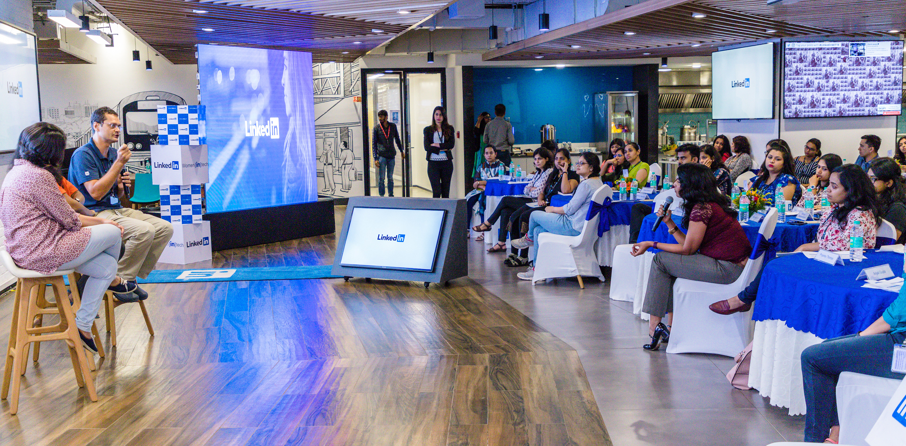
The LinkedIn Product–UED team operates with a dedicated product mindset. They apply the same principles used for designing and shipping features to their communication strategy. By leveraging clarity of intent, audience awareness, and systems thinking, they ensure executive stories are delivered with precision.
The team owns high-stakes presentations for C-level and VP audiences. These include product launches, internal keynotes, and strategic narratives. Rather than just being “slides,” these decks function as decision infrastructure. They reduce ambiguity, establish shared context, and empower leaders to move forward with confidence.
During a period of overlapping launches, the team required additional senior design capacity. I was brought in to scale executive storytelling while supporting fast-moving UED initiatives. This work required a blend of speed, precision, and sound judgment.

The Problem:
Speed vs. Precision at the Executive Level
Speed vs. Precision at the Executive Level
At LinkedIn, executive presentations are treated as product work. They sit within the Product–UED team to ensure leadership communication is intentional, on-brand, and built with the same rigor as shipped experiences.
These decks power product launches, executive keynotes, and internal alignment moments. They shape how strategy is understood and how decisions move forward.
The problem surfaced when multiple launches, summits, and leadership milestones converged. Demand outpaced available design capacity, while expectations remained uncompromising. Executive decks had to be produced quickly, without sacrificing precision, credibility, or adherence to an evolving design system.
The core challenges
▶ Overflow demand
Simultaneous launches and keynotes exceeded the team’s ability to support every request in parallel.
Simultaneous launches and keynotes exceeded the team’s ability to support every request in parallel.
▶ High-stakes visibility
Executive and global audiences left no room for inconsistency, errors, or unclear storytelling.
Executive and global audiences left no room for inconsistency, errors, or unclear storytelling.
▶ System adherence
Presentations needed to align with a maturing design system while maintaining a unified narrative voice.
Presentations needed to align with a maturing design system while maintaining a unified narrative voice.
▶ Compressed timelines
Tight schedules limited iteration, increasing risk without careful design judgment.
Tight schedules limited iteration, increasing risk without careful design judgment.
The question was not whether these decks mattered — they did. The challenge was how to scale executive storytelling without compromising quality, consistency, or trust.

My Role + Scope
I led visual and motion design for the presentations.
My responsibilities included:
▶ Designed executive-level presentations for product launches, summits, and internal keynotes
▶ Partnered directly with executives and C-level leaders on narrative structure, pacing, and content flow
▶ Delivered fast-turn, high-stakes work without compromising clarity, polish, or brand standards
▶ Maintained alignment with LinkedIn’s evolving design system across decks and event materials
▶ Extended illustration and icon libraries to support broader UED initiatives
▶ Improved visual consistency across presentations, events, and internal tools
▶ Contributed to motion design, infographics, and internal UI audits to support adjacent product efforts
Tools used:
Word • PowerPoint • Photoshop • Illustrator
Word • PowerPoint • Photoshop • Illustrator
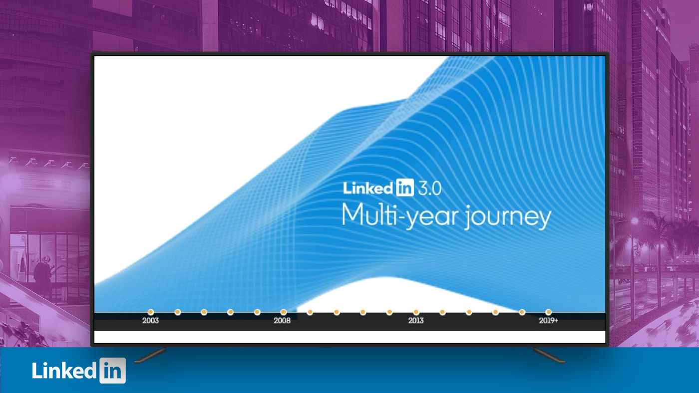
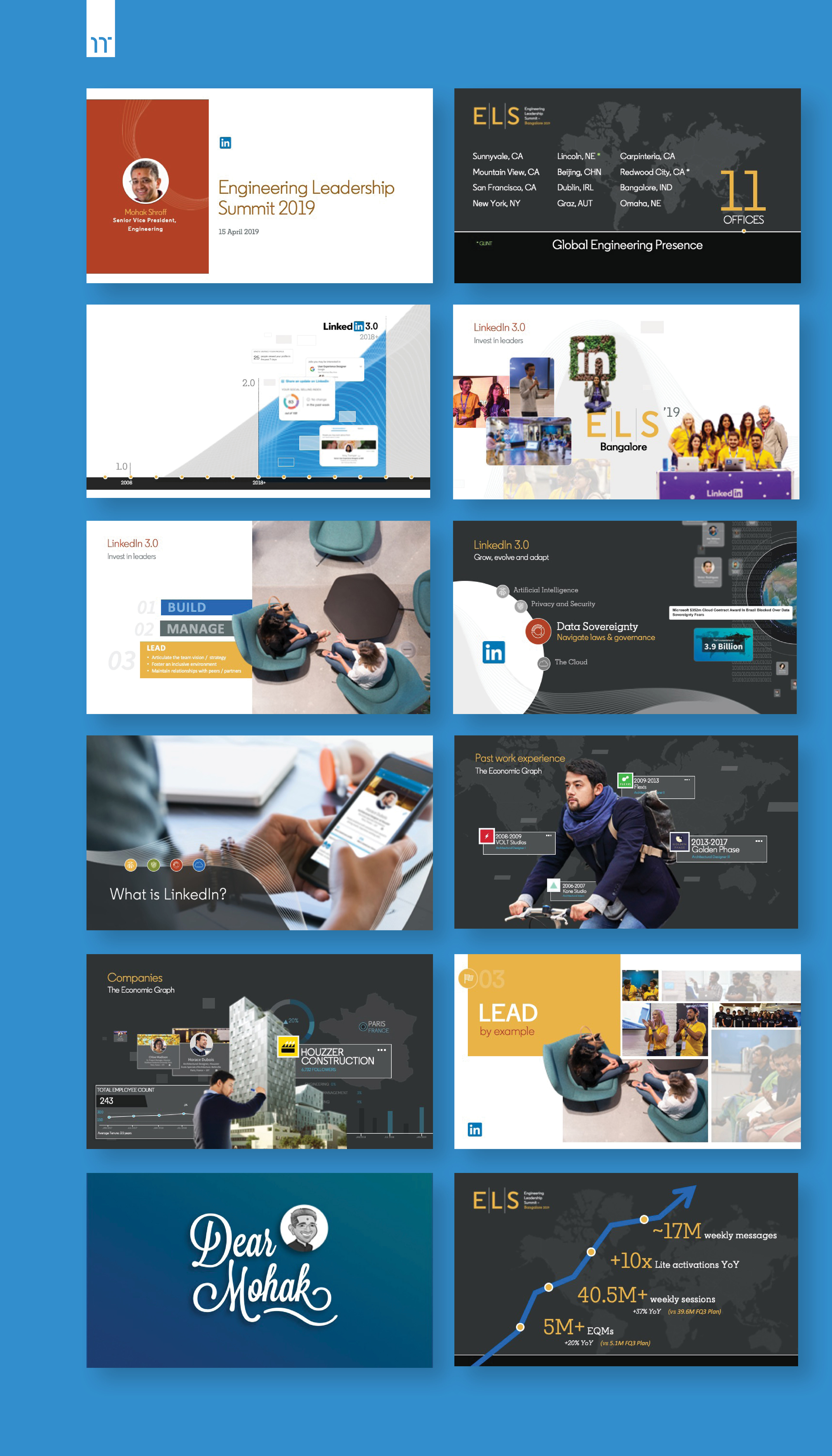
A fully animated executive keynote for Mohak Shroff, SVP of Engineering, designed to guide attention, reinforce narrative flow, and support leadership communication at scale.

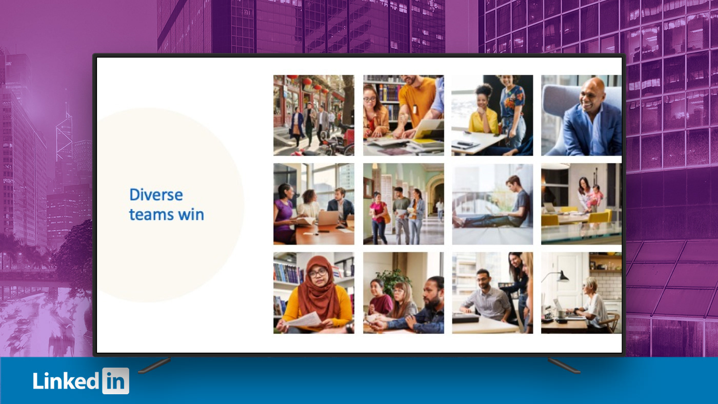
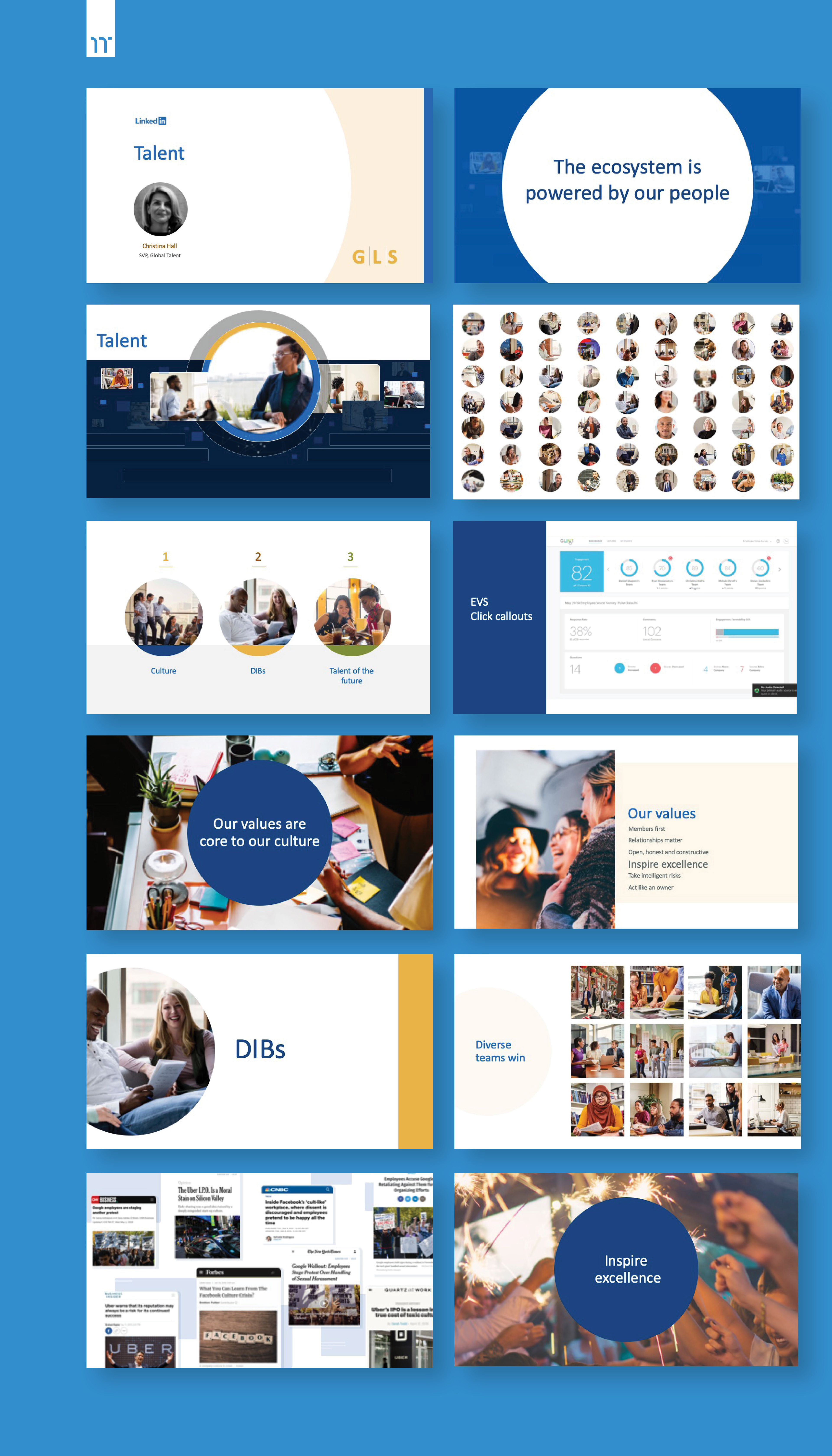
A fully animated executive keynote for Christina Hall, SVP of Global Talent, designed to guide attention, reinforce narrative flow, and support leadership communication at scale.
The Solution:
Turning Executive Stories into Momentum
Turning Executive Stories into Momentum
For executive keynotes, the solution centered on storytelling through motion. Animation and transitions were used deliberately. They weren’t used as decoration, but as narrative techniques to control pacing, reinforce hierarchy, and guide attention across complex ideas.
These examples come from executive keynotes delivered by Mohak Shroff and Christina Hall, where smooth transitions and dynamic motion helped maintain momentum and clarity across long-form presentations.
The work was executed shortly after LinkedIn launched an updated brand system. Many presentation-specific standards were still forming. Rather than wait for formal guidance, I applied first principles (e.g., typography, hierarchy, rhythm, and brand intent) to adapt the system for executive storytelling in real time.
In parallel, I developed reusable presentation patterns that balanced brand consistency with flexibility, allowing decks to scale across different leaders, audiences, and narratives.
While many executive decks focus heavily on metrics, this work emphasized human-centered storytelling, particularly in employee-facing presentations. The result was leadership communication that felt credible, intentional, and grounded in real people — not just slides and bullet points.
Mohak Shroff, SVP of Engineering, presenting at LinkedIn’s Engineering Leadership Summit (ELS).
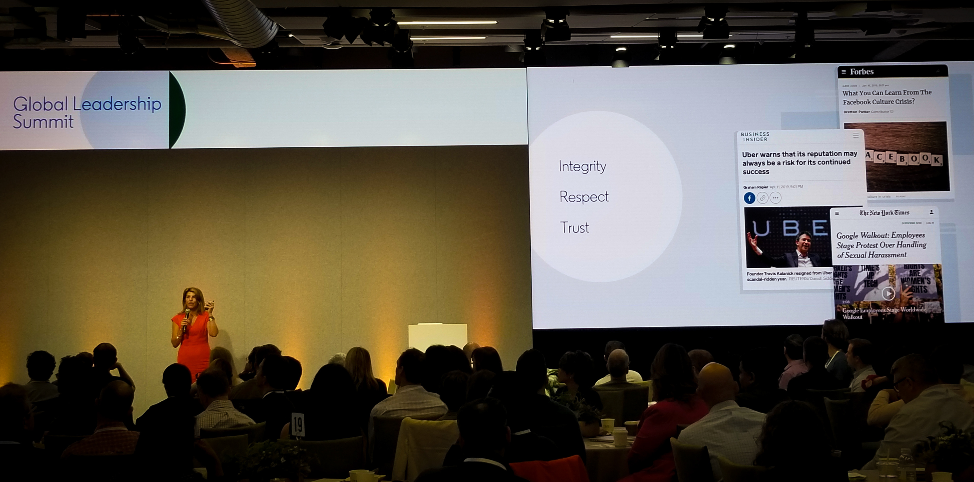
Christina Hall, SVP of Global Talent, presenting at LinkedIn’s Global Leadership Summit (GLS).

Challenges + Learnings:
High-Speed Work Inside an Evolving Design System
High-Speed Work Inside an Evolving Design System
Working at the executive level left little margin for error. Presentations needed to be persuasive, polished, and accurate, often with minimal review cycles. Design decisions had to be made quickly and stand up to scrutiny.
Another challenge was sustained context switching. I moved across launches, summits, and internal initiatives in parallel, requiring rapid shifts in subject matter while maintaining a consistent visual and narrative language.
Compounding this, LinkedIn had just launched an updated global rebranding initiative. Many standards across presentations were still being defined in real time. Questions around layout hierarchy, section dividers, motion usage, and presentation patterns did not yet have established answers.
Rather than wait for documentation to catch up, I helped establish reusable presentation patterns and a lightweight design kit the team could rely on. This reduced friction, improved consistency, and allowed the team to move faster without compromising quality.
The experience reinforced a core principle of system-led design: When rules are still forming, designers must operate with judgment, adaptability, and a bias toward building structure and not just delivering assets.

Impact + Results:
Executive Communication that Scaled
Executive Communication that Scaled
The work delivered immediate execution value while strengthening longer-term systems at LinkedIn.
Outcomes
▶ Delivered multiple executive-level presentations for product launches, summits, and internal keynotes under tight deadlines.
▶ Enhanced clarity and storytelling in leadership communication, fostering more confident decision-making at the executive level.
▶ Expanded illustration and icon libraries, boosting reuse across UED initiatives and future presentations.
▶ Improved visual and structural consistency across decks, events, and internal tools during a brand transition.
▶ Received strong feedback from executives and the Product–UED team for speed, accuracy, and dependability under pressure
The outcome was not just successful delivery. It was a more resilient presentation ecosystem. It became one that balanced urgency with consistency and allowed teams to move faster without sacrificing quality.
Interested? Let’s connect.