

TLDR | Project Overview:
A brand system refresh designed for enterprise scale
B2B Enterprise Software | Brand + Visual Systems | Sales Enablement | Scalable Design Framework
A brand system refresh designed for enterprise scale
B2B Enterprise Software | Brand + Visual Systems | Sales Enablement | Scalable Design Framework
The problem
IO Integration’s products were enterprise-grade.
IO Integration’s products were enterprise-grade.
Their brand presentation was not.
Sales and marketing materials were visually inconsistent and difficult to maintain.
Without a unified system, updates were slow, credibility suffered, and high-stakes client conversations carried unnecessary friction.
Without a unified system, updates were slow, credibility suffered, and high-stakes client conversations carried unnecessary friction.
Time + Team
Timeline: Multi-phase engagement
Creative & Visual Design Lead (me) • VP of Marketing • CEO
Timeline: Multi-phase engagement
Creative & Visual Design Lead (me) • VP of Marketing • CEO
My role
I owned end-to-end brand, visual, and presentation systems.
From strategy and creative direction through execution across collateral, decks, and digital assets.
I owned end-to-end brand, visual, and presentation systems.
From strategy and creative direction through execution across collateral, decks, and digital assets.
What I learned
In enterprise sales, design is functional.
It must build confidence quickly and hold up under pressure.
In enterprise sales, design is functional.
It must build confidence quickly and hold up under pressure.
Isolated assets create drag.
Systems create speed, consistency, and trust.
Systems create speed, consistency, and trust.
My approach
I led a system reset rather than a surface redesign:
I led a system reset rather than a surface redesign:
▶ Refined the brand foundation, including color, typography, and visual metaphors
▶ Introduced a repeatable graphic language to anchor recognition
▶ Built modular collateral templates for brochures, case studies, and white papers
▶ Designed scalable presentation systems for sales, executive, and keynote use
▶ Introduced a repeatable graphic language to anchor recognition
▶ Built modular collateral templates for brochures, case studies, and white papers
▶ Designed scalable presentation systems for sales, executive, and keynote use
The system was designed to work across print, digital, and live presentations without fragmentation.
Why it matters
This work shows how visual systems can directly support sales performance.
A unified design language reduces internal friction and strengthens credibility at every client touchpoint.
This work shows how visual systems can directly support sales performance.
A unified design language reduces internal friction and strengthens credibility at every client touchpoint.
Core question
How can a scalable visual system help a B2B brand sell with clarity and confidence?
How can a scalable visual system help a B2B brand sell with clarity and confidence?
▼ Read the full story to see how it all came together. ▼

Intro / Background:
Aligning brand perception with enterprise-grade products
Aligning brand perception with enterprise-grade products
IO Integration builds enterprise digital asset management tools used by creative and marketing teams around the world.
The products were robust and highly capable.
The brand presentation was not keeping pace.
The products were robust and highly capable.
The brand presentation was not keeping pace.
Visual inconsistencies across layout, color, and typography weakened first impressions.
Sales and marketing materials lacked cohesion, sending mixed signals to prospective clients.
Internally, the absence of a unified system made updates slow and difficult to scale.
Sales and marketing materials lacked cohesion, sending mixed signals to prospective clients.
Internally, the absence of a unified system made updates slow and difficult to scale.
The company needed more than a visual refresh.
It needed a cohesive design system that could modernize its brand, strengthen credibility, and unify communication across touchpoints from printed collateral to high-stakes sales presentations.
It needed a cohesive design system that could modernize its brand, strengthen credibility, and unify communication across touchpoints from printed collateral to high-stakes sales presentations.
This UX case study focuses on a guided question:
How can a consistent visual system strengthen credibility and help a B2B brand sell with confidence?

The Problem:
When strong products outgrow their presentation
When strong products outgrow their presentation
Design execution across sales decks, collateral, and web assets felt dated and inconsistent.
The work didn’t reflect the sophistication of the technology or the expectations of enterprise clients.
The work didn’t reflect the sophistication of the technology or the expectations of enterprise clients.
This wasn’t a redesign problem. It was a systems problem.
Without a unified visual framework, every new asset had to be rebuilt from scratch.
Consistency was hard to maintain. Updates were slow.
Sales and marketing teams lacked tools they could rely on with confidence.
Consistency was hard to maintain. Updates were slow.
Sales and marketing teams lacked tools they could rely on with confidence.
The result was friction at critical moments.
Disjointed design weakened clarity, diluted trust, and made high-stakes client conversations harder than they needed to be.
Disjointed design weakened clarity, diluted trust, and made high-stakes client conversations harder than they needed to be.
Key challenges
▶ Outdated visual language
The look and feel failed to represent the product’s caliber
The look and feel failed to represent the product’s caliber
▶ Lack of consistency
Disconnected assets eroded brand perception across touchpoints
Disconnected assets eroded brand perception across touchpoints
▶ Inefficient workflows
Manual rebuilds slowed marketing and sales cycles
Manual rebuilds slowed marketing and sales cycles
▶ Sales impact
Inconsistent design reduced confidence in client-facing conversations.
Inconsistent design reduced confidence in client-facing conversations.

My Role + Scope
I partnered closely with the VP of Marketing to define brand strategy. I owned the end-to-end creative & art direction, and brand & visual design systems.
My responsibilities included:
▶ Defined creative direction and brand strategy with marketing leadership
▶ Designed a unified collateral system, including brochures, case studies, white papers, and sales sheets
▶ Built presentation templates and keynote decks for sales and executive use
▶ Delivered brand-aligned assets across print, digital, and presentation formats
▶ Extended the system to website graphics, social media assets, and HTML email templates
Tools used:
Word • Photoshop • Illustrator • InDesign • PowerPoint • Keynote • Acrobat
Word • Photoshop • Illustrator • InDesign • PowerPoint • Keynote • Acrobat
The Solution:
Building a unified visual language that scales
Building a unified visual language that scales
The solution was not a cosmetic update.
It was a system reset.
It was a system reset.
The goal was to align IO Integration’s brand with the sophistication of its enterprise products—and give sales and marketing teams tools they could trust, reuse, and scale.
Brand system
The work began with a refined brand foundation. One that modernized the look while preserving equity.
Colors were dialed in from the existing palette, adjusted for contrast, clarity, and consistency across print and screen.
Typefaces were curated and unified to create hierarchy, rhythm, and readability across long-form content and presentations.
Water became a core visual metaphor.
Used intentionally to signal fluidity, motion, and integration—key attributes of IO Integration’s platform.
Used intentionally to signal fluidity, motion, and integration—key attributes of IO Integration’s platform.
A set of circular graphic elements was introduced as a recognizable brand signature.
Much like a system identifier, these elements created instant recognition across materials and helped anchor the visual language in a repeatable way.
Much like a system identifier, these elements created instant recognition across materials and helped anchor the visual language in a repeatable way.
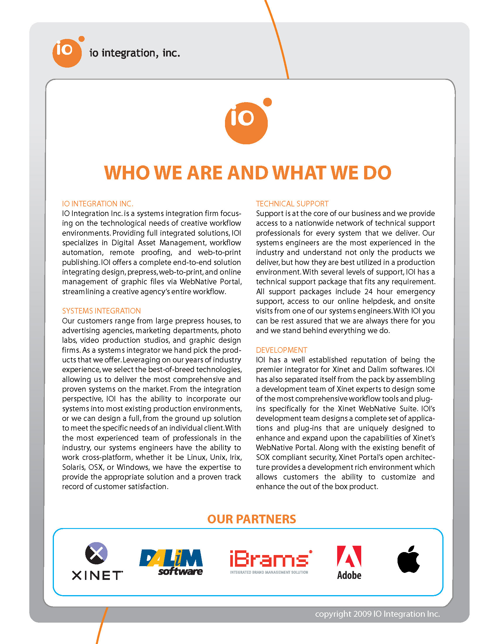
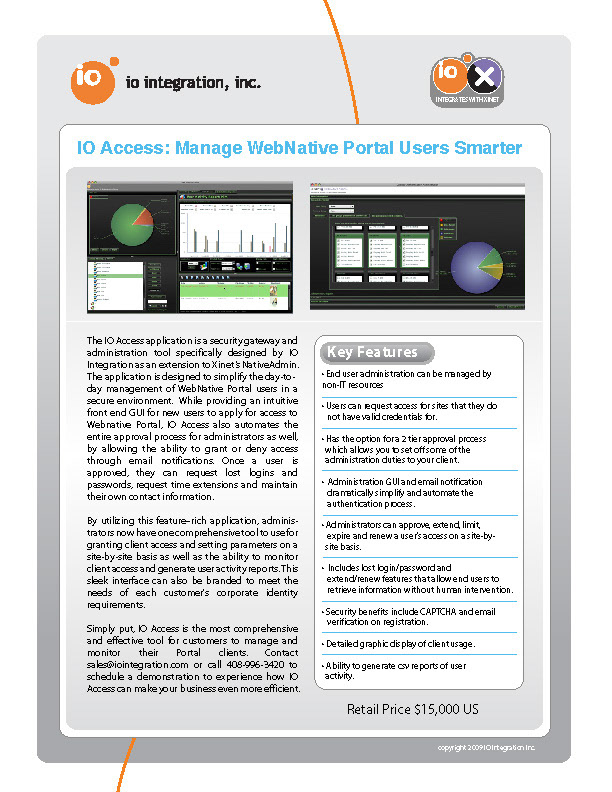
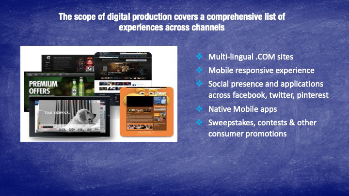
Collateral system
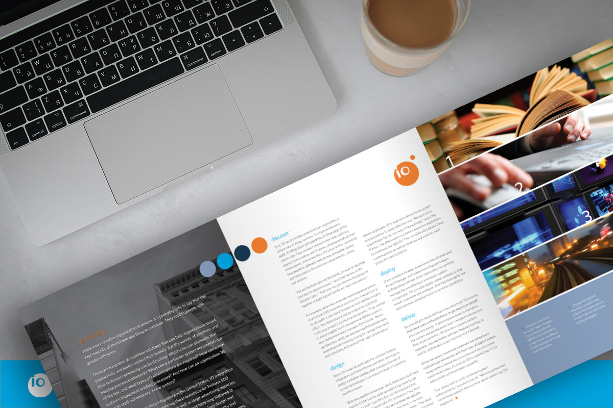
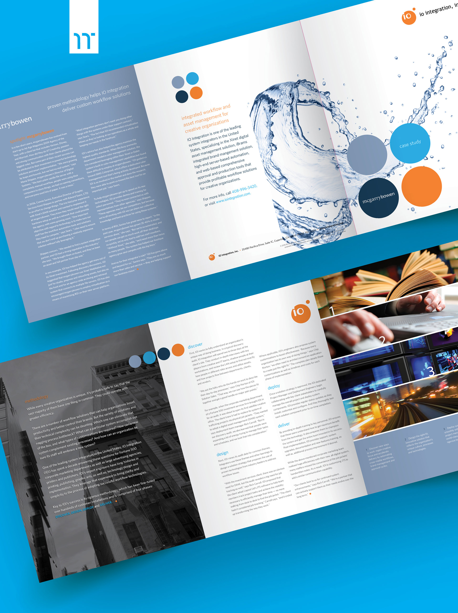
The redesign started with a new corporate brochure.
It established the visual rules: layout, hierarchy, typography, color, and image treatment.
The redesign started with a new corporate brochure.
It established the visual rules: layout, hierarchy, typography, color, and image treatment.
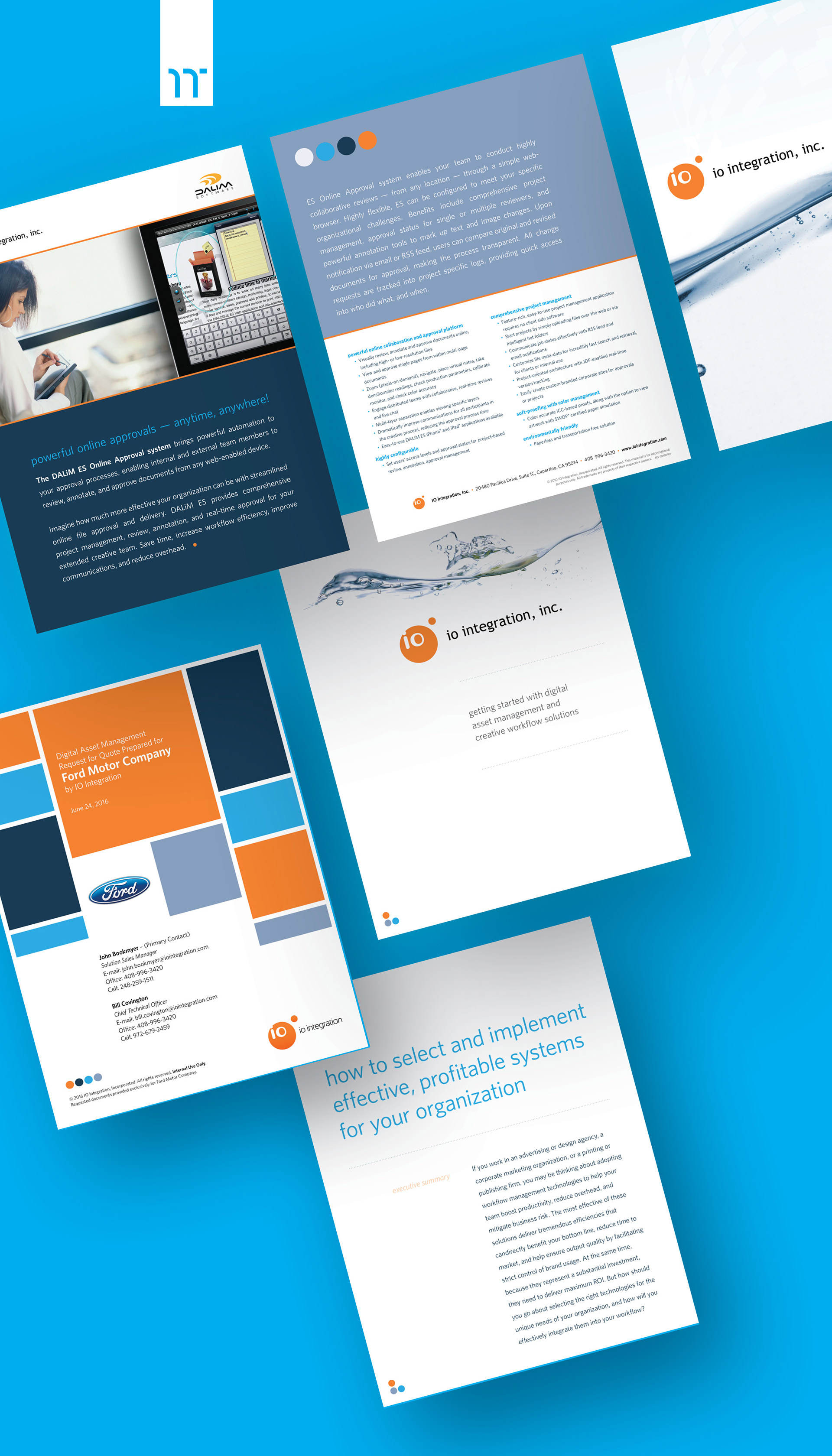
From there, the system expanded into case studies, white papers, sales sheets, and digital assets.
Each piece was designed to meet enterprise buyer expectations—clear structure, confident presentation, and visual polish.
Each piece was designed to meet enterprise buyer expectations—clear structure, confident presentation, and visual polish.
Over time, the work shifted from individual deliverables to a modular system.
Assets were flexible, scalable, and easy to adapt across formats, whether in a printed brochure, a PDF case study, or an HTML email campaign.
Assets were flexible, scalable, and easy to adapt across formats, whether in a printed brochure, a PDF case study, or an HTML email campaign.
Shown above: Corporate brochure (tri-fold)
Shown below: Case study (front + back) • Product brochure • RFP cover • Why IO Integration • White paper
Shown below: Case study (front + back) • Product brochure • RFP cover • Why IO Integration • White paper
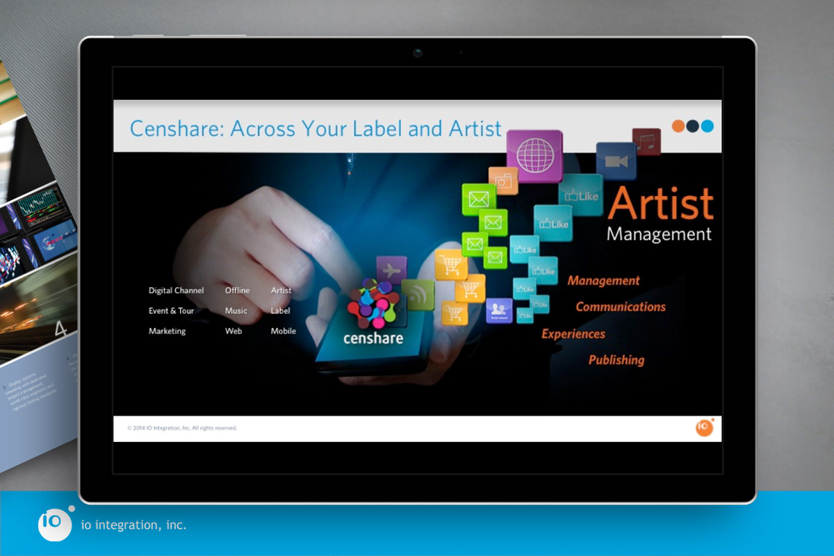
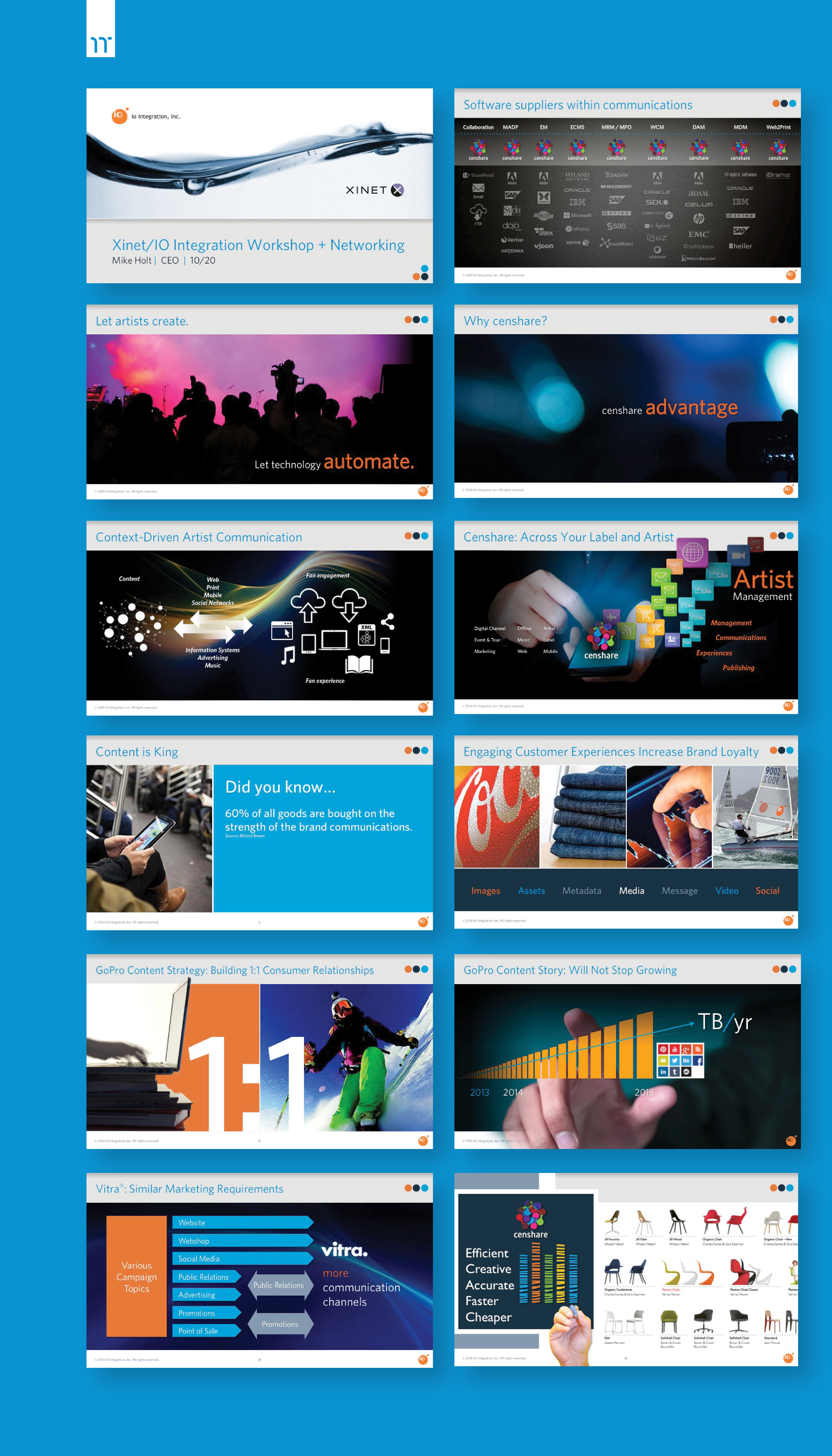
Presentations
The visual system was then applied across IO Integration’s full presentation ecosystem, including sales decks, executive briefings, and keynote presentations.
The visual system was then applied across IO Integration’s full presentation ecosystem, including sales decks, executive briefings, and keynote presentations.
This ensured every client-facing moment felt aligned and credible.
No visual resets. No one-off slides.
No visual resets. No one-off slides.
My presentation philosophy is simple: Less is more.
Clear visuals. Minimal text. Slides that support the speaker instead of competing with them.
Clear visuals. Minimal text. Slides that support the speaker instead of competing with them.
The result was a presentation system that reinforced confidence for both the audience and the presenter.
Shown below: Selected slides demonstrating system application. Screenshots are partial; animation and narrative flow have been simplified for this case study.

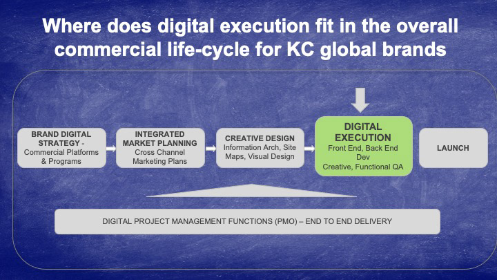
Before the redesign
Without dedicated design systems or tooling, IOI’s materials were assembled in Word and PowerPoint, creating poor, inconsistent hierarchy, alignment, and production quality. This work represents the baseline prior to introducing structured design practice.
Without dedicated design systems or tooling, IOI’s materials were assembled in Word and PowerPoint, creating poor, inconsistent hierarchy, alignment, and production quality. This work represents the baseline prior to introducing structured design practice.

Challenges + Learnings:
Designing for confidence, not decoration
Designing for confidence, not decoration
In enterprise sales, design is functional.
It needs to create confidence, not just look polished.
A core challenge was balancing visual sophistication with speed and usability.
Sales and marketing teams needed materials that were easy to update, easy to present, and reliable in high-stakes conversations.
Understanding how those materials were actually used surfaced where design breakdowns were slowing teams down.
Sales and marketing teams needed materials that were easy to update, easy to present, and reliable in high-stakes conversations.
Understanding how those materials were actually used surfaced where design breakdowns were slowing teams down.
Scalability was the second challenge.
IO Integration didn’t need isolated assets.
It needed a modular system that could support new products, evolving messaging, and multiple teams without losing consistency.
IO Integration didn’t need isolated assets.
It needed a modular system that could support new products, evolving messaging, and multiple teams without losing consistency.
Extending the system into presentation decks became a proving ground.
If the visual language worked in live sales conversations, it worked everywhere.
If the visual language worked in live sales conversations, it worked everywhere.
That alignment across sales, marketing, and leadership reduced friction, improved efficiency, and reinforced trust in the brand at every touchpoint.

Impact + Results:
Turning design consistency into sales confidence
Turning design consistency into sales confidence
The work resulted in a unified design system that aligned marketing, sales, and leadership under a single visual language.
One built to move quickly and scale.
One built to move quickly and scale.
Results
▶ Delivered a cohesive system across all marketing and sales materials
▶ Created flexible presentation templates for executive, sales, and event use
▶ Reduced internal production time, with updates shifting from hours to minutes
▶ Strengthened brand credibility in client conversations, helping shorten sales cycles
▶ Established a long-term creative partnership supporting future initiatives
The approach also reflects broader industry signals:
▶ Consistent branding across channels can increase revenue by up to 23% (Lucidpress)
▶ Design-driven companies outperform the S&P Index by 219% over ten years. (Design Management Institute)
▶ Clear, professional sales materials can shorten B2B sales cycles by 10–20% (Forrester)
▶ Consistent branding across channels can increase revenue by up to 23% (Lucidpress)
▶ Design-driven companies outperform the S&P Index by 219% over ten years. (Design Management Institute)
▶ Clear, professional sales materials can shorten B2B sales cycles by 10–20% (Forrester)
Together, these outcomes positioned IO Integration to sell with greater clarity, speed, and confidence.
Interested? Let’s connect.