
From Marketing Surface to Product Flow:
Architecting the F8 Developer Journey
Experience Architecture | Art Direction & Visual Systems | Journey Systems | Brand-to-Product Integration
Architecting the F8 Developer Journey
Experience Architecture | Art Direction & Visual Systems | Journey Systems | Brand-to-Product Integration
Designed visual systems and storytelling frameworks supporting global product initiatives across Facebook (Meta) platforms, connecting developer marketing surfaces to hands-on product experiences during the F8 Refresh 2021 conference.
Strategic Overview
F8 Refresh 2021 served as the final chapter of Facebook’s annual marquee developer conference before the company’s transition to Meta. Conducted as a 100% virtual-first event due to the COVID-19 pandemic, the project required a digital-first journey that replaced physical wayfinding with high-fidelity, interactive surfaces. This shift made it possible for developers to move confidently through the event without a physical venue, relying entirely on visual cues and interface hierarchy to understand where to go and what to do next.
F8 Refresh 2021 served as the final chapter of Facebook’s annual marquee developer conference before the company’s transition to Meta. Conducted as a 100% virtual-first event due to the COVID-19 pandemic, the project required a digital-first journey that replaced physical wayfinding with high-fidelity, interactive surfaces. This shift made it possible for developers to move confidently through the event without a physical venue, relying entirely on visual cues and interface hierarchy to understand where to go and what to do next.
This year marked a “return to roots” for the event. Previous F8s had grown into massive, consumer-facing spectacles held at larger venues such as the San Jose McEnery Convention Center with broad product announcements. However, the “Refresh” theme signaled a move back to foundational technology and developer-centric tools. It was an intentional effort to bring back the “traditional spirit” of the technical 8-hour hackathon for the global builder community.
At its core, this case study follows how a single visual and experience system was used to move developers from first touch to hands-on product use in a fully virtual environment.
▶ The Mission
Architect a cohesive, journey-driven experience connecting “marketing surfaces” to technical “product flows.”
Architect a cohesive, journey-driven experience connecting “marketing surfaces” to technical “product flows.”
▶ The Audience
A global community of coders, engineers, and technical builders.
A global community of coders, engineers, and technical builders.
▶ The “North Star”
High-tech professionalism — Every pixel had to establish authority in a virtual environment where the human presence of the speaker was mediated by a screen.
High-tech professionalism — Every pixel had to establish authority in a virtual environment where the human presence of the speaker was mediated by a screen.
Visual journey system connecting marketing surfaces, event environments, and product demonstrations across the F8 developer ecosystem.
Logistics
Time: 4 Weeks (Design & Production Sprint)
Context: Global Virtual Developer Event / Brand Pivot
Status: Integrated Experience (Launched May 2021)
Role: Art Direction & Design (Systems Governance • Product UI • Asset Production)
Focus: Journey-Driven Experience & Integrated Ecosystem
Core Stack: Figma • Photoshop • Illustrator • InDesign • PowerPoint

Journey Orchestration:
From Awareness to Product Engagement
From Awareness to Product Engagement
The journey was architected chronologically, guiding developers from high-energy awareness to deep technical engagement. This approach reduced decision fatigue early on, so developers could focus on building instead of figuring out where to start.
The Portal (Marketing Surface)
▶ The “Front Door”
A hero-centric landing page designed to drive global registration through a $100,000 challenge.
A hero-centric landing page designed to drive global registration through a $100,000 challenge.
▶ Action-Oriented Design
Large-scale hero imagery and bright F8 Refresh branding signaled the start of the journey with clear “Start Building” and “Register” CTAs.
Large-scale hero imagery and bright F8 Refresh branding signaled the start of the journey with clear “Start Building” and “Register” CTAs.
The Hub (Engagement Hub)
▶ The Transition
A microsite served as the attendee’s “home base” during the event.
A microsite served as the attendee’s “home base” during the event.
▶ Utility-First
Scaled-down marketing visuals allowed the agenda, speaker intros, and session replays to take center stage for a global audience.
Scaled-down marketing visuals allowed the agenda, speaker intros, and session replays to take center stage for a global audience.
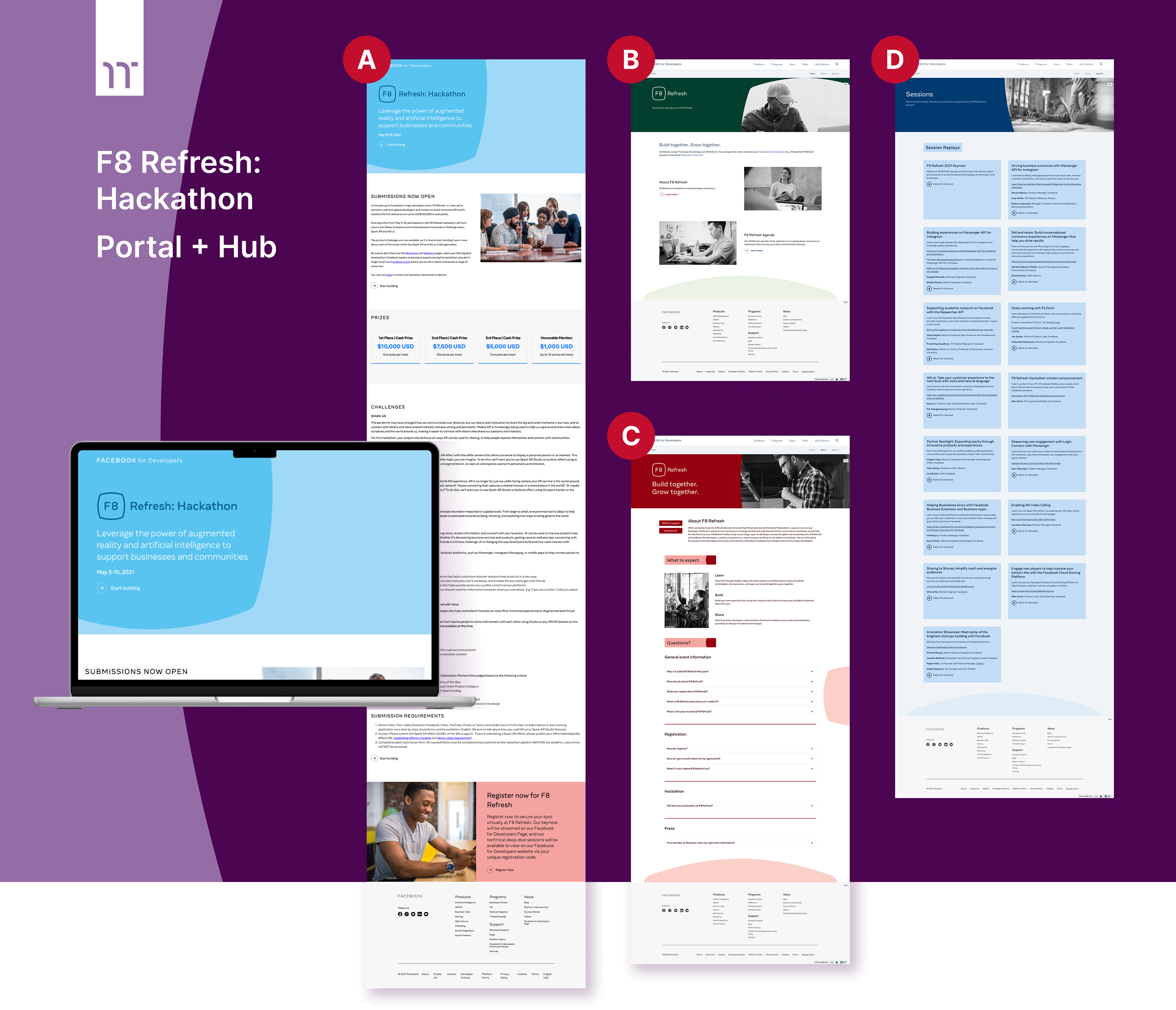
Screens from the F8 Refresh landing page and microsite:
(A) Landing page
(B) Microsite home page
(C) Microsite agenda page
(D) Microsite FAQ page
(A) Landing page
(B) Microsite home page
(C) Microsite agenda page
(D) Microsite FAQ page

System-Wide Identity:
The Experience Thread
The Experience Thread
To bridge event transitions, “dead time” and keep the virtual audience engaged, we developed a global motion system that reinforced the event's technical DNA.
▶ Technical Motion
Developed a code-string animation loop (e.g., <html id=“facebook”>) used across the entire event for transitions and filler content.
Developed a code-string animation loop (e.g., <html id=“facebook”>) used across the entire event for transitions and filler content.
▶ The Aesthetic
The “hacker” aesthetic of the motion work spoke directly to the craft of the developer audience while maintaining the polished, high-fidelity look required for a marquee Facebook event.
The “hacker” aesthetic of the motion work spoke directly to the craft of the developer audience while maintaining the polished, high-fidelity look required for a marquee Facebook event.
▶ Universal Shapes
Design elements were derived from the rounded polygon of the F8 logo, used as abstract background shapes to provide continuity across disparate digital surfaces.
Design elements were derived from the rounded polygon of the F8 logo, used as abstract background shapes to provide continuity across disparate digital surfaces.
Experience Architecture:
Establishing Authority Without a Physical Stage
Establishing Authority Without a Physical Stage
With no physical stage, the visual system provided the event’s entire sense of authority and consistency. To maintain authority in a 100% virtual environment, I architected a modular “Situation System” (Situ) that served as the primary framework for virtual wayfinding and experience design. This wasn’t just a broadcast package; it was a disciplined UX system designed to manage cognitive load during high-density technical sessions. In practice, this prevented speakers and viewers from competing for attention, keeping complex code demos readable without diminishing the human presence on screen.
▶ Functional Palette
Leveraged a color-coded “Application Theory” to provide contextual cues, signaling to the user when they were transitioning between different product tracks.
Leveraged a color-coded “Application Theory” to provide contextual cues, signaling to the user when they were transitioning between different product tracks.
▶ Scalable Architecture
Developed a robust PIP (Picture-in-Picture) framework that prioritized the information hierarchy, ensuring that live code demos and complex data visualizations remained legible alongside the human presenter.
Developed a robust PIP (Picture-in-Picture) framework that prioritized the information hierarchy, ensuring that live code demos and complex data visualizations remained legible alongside the human presenter.
▶ Journey Continuity
This system bridged the gap between marketing surfaces and product flows, creating a seamless “Thread of Truth” from the initial landing page to the final technical deep-dive.
This system bridged the gap between marketing surfaces and product flows, creating a seamless “Thread of Truth” from the initial landing page to the final technical deep-dive.

Specialized Track:
Scaling FB Spark AR for a Global Creator Community
Scaling FB Spark AR for a Global Creator Community
With the core system in place, the next challenge was testing its flexibility against a high-energy, creator-first audience.
While the core F8 brand provided the umbrella, the Spark AR track required a specialized, high-energy visual language to speak to a global community of over 600,000 creators. This track represented the peak of mobile AR innovation before the platform’s eventual pivot toward AR glasses. This shift allowed creators to immediately recognize Spark AR as their space, without losing the clarity and discipline established by the broader F8 system.
▶ Scaling a Creator-Centric Hub
Leveraged early-stage Spark AR branding to architect a dedicated microsite and technical hub, expanding “infantile" brand assets into a cohesive, high-fidelity environment for a virtual audience.
Leveraged early-stage Spark AR branding to architect a dedicated microsite and technical hub, expanding “infantile" brand assets into a cohesive, high-fidelity environment for a virtual audience.
▶ Visualizing Technical Breadth
Designed graphics and session layouts that simplified the communication of complex AR Studio capabilities — including Face Tracking, Plane Tracking, and JavaScript scripting — making high-level IDE concepts digestible for developers of all skill levels.
Designed graphics and session layouts that simplified the communication of complex AR Studio capabilities — including Face Tracking, Plane Tracking, and JavaScript scripting — making high-level IDE concepts digestible for developers of all skill levels.
▶ Impact-Driven Design
Developed a visual narrative that highlighted the platform’s massive scale, connecting developer innovation to a global reach of over 1 billion users across the Facebook (Meta) platform (Facebook app and Instagram).
Developed a visual narrative that highlighted the platform’s massive scale, connecting developer innovation to a global reach of over 1 billion users across the Facebook (Meta) platform (Facebook app and Instagram).
▶ Strategic Brand Bridge
Utilized Spark AR’s geometric shapes, rich textures, electric color palette, and consistent typography to allow the vibrant, experimental Spark AR “creator” aesthetic to lead the narrative without breaking the overall F8 event’s professional “North Star.”
Utilized Spark AR’s geometric shapes, rich textures, electric color palette, and consistent typography to allow the vibrant, experimental Spark AR “creator” aesthetic to lead the narrative without breaking the overall F8 event’s professional “North Star.”
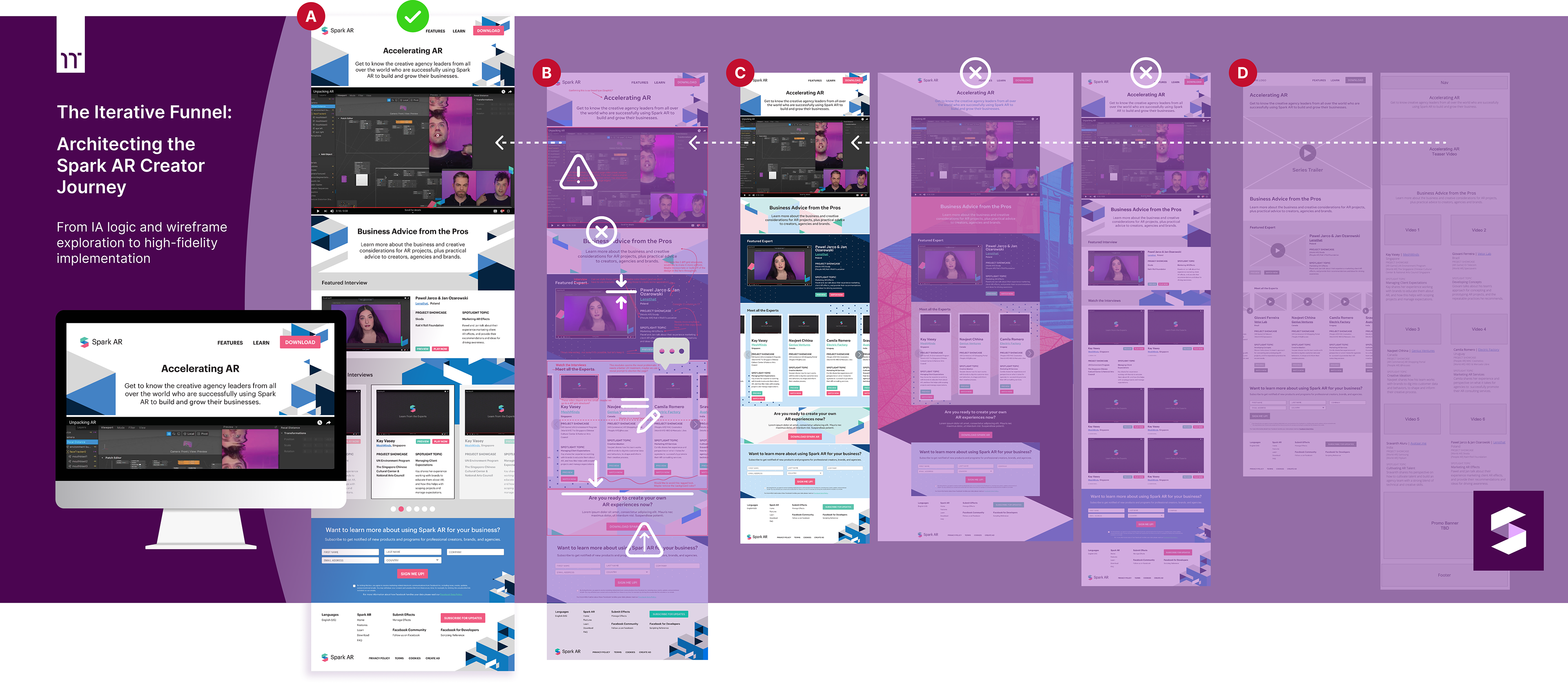
To optimize the onboarding funnel for Spark AR creators session, I conducted a high-velocity design sprint that moved from structural information architecture to high-fidelity variations. This process allowed for the exploration of diverse visual hierarchies (D) and (C), and the refinement of the developer entry point through strategic feedback cycles (B) before final production (A).
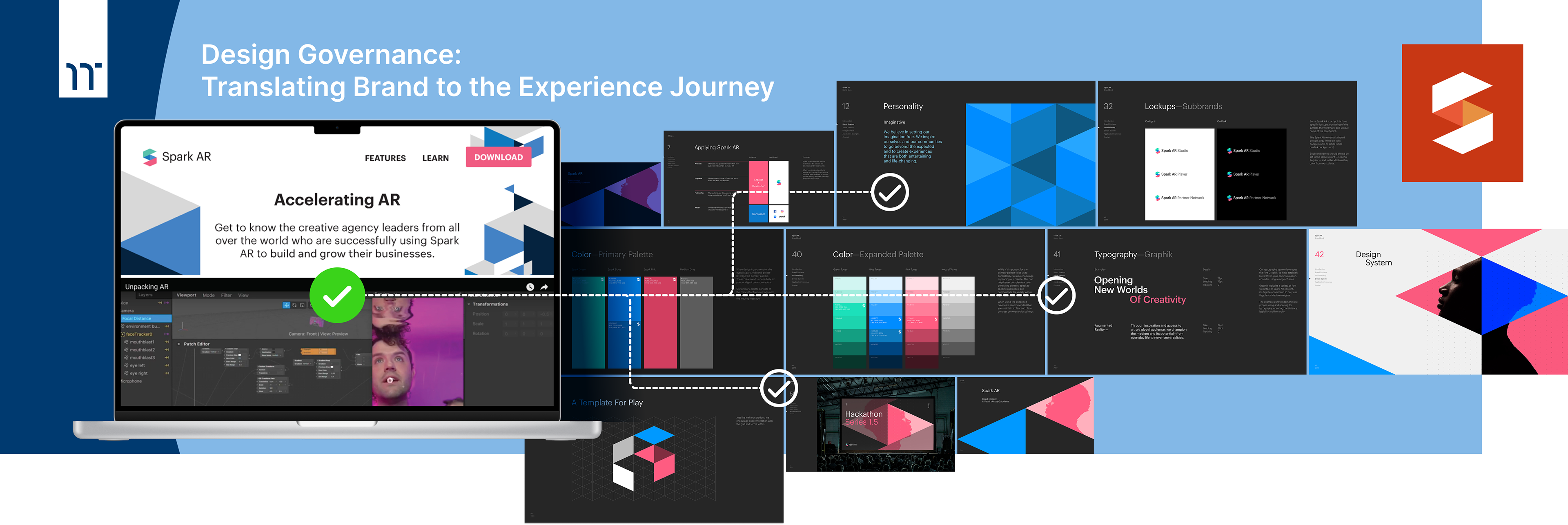
I treated the Spark AR Brand Guidelines as more than a visual standard; they were the foundation for a cohesive Experience Journey. By governing how these standards were applied across diverse digital surfaces, I ensured that the transition from high-level event marketing to technical tool utility felt seamless and intentional.

Technical Enablement:
Powering Live Spark AR Demonstrations
Powering Live Spark AR Demonstrations
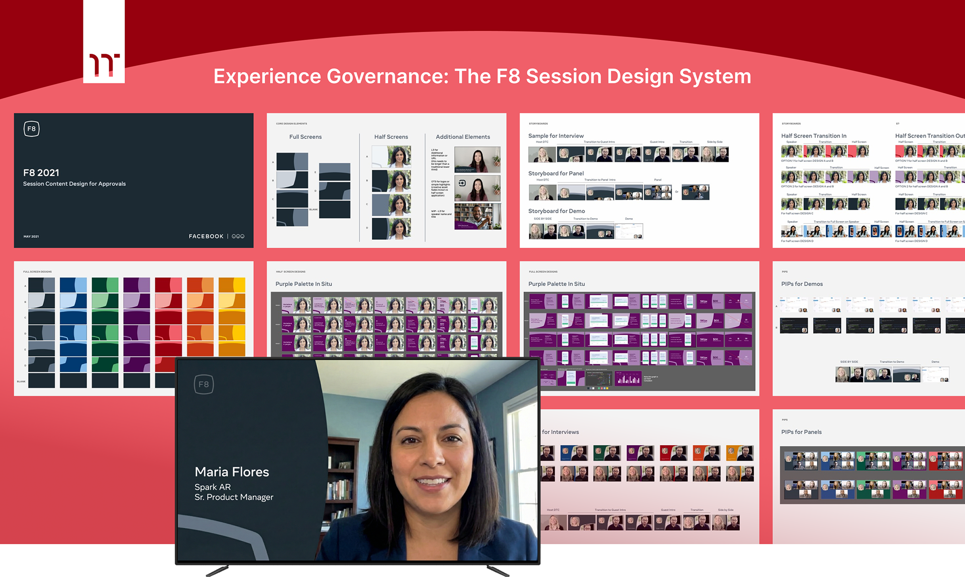
While the Spark AR track showcased the system’s flexibility at the experience level, its success ultimately depended on what happened behind the scenes. Beyond the interface, I supported the live technical sessions by producing a comprehensive suite of demo-ready assets — textures, components, and files engineered specifically for on-set use.
The grid-based visual below represents this production layer: A working library of Spark AR assets designed to be immediately deployable in live demonstrations, balancing creative fidelity with the technical constraints of real-time AR development. This preparation removed friction for on-set teams, ensuring demos could focus on teaching capabilities instead of troubleshooting assets in real time.
▶ Beyond the UI
Demonstrated the depth of my experience by moving beyond the interface (the web portal) and into the content layer.
Demonstrated the depth of my experience by moving beyond the interface (the web portal) and into the content layer.
▶ On-Set Enablement
Produced a suite of specialized demo assets specifically for the Spark AR technical tracks, providing the raw materials required for live on-set developer demonstrations.
Produced a suite of specialized demo assets specifically for the Spark AR technical tracks, providing the raw materials required for live on-set developer demonstrations.
▶ Technical Versatility
Managed the creation of diverse assets — from 3D textures to UI components — ensuring they were optimized for the technical constraints of the Spark AR environment.
Managed the creation of diverse assets — from 3D textures to UI components — ensuring they were optimized for the technical constraints of the Spark AR environment.
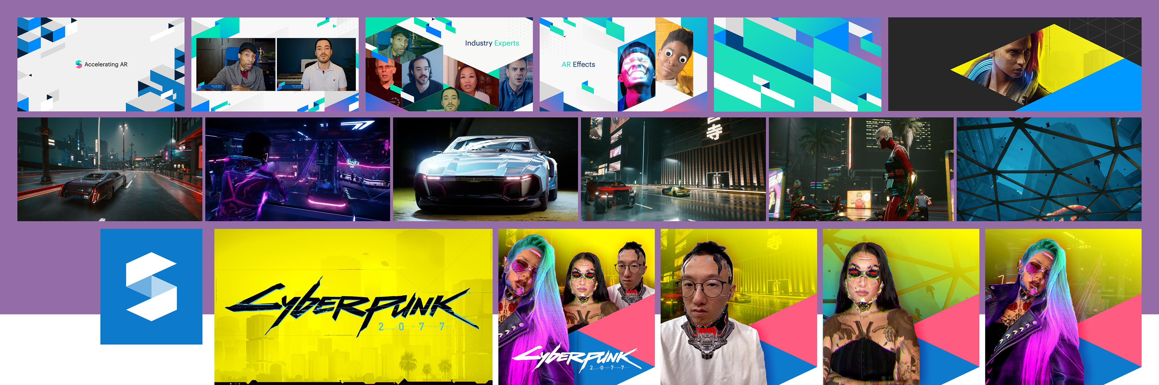
A production-ready asset library designed to support live Spark AR demonstrations, balancing creative fidelity with real-time technical constraints.

Spark AR Outcomes:
Activating a Global Creator Ecosystem
Activating a Global Creator Ecosystem
The Spark AR portal served as a high-fidelity entry point for a global community of creators, bridging the gap between high-level event marketing and hands-on technical utility. By architecting a journey that was as functional as it was visually aligned with Facebook’s evolving standards, the project achieved several key strategic wins:
▶ Empowered the Creator Funnel
Delivered a frictionless onboarding experience that allowed developers to transition from the virtual hackathon stage directly into the Spark AR creator environment.
Delivered a frictionless onboarding experience that allowed developers to transition from the virtual hackathon stage directly into the Spark AR creator environment.
▶ Maintained Governance at Scale
Successfully translated rigid Spark AR Brand Guidelines into a flexible UI, proving that complex design systems can be executed within high-velocity production sprints without sacrificing brand integrity.
Successfully translated rigid Spark AR Brand Guidelines into a flexible UI, proving that complex design systems can be executed within high-velocity production sprints without sacrificing brand integrity.
▶ Validated Product Utility
By producing specialized Demo Assets, I ensured that the technical tracks didn't just show “what” Spark AR was, but provided the raw materials for developers to build their first AR experiences on set.
By producing specialized Demo Assets, I ensured that the technical tracks didn't just show “what” Spark AR was, but provided the raw materials for developers to build their first AR experiences on set.
▶ The “Thread of Truth”
This section finalized the end-to-end narrative, proving that a single Art Director could govern the experience from the first landing page hit to the final product dashboard.
This section finalized the end-to-end narrative, proving that a single Art Director could govern the experience from the first landing page hit to the final product dashboard.


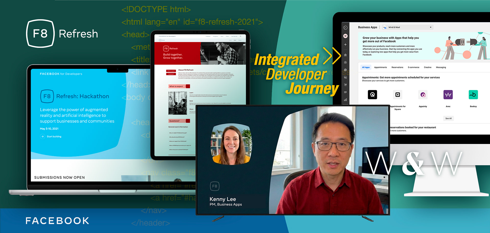
Top:
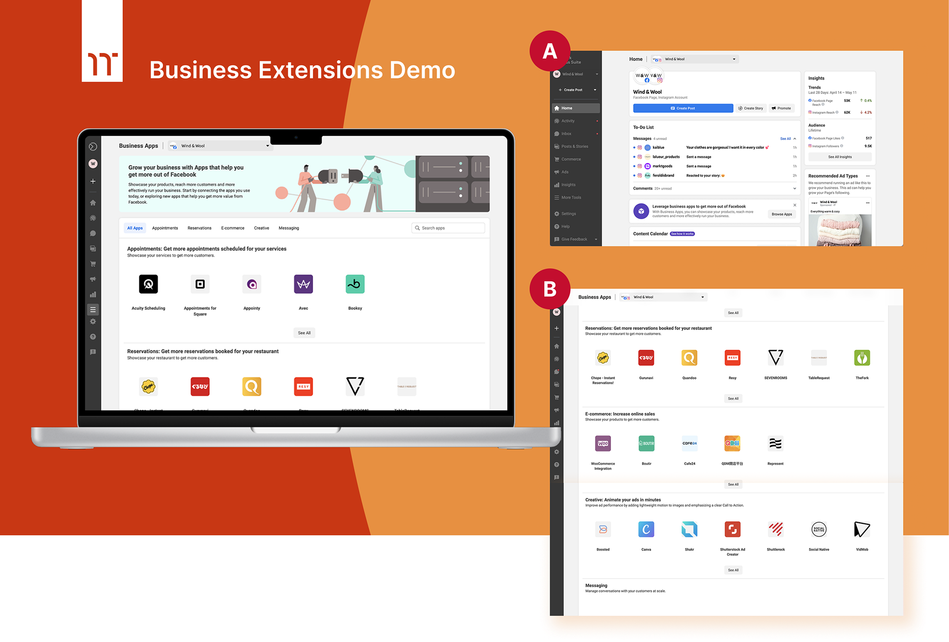
Facebook Apps Business Extensions demo
(A) Home page (Wind & Wool)
(B) Apps page where businesses can manage things like reservations; e-commerce analytics; messages; and create content
Facebook Apps Business Extensions demo
(A) Home page (Wind & Wool)
(B) Apps page where businesses can manage things like reservations; e-commerce analytics; messages; and create content
Bottom:
Wind & Wool Business Persona
Create fictitious brands to be used in the demos. These include corporate identity to product and lifestyle photography.
Wind & Wool Business Persona
Create fictitious brands to be used in the demos. These include corporate identity to product and lifestyle photography.
Product Enablement:
Bringing B2B Developer Tools to Life
Bringing B2B Developer Tools to Life
To showcase the real-world impact of the F8 Refresh innovations, I designed holistic business personas to serve as the primary demo vehicles for the event’s B2B technical tracks. By grounding the demos in believable businesses, this work made abstract developer tools feel immediately relevant to real operational problems.
▶ Total Brand Creation & Journey-Driven Demos
Authored the visual identity for Wind & Wool (a women's speciality online retailer). It included primary logotypes and a curated system of merchant product and lifestyle photography designed to feel like a premium, active Facebook and Instagram storefronts.
Authored the visual identity for Wind & Wool (a women's speciality online retailer). It included primary logotypes and a curated system of merchant product and lifestyle photography designed to feel like a premium, active Facebook and Instagram storefronts.
▶ B2B Business Suite Integration
Designed the Facebook Business Extensions screens, showing how the W&W persona manages cross-platform insights, content calendars, and customer engagement in a single “product flow.”
Designed the Facebook Business Extensions screens, showing how the W&W persona manages cross-platform insights, content calendars, and customer engagement in a single “product flow.”
▶ The Demo Narrative
By creating a believable, high-fidelity brand, I enabled the technical teams to demonstrate how developer-built extensions — like appointments, reservations, and e-commerce integrations — solve tangible problems for business owners.
By creating a believable, high-fidelity brand, I enabled the technical teams to demonstrate how developer-built extensions — like appointments, reservations, and e-commerce integrations — solve tangible problems for business owners.

System Impact:
Delivering a Cohesive Virtual Experience
Delivering a Cohesive Virtual Experience
Taken together, the F8 Refresh experience demonstrated how a single, governed visual system could translate abstract technical innovation into real-world product and business outcomes. By maintaining continuity across marketing surfaces, technical demos, and fully realized product flows, the work established a clear throughline from first impression to final execution — even within the constraints of a fully virtual event.
As a result, developers didn’t just watch the event — they left with a clear understanding of what they could build next and how to start.
▶ Strategic Impact
The visual system successfully bridged the gap between abstract technical innovation (Spark AR) and practical business utility (Wind & Wool) for a global, virtual audience.
The visual system successfully bridged the gap between abstract technical innovation (Spark AR) and practical business utility (Wind & Wool) for a global, virtual audience.
▶ The Journey Conclusion
The arc now ends not just at a generic “screen,” but at a fully realized branded business experience. This is the ultimate proof of “connecting product flows and marketing surfaces."
The arc now ends not just at a generic “screen,” but at a fully realized branded business experience. This is the ultimate proof of “connecting product flows and marketing surfaces."
▶ The Outcome
Provided a high-water mark for virtual production during the COVID-19 pandemic, maintaining the 8-hour hackathon’s “traditional spirit” while guiding the F8 brand toward its eventual evolution as Meta Connect.
Provided a high-water mark for virtual production during the COVID-19 pandemic, maintaining the 8-hour hackathon’s “traditional spirit” while guiding the F8 brand toward its eventual evolution as Meta Connect.
▶ If you’re dealing with end-to-end complexity across brand, product, and how experiences come to life — let’s talk.