
Executive Summary:
Automating a Costly 30 Seconds in Banking
Interaction Designer | Fintech | 0-to-1 Product Strategy | Workflow Optimization | Experience Architecture
Automating a Costly 30 Seconds in Banking
Interaction Designer | Fintech | 0-to-1 Product Strategy | Workflow Optimization | Experience Architecture
The Challenge: The “Manual Workaround” Institutional Drag
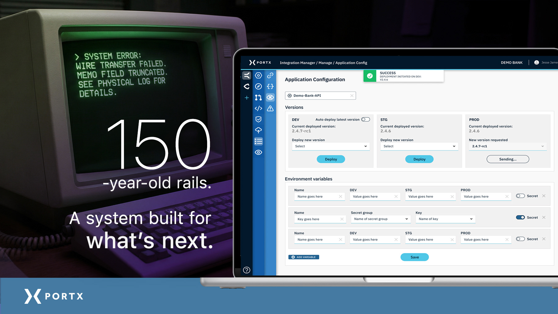
Analysis of legacy banking workflows reveals a “Compliance Friction” problem — a systemic inefficiency where staff are forced to navigate 150-year-old telegraph-era protocols using modern manual hacks. This “Operational Drag” occurs when federal audit requirements for a permanent paper trail outpace the capabilities of aging infrastructure, forcing staff to use $0.00 wire transfers as makeshift chat apps and Word/text docs and sticky notes as regulatory databases.
Analysis of legacy banking workflows reveals a “Compliance Friction” problem — a systemic inefficiency where staff are forced to navigate 150-year-old telegraph-era protocols using modern manual hacks. This “Operational Drag” occurs when federal audit requirements for a permanent paper trail outpace the capabilities of aging infrastructure, forcing staff to use $0.00 wire transfers as makeshift chat apps and Word/text docs and sticky notes as regulatory databases.
The Strategy: Integrated Communication & The QuickNotes Engine
As the Founding UX/UI Designer and acting Experience Architect (XA), I functioned as a “Design Athlete,” architecting a scalable ecosystem that turns legal necessity into a user advantage.
As the Founding UX/UI Designer and acting Experience Architect (XA), I functioned as a “Design Athlete,” architecting a scalable ecosystem that turns legal necessity into a user advantage.
▶ Integrated Messaging (The Audit Trail)
Replacing fragmented external “hacks” with a native, contextual communication layer that “pins” every message to the transaction ID for a permanent, searchable audit trail.
Replacing fragmented external “hacks” with a native, contextual communication layer that “pins” every message to the transaction ID for a permanent, searchable audit trail.
▶ The QuickNotes Engine (80/20 Logic)
Identifying 5–6 routine codes & reasons cover the vast majority of daily wire exceptions and embedding these compliance-approved templates directly into the UI.
Identifying 5–6 routine codes & reasons cover the vast majority of daily wire exceptions and embedding these compliance-approved templates directly into the UI.
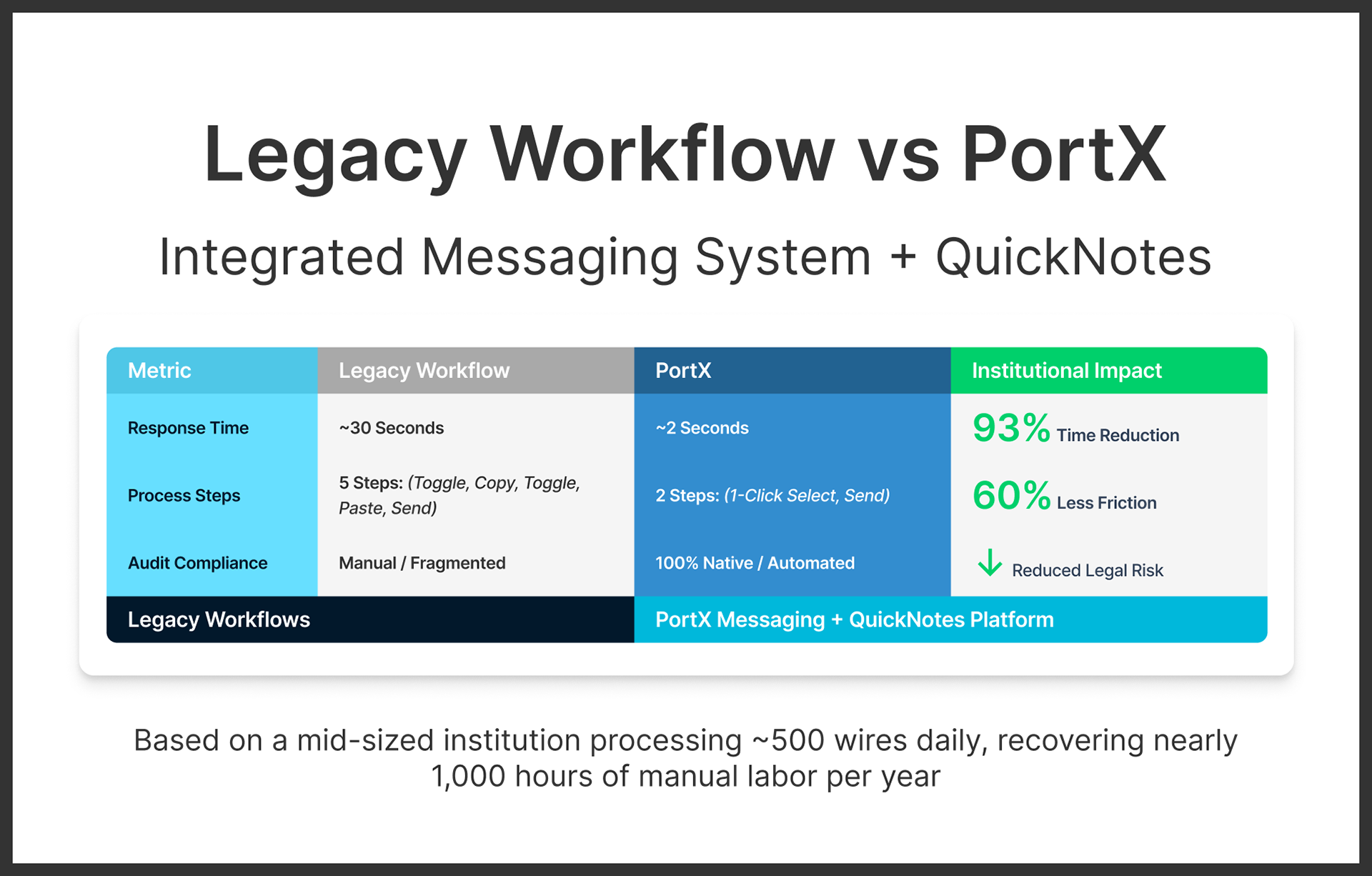
Key Strategy Result: 93% Reduction in Operational Friction
This modernization successfully transformed a high-risk manual chore into a high-velocity automated action. By replacing the “sticky note/Word doc” loop with QuickNotes, I reduced the time-to-decision from 30 seconds to just 2 seconds. Extrapolated across a mid-sized institution, this represents nearly 1,000 hours of manual labor recovered per year, allowing staff to shift from data entry to high-value fraud prevention. By treating the audit trail as the product’s “North Star,” the project established the architectural blueprint for the entire PortX Cloud ecosystem.
Time: 2 Weeks (sprint cycle)
Context: 0-to-1 Fintech Startup
Status: MVP Launched / Global Suite Integration
Role: Founding UX/UI Designer & Experience Architect (XA)
Focus: Product Architecture & Workflow Automation
Core Stack: Figma • Miro • Balsamiq • Jira • Confluence
Project Outcome:
Modernizing Legacy Banking without Compromising Compliance
Modernizing Legacy Banking without Compromising Compliance
For the PortX Cloud platform, I architected an integrated messaging and regulatory template system designed to eliminate the “manual hacks” inherent in 150-year-old banking infrastructure. By moving away from fragmented external workarounds, I developed a Contextual Threading Model that allows bank staff to maintain legally required audit trails while achieving modern operational speed.
The Strategic Impact
▶ Modernizing the Legacy Paper Trail
By replacing archaic $0.00 wire “hacks” with a native, pinned communication layer, we established a defensible, searchable system that ensures 100% regulatory compliance within the transaction record.
By replacing archaic $0.00 wire “hacks” with a native, pinned communication layer, we established a defensible, searchable system that ensures 100% regulatory compliance within the transaction record.
▶ The 80/20 Efficiency Lever
I designed the QuickNotes engine — a regulatory template layer that automates the most frequent exception responses, effectively killing the reliance on external sticky notes and Word/text documents serving as impromptu databases while reducing human error and increasing productivity.
I designed the QuickNotes engine — a regulatory template layer that automates the most frequent exception responses, effectively killing the reliance on external sticky notes and Word/text documents serving as impromptu databases while reducing human error and increasing productivity.
▶ Strategic Velocity (Logic-First Delivery)
By delivering a Logic-First Proof of Concept (POC) in mid-fidelity, I successfully unblocked engineering backend development during a high-pressure, two-week sprint while simultaneously supporting multiple product roadmaps across the PortX Cloud suite.
By delivering a Logic-First Proof of Concept (POC) in mid-fidelity, I successfully unblocked engineering backend development during a high-pressure, two-week sprint while simultaneously supporting multiple product roadmaps across the PortX Cloud suite.
▶ Metric-Driven Operational ROI
The final logic achieved a 93% reduction in manual friction — transforming a 30-second toggle-copy-paste chore into a 2-second automated action. This translates to a projected 1,000 hours of manual labor recovered per year for mid-sized financial institutions.
The final logic achieved a 93% reduction in manual friction — transforming a 30-second toggle-copy-paste chore into a 2-second automated action. This translates to a projected 1,000 hours of manual labor recovered per year for mid-sized financial institutions.
The Result
The result is a robust, compliance-first infrastructure that transforms the “un-sexy” plumbing of banking from a source of institutional fatigue into a modern operational multiplier. This positions PortX as the definitive “Operating System” for the modern, regulated financial world.
The result is a robust, compliance-first infrastructure that transforms the “un-sexy” plumbing of banking from a source of institutional fatigue into a modern operational multiplier. This positions PortX as the definitive “Operating System” for the modern, regulated financial world.

q Read the full story to see how it all came together. q

Intro / Background:
Designing for a System That Never Stops
Designing for a System That Never Stops
There is a massive divide in the financial world. While modern fintechs like Venmo or CashApp offer seamless, instant experiences, they aren’t subject to the same rigorous federal regulations as traditional banks. In the regulated banking world, technology moves slowly because it relies on archaic “telephone line-era” infrastructure that was never designed for modern communication as we now know it today.
Because money moves 24/7/365, banks cannot simply “shut down” for upgrades. Any stoppage would be catastrophic. This creates a high-stakes environment where liability is massive. Hence, every transaction requires a bulletproof, legally defensible Audit Trail.
As the Founding UX/UI Designer, I was brought on as the lead when the company was starting from zero. With no existing designs or guidelines in place, my mission was to architect the visual and functional “DNA” for this entire suite from the ground up.

The PortX Ecosystem:
One Platform, Many Products
One Platform, Many Products
To understand the scope of this project, it is helpful to view their enterprise SaaS flagship PortX Cloud not as a single app, but as a multi-layered ecosystem — functioning much like Microsoft Office 365 does for the enterprise.
My role as the Founding UX/UI Designer required me to architect the foundational design blueprint across three distinct levels of the platform simultaneously. Here is a general overview of the PortX Cloud platform and hierarchy:
▶ The Suite
PortX Cloud is the overarching “Operating System” that connects a bank or credit union’s internal data to the rest of the world.
PortX Cloud is the overarching “Operating System” that connects a bank or credit union’s internal data to the rest of the world.
▶ The Products
Major functional tools within the suite include Payment Manager (for moving money), Integration Manager (for connecting systems), and Data Manager (for data governance).
Major functional tools within the suite include Payment Manager (for moving money), Integration Manager (for connecting systems), and Data Manager (for data governance).
▶ The Modules (or Sub-Products)
Specific, high-stakes tools that live inside each product. My focus for this case study is the Wires module — the first MVP-level tool of the Payment Manager suite.
Specific, high-stakes tools that live inside each product. My focus for this case study is the Wires module — the first MVP-level tool of the Payment Manager suite.

Scope of Ownership:
Defining the System, Not Just the Screens
Defining the System, Not Just the Screens
In a high-stakes, “0-to-1" environment, I functioned as a Design Athlete. While this case study deep-dives into a specific operational breakthrough for wire transfers, my daily responsibilities covered the entire PortX product ecosystem.
▶ Product Strategy
I served as the Lead Designer for all three core product teams: Payment Manager, Integration Manager, and Data Manager.
I served as the Lead Designer for all three core product teams: Payment Manager, Integration Manager, and Data Manager.
▶ Design Systems
I architected the foundational component library and iconography from scratch. This system would eventually allow the company to launch new products or modules within PortX Cloud at speed.
I architected the foundational component library and iconography from scratch. This system would eventually allow the company to launch new products or modules within PortX Cloud at speed.
▶ Cross-Functional Leadership
I operated with high autonomy, working directly with C-level leadership on vision, Engineering on feasibility, and Choice Bank staff for real-world usability testing.
I operated with high autonomy, working directly with C-level leadership on vision, Engineering on feasibility, and Choice Bank staff for real-world usability testing.

Solution Architecture:
The Platform “Design DNA"
The Platform “Design DNA"
Modernizing a 150-year-old infrastructure required more than a new interface. It required a scalable architectural model that could unify three distinct product lines: Integration Manager, Payment Manager, and Data Manager.
As the Experience Architect (XA), I developed a 3-Tier Universal Navigation framework to serve as the platform's “Design DNA". This ensured that the interaction logic established for the Wires MVP could be inherited by every future module.
01. The Ecosystem Logic: The Map
To move from a fragmented experience to a unified suite, I mapped the platform into three logical hierarchies: Families (T1), Modules (T2), and Sub-Modules (T3). This map allowed stakeholders to visualize the full breadth of the PortX Cloud suite.
To move from a fragmented experience to a unified suite, I mapped the platform into three logical hierarchies: Families (T1), Modules (T2), and Sub-Modules (T3). This map allowed stakeholders to visualize the full breadth of the PortX Cloud suite.
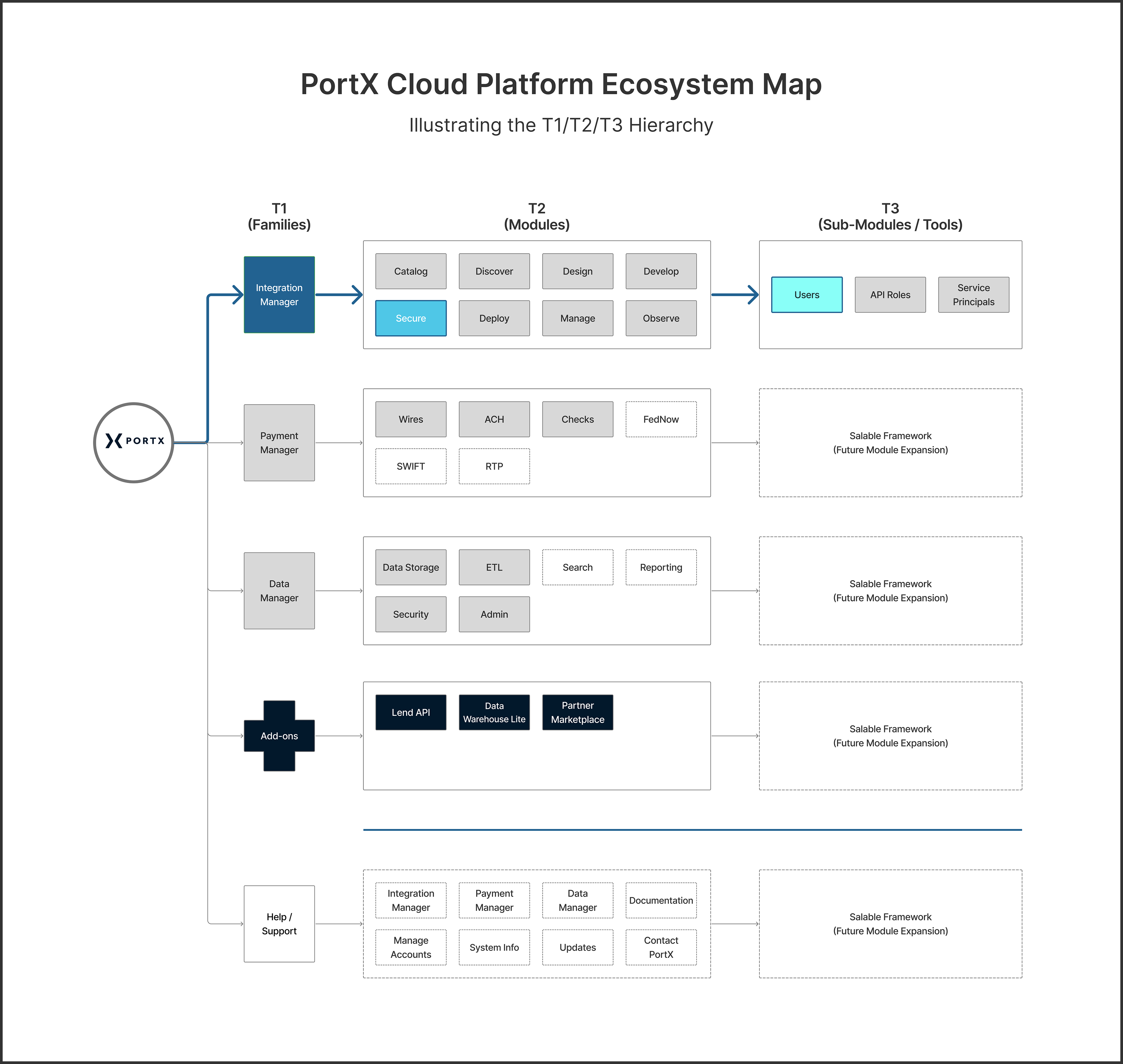
Platform Ecosystem Map
Illustrating the T1/T2/T3 hierarchy. While the Wires MVP initially utilized the first two tiers, the system was architected to support the more complex configuration needs of advanced tools, such as Integration Manager.
Illustrating the T1/T2/T3 hierarchy. While the Wires MVP initially utilized the first two tiers, the system was architected to support the more complex configuration needs of advanced tools, such as Integration Manager.
02. The Navigation Framework: The Execution
The 3-column UI translates this abstract logic into a high-velocity workspace. By showing all tiers at once, we replaced “recall” with “recognition,” allowing users to switch between products without losing their place in the system.
The 3-column UI translates this abstract logic into a high-velocity workspace. By showing all tiers at once, we replaced “recall” with “recognition,” allowing users to switch between products without losing their place in the system.
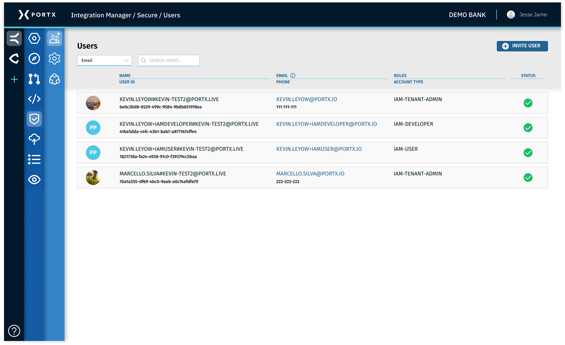
Universal Navigation UI
A high-fidelity view of the Integration Manager utilizing the full 3-tier system. Note the active state indicators in the side menu and the header breadcrumb — a “fail-safe” wayfinding system I implemented to maintain clarity when technical debt delayed dynamic sliding transitions.
A high-fidelity view of the Integration Manager utilizing the full 3-tier system. Note the active state indicators in the side menu and the header breadcrumb — a “fail-safe” wayfinding system I implemented to maintain clarity when technical debt delayed dynamic sliding transitions.

The Proving Ground:
Why Wires Came First
Why Wires Came First
While my role required a high-level view of the entire PortX Cloud suite, Payment Manager led the way. I knew that the success of the platform depended on the performance of its most critical module: Wires.
In the banking world, wire transfers are the “heavy lifters”. They are high-value, time-sensitive, and carry the most significant regulatory risk. If the design system I was building couldn’t solve the deep-seated friction in this high-stakes environment, it wouldn't stand a chance in the rest of the ecosystem. I decided to “zoom in” on the wire transfer workflow to battle-test my theories on efficiency and compliance.
▶ What I found was a system being held together by manual “hacks” or workarounds that were invisible to the technical requirements, but devastating to the bank's operational velocity.

The Problem:
When Workarounds Become the Workflow
When Workarounds Become the Workflow
While the initial technical requirements for Payment Manager/Wires focused on moving data, my role was to observe the human element of the workflow. I quickly realized that bank staff were operating under a level of frustration that a technical document alone couldn't capture.
The legacy process for managing wire transfers was a minefield of manual effort. This wasn't just due to “old software”. It was a result of an archaic infrastructure that hasn’t changed its core logic in over 150 years.
▶ The $0.00 “Chat” Hack (A Telegraph Era Legacy)
Wire transfers were born in the 1870s, moving money via telegraph. In that era, the only way to communicate was through the wire itself. Today, while banks use email and phone calls for other areas of business, federal regulations require a legally defensible “paper trail” that can be connected back to the transaction record within the federal wires platform.
Wire transfers were born in the 1870s, moving money via telegraph. In that era, the only way to communicate was through the wire itself. Today, while banks use email and phone calls for other areas of business, federal regulations require a legally defensible “paper trail” that can be connected back to the transaction record within the federal wires platform.
Because modern email isn’t integrated with legacy banking rails, staff are forced to use the $0.00 wire transfer as a makeshift chat app if they have questions about the original wire. They are literally hacking the financial system to send cryptic notes — all within strict character limits and with zero searchable history.
▶ The “Sticky Note” Database
Every wire approval or rejection required a documented reason for regulatory compliance. Since the legacy system didn’t support templates or automated responses, staff kept “cheat sheets” of phrases on sticky notes or separate Word/text docs. They spent their days in a loop of toggling, copying, and pasting — a mundane task that killed productivity and invited human error and massive fatigue.
Every wire approval or rejection required a documented reason for regulatory compliance. Since the legacy system didn’t support templates or automated responses, staff kept “cheat sheets” of phrases on sticky notes or separate Word/text docs. They spent their days in a loop of toggling, copying, and pasting — a mundane task that killed productivity and invited human error and massive fatigue.

The Challenge:
When the System Depends on Human Glue
When the System Depends on Human Glue
Before PortX, bank operations were a chaotic collage of disparate tools. Staff were forced to manage high-stakes wire approvals by jumping between sticky notes, internal Word or text documents containing regulatory codes, and 40-year-old terminal interfaces that were never designed for modern messaging.
This “Manual Tax” wasn’t just slow — it was a compliance nightmare. Every copy-paste between a Word doc and a $0.00 wire screen was a potential $100M error in the making.
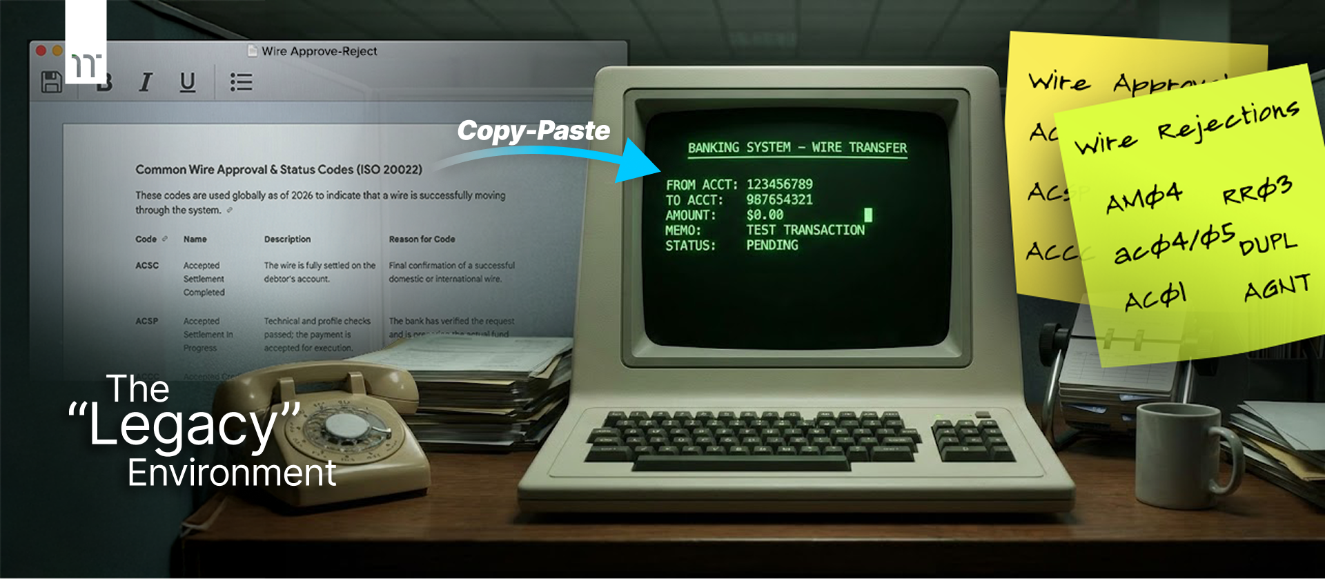
The Fragmented Truth: Navigating Institutional Drag
Bank and credit union operations staff were forced to reconcile high-stakes wire transfers by manually cross-referencing global ISO 20022 codes from static Word documents against 40-year-old terminal interfaces. This “manual tax” — represented by the physical sticky notes used to track rejection codes — was the primary bottleneck I aimed to eliminate.
Bank and credit union operations staff were forced to reconcile high-stakes wire transfers by manually cross-referencing global ISO 20022 codes from static Word documents against 40-year-old terminal interfaces. This “manual tax” — represented by the physical sticky notes used to track rejection codes — was the primary bottleneck I aimed to eliminate.
The Integration Gap:
Why $0.00 Wires Became the Paper Trail
Why $0.00 Wires Became the Paper Trail
It’s a common misconception that banks lack modern communication tools. They use email and instant messaging just like any other business. However, due to archaic infrastructure and rigid federal regulations, these tools are entirely disconnected from the legacy banking rails.
The $0.00 wire “hack” was born out of a necessity for a non-negotiable audit trail. To meet federal compliance, every piece of communication regarding a transaction must be permanently attached to that transaction’s record. Because modern email isn’t integrated with legacy banking systems, staff had to use the $0.00 wire transfer as a “paper trail” that regulators could verify.

The Modernization Gap:
When Consumer Mental Models Hit Institutional Constraints
When Consumer Mental Models Hit Institutional Constraints
As consumers, we take seamless, instant communication for granted. When we send money via Venmo or Zelle, we expect an immediate notification and a clear history. However, the backend of the global financial system wasn’t built for this.
▶ PortX is not just building a UI. They are rebuilding the “plumbing” of banking.
The messaging workarounds I discovered — the $0.00 wires and the sticky notes — might seem trivial in a consumer context. But they represent a systemic failure of legacy technology. In a highly regulated environment where every second counts and every mistake is a legal liability, these “small” frictions cause massive institutional drag.
The Mission: Solving for 1% to Impact 100%
While QuickNotes and the messaging platform were just one part of the broader PortX Cloud suite, they were the “linchpin” for user adoption. By solving this specific, “un-sexy” pain point, I was able to:
While QuickNotes and the messaging platform were just one part of the broader PortX Cloud suite, they were the “linchpin” for user adoption. By solving this specific, “un-sexy” pain point, I was able to:
▶ Prove the Value of the New Rails
Show bank staff that moving to PortX Cloud wasn’t just a technical upgrade, but a direct improvement to their daily quality of life.
Show bank staff that moving to PortX Cloud wasn’t just a technical upgrade, but a direct improvement to their daily quality of life.
▶ Establish the Design Foundation
Use the Payment Manager/Wires MVP to battle-test the component library that would eventually power the entire PortX Cloud ecosystem.
Use the Payment Manager/Wires MVP to battle-test the component library that would eventually power the entire PortX Cloud ecosystem.

Research + Discovery:
Uncovering the Architecture of Workarounds
Uncovering the Architecture of Workarounds
While the technical requirements for the Wires MVP were documented, the operational reality was a “black box.” I approached my research not as a verification of existing requirements, but as an investigation into why modern financial tools were still failing to eliminate manual workarounds.
Phase 01: Benchmarking the Industry (The EWIRE Audit)
I began by analyzing EWIRE — the industry incumbent — to understand prevailing patterns and identify where usability was breaking down despite modern web standards. The goal was not comparison for its own sake, but to identify the specific gaps PortX could improve upon while staying compliant and familiar to bank staff.
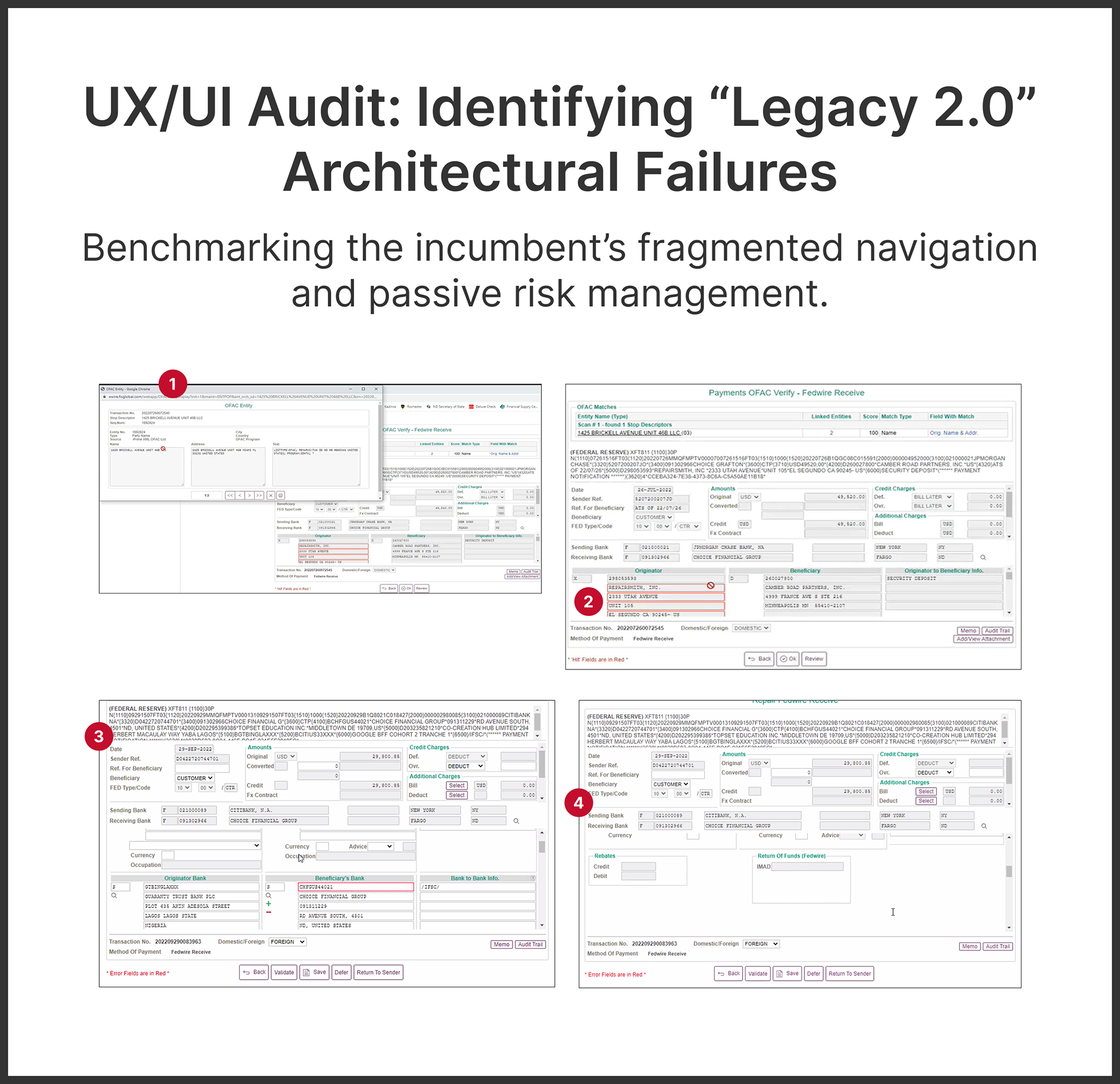
Competitive Audit: Assessing the “Modern” Bar
My audit of EWIRE confirmed that the current market leader was merely “digitizing the mess” rather than re-architecting the process. By benchmarking their architectural failures, I identified that the path to a $1.6B modernization wasn’t just about a “prettier” UI, but about Interaction Consolidation — moving the work out of browser tabs and into a single, high-velocity stream. A few of the specific observations included:
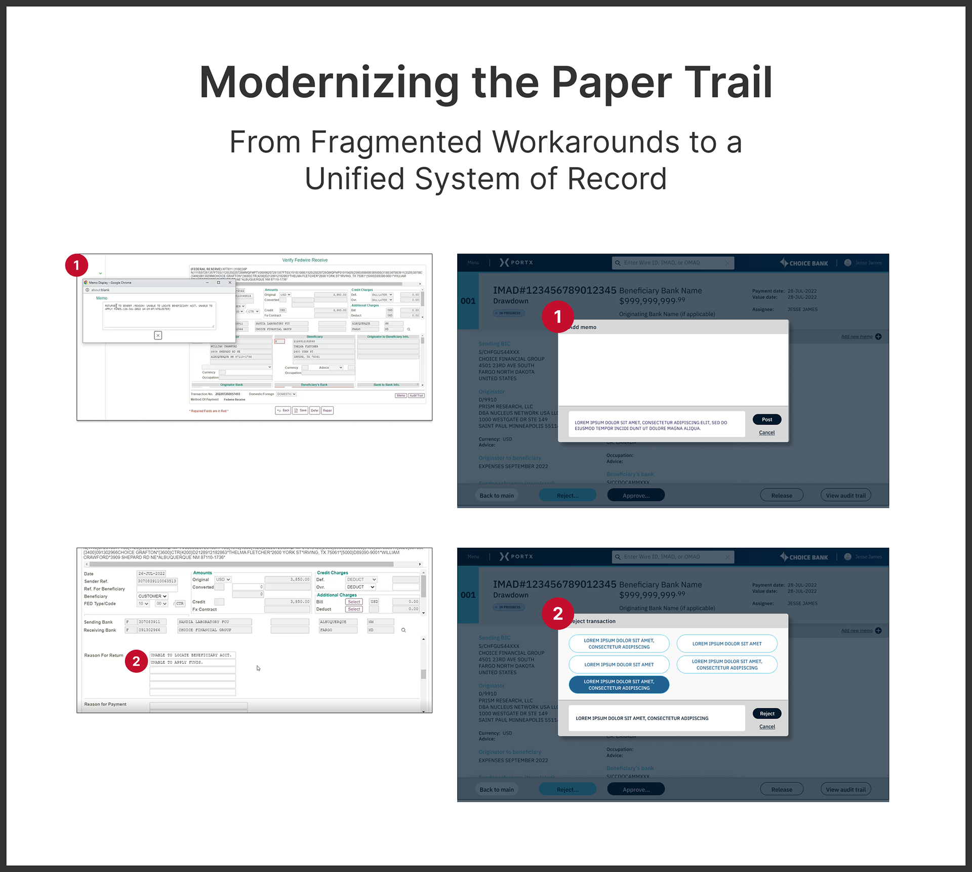
▶ Callout 01: Fragmented State Management
The Audit: Critical messaging logic is offloaded to unmanaged pop-up windows rather than being native to the transaction flow. This forces users to manually manage their own “window architecture,” leading to the high-risk reliance on scrap paper I observed in the field.
The Audit: Critical messaging logic is offloaded to unmanaged pop-up windows rather than being native to the transaction flow. This forces users to manually manage their own “window architecture,” leading to the high-risk reliance on scrap paper I observed in the field.
▶ Callout 02: Passive Error Handling (Risk of “Manual Tax”)
The Audit: Errors are indicated by static red outlines without contextual guidance or automated mapping. In a high-volume environment, this forces the user to “hunt" for failures across hundreds of fields, creating a massive Cognitive Load and leading directly to the use of Word doc “cheat sheets."
The Audit: Errors are indicated by static red outlines without contextual guidance or automated mapping. In a high-volume environment, this forces the user to “hunt" for failures across hundreds of fields, creating a massive Cognitive Load and leading directly to the use of Word doc “cheat sheets."
▶ Callout 03: Lack of Information Scent (The “Information Dump”)
The Audit: There is no visual hierarchy to distinguish between raw Federal Reserve data and actionable user fields. Because every data point has the same visual weight, staff cannot scan for “Audit Red Flags,” resulting in “Wayfinding Fatigue.”
The Audit: There is no visual hierarchy to distinguish between raw Federal Reserve data and actionable user fields. Because every data point has the same visual weight, staff cannot scan for “Audit Red Flags,” resulting in “Wayfinding Fatigue.”
▶ Callout 04: Wayfinding Failure (Unanchored Workflows)
The Audit: During deep-nested configurations, the UI lacks persistent headers or navigational anchors. Users lose their place while scrolling, necessitating the $0.00 “dummy” wire as a manual bookmark to avoid losing progress in a session.
The Audit: During deep-nested configurations, the UI lacks persistent headers or navigational anchors. Users lose their place while scrolling, necessitating the $0.00 “dummy” wire as a manual bookmark to avoid losing progress in a session.
Moving Forward: The “Aha!” Moment
This audit clarified that our opportunity was not to reinvent banking workflows, but to architect a system that was easier to navigate, faster to execute, and less mentally taxing for the people who use it every day. It confirmed that the “Human Glue” I saw on the desks wasn't a choice — it was a reaction to these specific architectural gaps.
This audit clarified that our opportunity was not to reinvent banking workflows, but to architect a system that was easier to navigate, faster to execute, and less mentally taxing for the people who use it every day. It confirmed that the “Human Glue” I saw on the desks wasn't a choice — it was a reaction to these specific architectural gaps.
Phase 02: Synthesis (Uncovering the Human Cost)
It was only after “getting my hands dirty” by cross-referencing these audit findings with live shadowing sessions at Choice Bank that the true Human Cost of Compliance became visible. I realized that the manual “hacks” I observed — the sticky notes and Word docs — weren’t just habits; they were mandatory survival strategies for staff navigating the architectural failures of the incumbent tools.
Observed Behaviors: The “Aha!” Moments
I identified three major friction points that hadn’t been captured in the initial project brief:
I identified three major friction points that hadn’t been captured in the initial project brief:
▶ The “Compliance-First” Word Docs (The Field Gap)
Because EWIRE utilizes multiple single-line text fields for wire rejections, it is physically incapable of hosting the complete, long-form ISO 20022 regulatory codes required for modern compliance. This architectural bottleneck forced staff to maintain external Word documents as their actual “workspace,” copy-pasting code fragments into the UI only at the point of submission.
Because EWIRE utilizes multiple single-line text fields for wire rejections, it is physically incapable of hosting the complete, long-form ISO 20022 regulatory codes required for modern compliance. This architectural bottleneck forced staff to maintain external Word documents as their actual “workspace,” copy-pasting code fragments into the UI only at the point of submission.
▶ The Fragmented Paper Trail (The Pop-up Tax)
I observed users handwriting transaction IDs and rejection codes on scrap paper to reference while they made internal calls or sent emails. This behavior was driven by EWIRE's reliance on modeless pop-up windows to display transaction “Reasons”. Because these windows can be moved or easily hidden behind the main application, users lacked a persistent “System of Record” they could trust to stay visible.
I observed users handwriting transaction IDs and rejection codes on scrap paper to reference while they made internal calls or sent emails. This behavior was driven by EWIRE's reliance on modeless pop-up windows to display transaction “Reasons”. Because these windows can be moved or easily hidden behind the main application, users lacked a persistent “System of Record” they could trust to stay visible.
▶ The Manual “Tax” on High-Volume
Banks process hundreds of wire transfers daily, yet staff were forced to respond with the same 5–6 routine codes & reasons thousands of times per month. This repetitive “toggling and copy-pasting” between the Word doc and the UI was a primary source of staff fatigue, which — in a zero-tolerance environment — is the leading indicator of audit risk and burnout.
Banks process hundreds of wire transfers daily, yet staff were forced to respond with the same 5–6 routine codes & reasons thousands of times per month. This repetitive “toggling and copy-pasting” between the Word doc and the UI was a primary source of staff fatigue, which — in a zero-tolerance environment — is the leading indicator of audit risk and burnout.
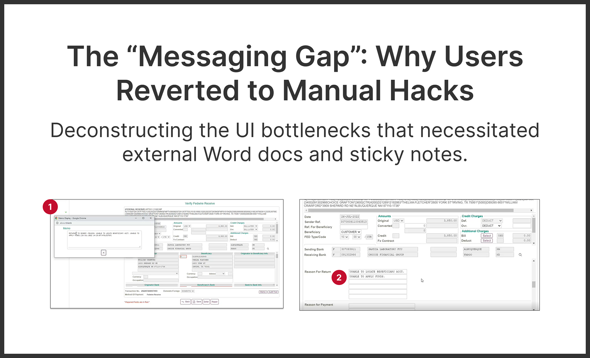
Connecting the Dots: Why the “Human Glue” Existed
My investigation into the EWIRE repair flow revealed the technical root of the staff’s manual workarounds. The incumbent solution utilized fragmented, single-line form fields for wire rejections, which were physically incapable of hosting the complex regulatory phrasing required for modern compliance. Additionally, hiding the rejection logic within transient pop-ups meant that wayfinding was lost the moment a modal was closed.
The Mandate for PortX
We didn’t just need a “Memo” field; we needed a native, persistent System of Record that eliminated the need for external Word docs and scrap paper entirely.
We didn’t just need a “Memo” field; we needed a native, persistent System of Record that eliminated the need for external Word docs and scrap paper entirely.
▶ Callout 01: The Messaging Mirage
The Insight: EWIRE treats transaction "Reasons” as a secondary, modeless pop-up window rather than a native, persistent system of record.
The “Aha!” Moment: Because the “Reason” is launchable only as a disconnected window, it is easily obscured or lost behind the main application. This architectural failure directly explained the handwritten scrap paper. Users were forced to create their own “analog audit trail” because the software lacked a persistent “Why” in the primary interface.
▶ Callout 02: The “Single-Line” Bottleneck
The Insight: EWIRE utilizes multiple single-line text fields for rejection reasons, forcing users to click through multiple inputs just to enter a complete compliance message.
The Insight: EWIRE utilizes multiple single-line text fields for rejection reasons, forcing users to click through multiple inputs just to enter a complete compliance message.
The “Aha!” Moment: This is why the Word or text documents existed. Because the tool’s form fields were too restrictive to handle long-form ISO 20022 regulatory codes, staff had to “chunk” their messages in another app before copy-pasting them piece by piece into EWIRE.

The Pivot:
Competing with the Desk
Competing with the Desk
As I synthesized the “Human Glue” observed at Choice Bank with the fragmented architecture of EWIRE, the project’s mission fundamentally shifted. I realized that delivering a “Wires Feature” would not solve the bank’s problem; as long as the tool remained fragmented, the staff would remain tethered to their sticky notes and Word docs.
The Realization
We weren’t just modernizing a payment rail; we were competing against the physical desk. To succeed, PortX had to become a Unified System of Record that rendered external “hacks” obsolete.
We weren’t just modernizing a payment rail; we were competing against the physical desk. To succeed, PortX had to become a Unified System of Record that rendered external “hacks” obsolete.

Design Strategy:
Preventing Workarounds From Becoming the System
Preventing Workarounds From Becoming the System
“I believe in Athletes, not first basemen.” — Jim Clark, Netscape Co-founder
As the Founding UX/UI Designer, this philosophy was my North Star at PortX — and throughout my career in general. In a high-stakes, 0-to-1 environment, I couldn’t just be a “first baseman” specializing in a single niche. I had to be a Design Athlete: A systems thinker and analyst capable of supporting three distinct product teams under the PortX Cloud enterprise SaaS suite (Payment Manager, Integration Manager, and Data Manager) simultaneously.
▶ To thrive in this multidimensional role and complex multi-product ecosystem, I operationalized my approach through three strategic pillars: Long-term systems vision, agile recalibration for user needs, and proactive cross-functional leadership.
1. Vision Over Pixel-Pushing
While my final deliverables were high-fidelity, PortX didn’t hire me simply to create screens. They hired me for my ability to analyze systems, recognize patterns, and maintain a long-term vision. Ultimately, turning chaos into order is what I do best.
While my final deliverables were high-fidelity, PortX didn’t hire me simply to create screens. They hired me for my ability to analyze systems, recognize patterns, and maintain a long-term vision. Ultimately, turning chaos into order is what I do best.
▶ Supporting the Ecosystem
I operated as the sole designer for three products, which required a high degree of autonomy. I had to ensure that a component built for a Wire transaction today wouldn’t become technical debt for the entire PortX Cloud suite tomorrow.
I operated as the sole designer for three products, which required a high degree of autonomy. I had to ensure that a component built for a Wire transaction today wouldn’t become technical debt for the entire PortX Cloud suite tomorrow.
▶ Building from Zero
I established a scalable component library from scratch. This wasn’t just a UI kit; it was the “DNA” of PortX Cloud. It ensured that future modules like ACH, Checks, and FedNow would inherit a proven, battle-tested framework.
I established a scalable component library from scratch. This wasn’t just a UI kit; it was the “DNA” of PortX Cloud. It ensured that future modules like ACH, Checks, and FedNow would inherit a proven, battle-tested framework.
2. Agile Recalibration: Progress Over Perfection
In a 0-to-1 environment, perfection is the enemy of shipped. My value lay in my ability to pivot and recalibrate when real-world problems threatened to undermine the product's utility.
In a 0-to-1 environment, perfection is the enemy of shipped. My value lay in my ability to pivot and recalibrate when real-world problems threatened to undermine the product's utility.
▶ Proactive Problem Solving
I view my role as an investigator of efficiency, identifying and addressing critical gaps that may not have been captured in the initial project scope. For example, during this project, my discovery of the “Sticky Note” workflow led me to propose QuickNotes — an unbriefed but essential layer that solved for human behavior rather than just technical requirements.
I view my role as an investigator of efficiency, identifying and addressing critical gaps that may not have been captured in the initial project scope. For example, during this project, my discovery of the “Sticky Note” workflow led me to propose QuickNotes — an unbriefed but essential layer that solved for human behavior rather than just technical requirements.
▶ Strategic Efficiency
I focused on “the plumbing” of the design. My strategy was about planning for scale while remaining nimble enough to execute a two-week engineering sprint.
I focused on “the plumbing” of the design. My strategy was about planning for scale while remaining nimble enough to execute a two-week engineering sprint.
3. Self-Directed & Cross-Functional Collaboration
While the bulk of my execution was autonomous, I functioned as the connective tissue between every department. I moved independently, but never in a vacuum.
While the bulk of my execution was autonomous, I functioned as the connective tissue between every department. I moved independently, but never in a vacuum.
▶ Stakeholder Alignment
I maintained a constant feedback loop with a broad range of stakeholders — syncing with Engineering for feasibility, PMs for requirements, and C-level leadership for long-term vision and product alignment.
I maintained a constant feedback loop with a broad range of stakeholders — syncing with Engineering for feasibility, PMs for requirements, and C-level leadership for long-term vision and product alignment.
▶ User & Market Feedback
I worked directly with bank staff at Choice Bank for usability testing and partnered with the Sales team to translate customer pain points into design refinements.
I worked directly with bank staff at Choice Bank for usability testing and partnered with the Sales team to translate customer pain points into design refinements.
Operating as a Design Athlete within the PortX ecosystem meant translating these high-level pillars into a surgical, project-specific framework designed to solve the “Human Glue” problem once and for all.
The Wires MVP Mandate: Design Principles That Replaced Human Glue
To move from “Human Glue” to a unified system of record, I established three design principles that governed the final solution:
▶ Principle 01: Native Persistence (The “Scrap Paper” Killer)
The Strategy: Eliminate fragmented, modeless pop-up windows. Every piece of compliance data must be native to the primary view to ensure a persistent audit trail.
The Strategy: Eliminate fragmented, modeless pop-up windows. Every piece of compliance data must be native to the primary view to ensure a persistent audit trail.
▶ Principle 02: Integrated Logic (QuickNotes & The 80/20 Rule)
The Strategy: I proposed QuickNotes — a pre-filled response layer surfaced directly inside the interface. My research showed that 5–6 specific codes & reasons covered the vast majority of daily wire exceptions. By automating these, we transformed a 30-second manual chore into a 2-second action, drastically reducing human error.
The Strategy: I proposed QuickNotes — a pre-filled response layer surfaced directly inside the interface. My research showed that 5–6 specific codes & reasons covered the vast majority of daily wire exceptions. By automating these, we transformed a 30-second manual chore into a 2-second action, drastically reducing human error.
▶ Principle 03: Surgical Scannability
The Strategy: Create a clear visual hierarchy between “System Data” and “Actionable Data.” Staff must be able to scan for audit red flags in seconds, not minutes.
The Strategy: Create a clear visual hierarchy between “System Data” and “Actionable Data.” Staff must be able to scan for audit red flags in seconds, not minutes.

Strategic Delivery:
Proving the Logic Before the UI
Proving the Logic Before the UI
In a high-velocity, two-week sprint, I operationalized my approach by delivering High-Fidelity Logic in a Mid-Fidelity Visual format. As the sole designer supporting three product teams simultaneously (Payment Manager, Integration Manager, and Data Manager), I made the executive decision to prioritize functional “de-risking" over aesthetic polish for this Proof of Concept.
1. Optimizing for Functional Velocity
My primary mission in this sprint was to validate the 30s-to-2s efficiency gain and the compliance-required Audit Trail logic before the engineers touched a single line of code. By using mid-fidelity wireframes, I ensured that every stakeholder meeting — from C-level vision alignment to engineering feasibility pairing — stayed focused on the high-stakes “plumbing” of the transaction.
My primary mission in this sprint was to validate the 30s-to-2s efficiency gain and the compliance-required Audit Trail logic before the engineers touched a single line of code. By using mid-fidelity wireframes, I ensured that every stakeholder meeting — from C-level vision alignment to engineering feasibility pairing — stayed focused on the high-stakes “plumbing” of the transaction.
2. Codifying the "Design DNA" in Real-Time
At this early stage, the PortX Cloud Design System was in its infancy. I used the overall Payment Manager/Wires MVP as a laboratory to define the system’s first core primitives, i.e., the layouts, typography, and interaction patterns. Along with the Integration Manager MVP, this would eventually power 90% of the entire suite. I provided Engineering with a behavioral blueprint that allowed them to build the backend infrastructure immediately, while we refined the visual language in tandem.
At this early stage, the PortX Cloud Design System was in its infancy. I used the overall Payment Manager/Wires MVP as a laboratory to define the system’s first core primitives, i.e., the layouts, typography, and interaction patterns. Along with the Integration Manager MVP, this would eventually power 90% of the entire suite. I provided Engineering with a behavioral blueprint that allowed them to build the backend infrastructure immediately, while we refined the visual language in tandem.
3. Resource ROI
Investing in high-fidelity visuals for an MVP that was specifically intended for early adoption and rapid iteration at Choice Bank would have been a poor allocation of startup resources. Delivering a high-logic POC allowed me to hit the Wires deadline while remaining nimble enough to continue driving the roadmap for Integration Manager (and Data Manager).
Investing in high-fidelity visuals for an MVP that was specifically intended for early adoption and rapid iteration at Choice Bank would have been a poor allocation of startup resources. Delivering a high-logic POC allowed me to hit the Wires deadline while remaining nimble enough to continue driving the roadmap for Integration Manager (and Data Manager).
The Solution:
Replacing the Desk with a Unified System of Record
Replacing the Desk with a Unified System of Record
The final PortX Wires MVP is the direct architectural answer to the “Human Glue” found in the field. By moving away from the fragmented pop-ups and dense “data dumps” of the incumbent, I designed a unified interface that keeps the audit trail, transaction details, and compliance communication in a single, persistent view. This solution finally won the “competition with the desk” by providing a digital workspace more efficient than any analog hack.
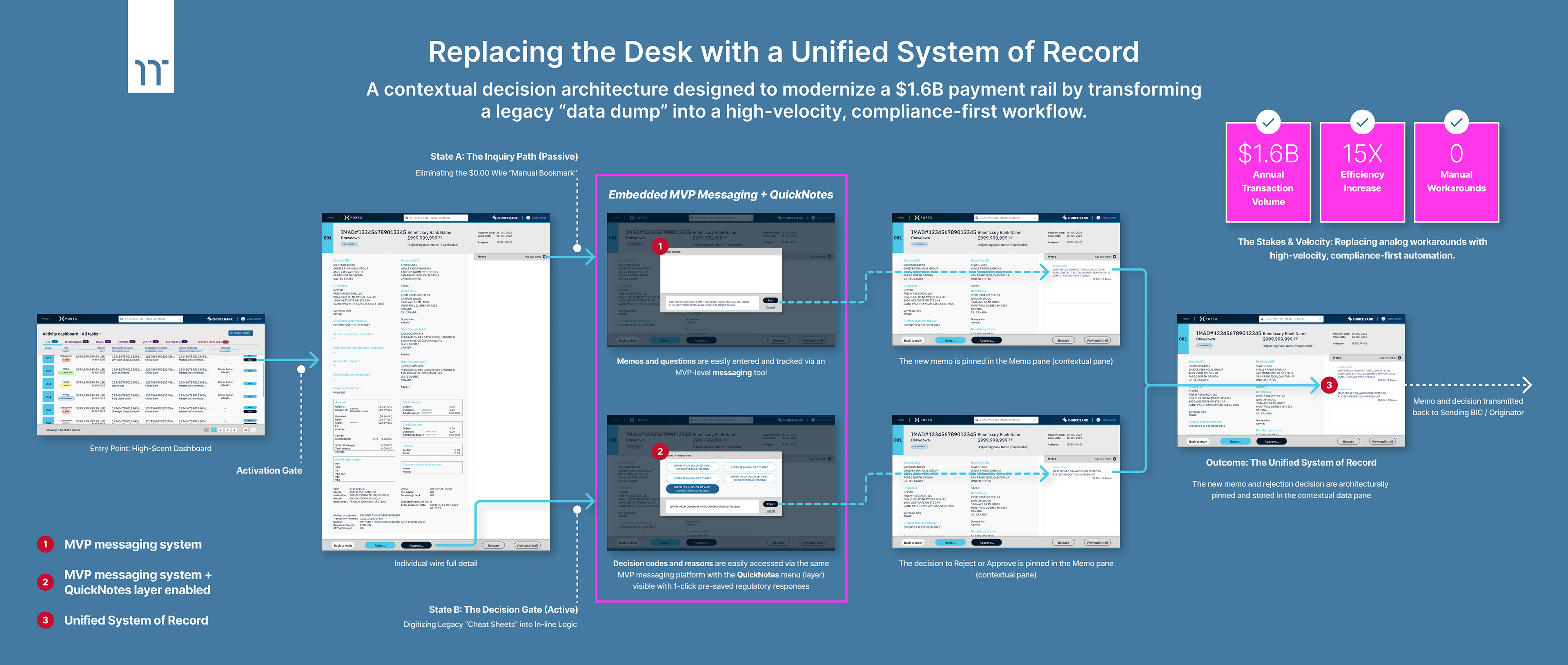
Key Architectural Wins
▶ Native Persistence in Action
By utilizing a dedicated third column for messaging and history, we ensured that the “Why” behind a transaction is never hidden behind a window or lost in a modal. This eliminated the need for scrap paper "analog bookmarks" entirely.
▶ QuickNotes Implementation
I integrated the 80/20 Rule directly into the communication stream. With one click, staff can now trigger compliance-approved response codes, fulfilling the “Integrated Logic” mandate and reducing the manual copy-paste chore from 30 seconds to under 2 seconds.
I integrated the 80/20 Rule directly into the communication stream. With one click, staff can now trigger compliance-approved response codes, fulfilling the “Integrated Logic” mandate and reducing the manual copy-paste chore from 30 seconds to under 2 seconds.
▶ High-Scent Navigation
The T1/T2/T3 Navigation framework provides the “Information Scent” that was missing in legacy tools. It allows users to maintain context as they drill down from a global fleet view into a specific wire detail, preventing the “Wayfinding Fatigue” that previously led to operational risk.
The T1/T2/T3 Navigation framework provides the “Information Scent” that was missing in legacy tools. It allows users to maintain context as they drill down from a global fleet view into a specific wire detail, preventing the “Wayfinding Fatigue” that previously led to operational risk.
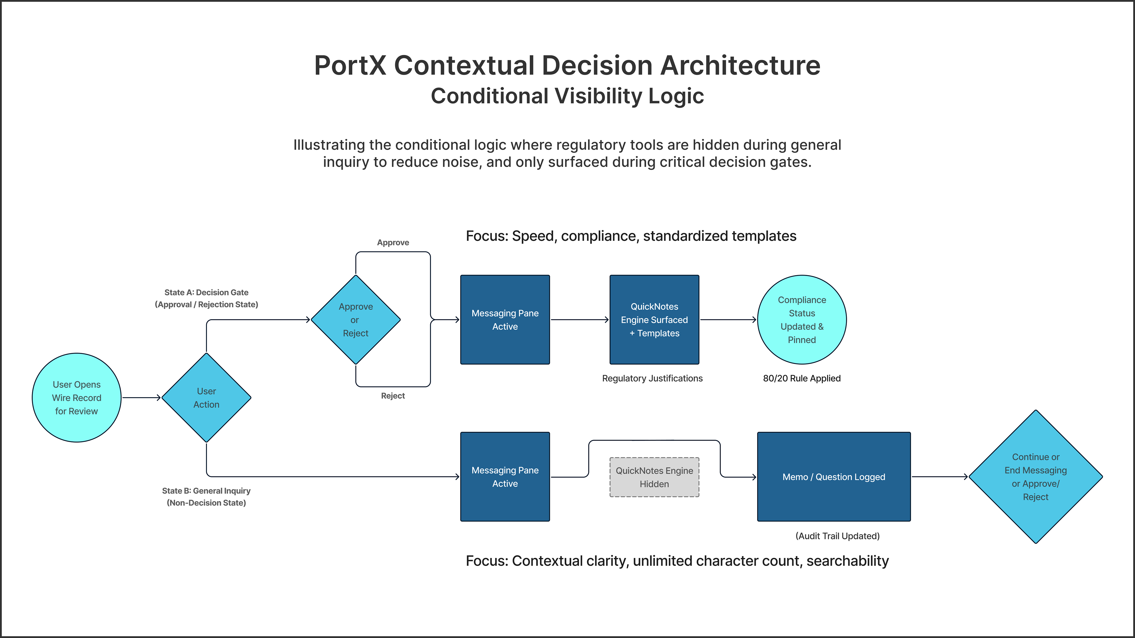
State-Aware Interface Logic: Reducing Cognitive Load
In a high-stakes compliance environment, presenting too many tools simultaneously increases cognitive load and the risk of user error. As the Experience Architect, I determined that the QuickNotes engine should not be a permanent fixture on the screen, but rather a contextual utility that responds to the user's intent.
I designed a two-state architectural model to govern when the regulatory templates are injected into the workflow:
▶ State A: The Inquiry Path (Low Noise)
When a user is simply reviewing wire details or asking a general question, the QuickNotes engine remains hidden. This keeps the interface usable for message threading and data verification.
When a user is simply reviewing wire details or asking a general question, the QuickNotes engine remains hidden. This keeps the interface usable for message threading and data verification.
▶ State B: The Decision Gate (High Compliance)
The moment a trigger action occurs — specifically clicking “Approve” or “Reject” — the system recognizes a compliance requirement. Only then does the QuickNotes menu surface, presenting the approved regulatory templates exactly when they are needed to justify the movement of funds.
The moment a trigger action occurs — specifically clicking “Approve” or “Reject” — the system recognizes a compliance requirement. Only then does the QuickNotes menu surface, presenting the approved regulatory templates exactly when they are needed to justify the movement of funds.

The Implementation:
Making Workflows First-Class
Making Workflows First-Class
Translating this architectural vision into a functional tool required a surgical focus on the two primary friction points identified in the field: The “black hole” of fragmented communication and the high-velocity repetitive manual entry.
1. Integrated Messaging: Killing the $0.00 Wire Chat
The first step was to build a native messaging platform that replaced the need for external, unintegrated “hacks.” This wasn’t just a “chat box;” it was a Compliance-First Audit Trail.
The first step was to build a native messaging platform that replaced the need for external, unintegrated “hacks.” This wasn’t just a “chat box;” it was a Compliance-First Audit Trail.
▶ Contextual Threading
Every message is permanently “pinned” to the specific wire transfer ID. This effectively killed the $0.00 wire hack by providing a legally defensible paper trail that stays with the data forever. Unlike the legacy rails, this system removes the rigid constraints of the past:
Every message is permanently “pinned” to the specific wire transfer ID. This effectively killed the $0.00 wire hack by providing a legally defensible paper trail that stays with the data forever. Unlike the legacy rails, this system removes the rigid constraints of the past:
▶ Closing the Communication Loop
Staff can now collaborate or query compliance officers directly within the transaction details view, keeping all individual wire transaction communication threaded inside the system.
Staff can now collaborate or query compliance officers directly within the transaction details view, keeping all individual wire transaction communication threaded inside the system.
▶ Unlimited Character Limits
By moving off the legacy federal messaging rails, I eliminated the need for cryptic shorthand and abbreviations. Staff can now communicate with the precision and clarity required for high-stakes financial decisions.
By moving off the legacy federal messaging rails, I eliminated the need for cryptic shorthand and abbreviations. Staff can now communicate with the precision and clarity required for high-stakes financial decisions.
▶ Global Searchability
Communication is no longer a “black hole.” Every note and memo is fully searchable, allowing compliance officers to audit months of history in seconds rather than manual hours.
Communication is no longer a “black hole.” Every note and memo is fully searchable, allowing compliance officers to audit months of history in seconds rather than manual hours.
2. QuickNotes: Killing the “Sticky Note” Workflow
The second — and more impactful — layer was QuickNotes, an efficiency tool designed to automate repetitive regulatory responses.
The second — and more impactful — layer was QuickNotes, an efficiency tool designed to automate repetitive regulatory responses.
▶ One-Click Regulatory Responses
Based on my discovery that 5–6 routine codes & reasons covered the vast majority of wire exceptions, I built a “one-click” menu of pre-approved responses (e.g., “Incomplete Beneficiary Info”).
Based on my discovery that 5–6 routine codes & reasons covered the vast majority of wire exceptions, I built a “one-click” menu of pre-approved responses (e.g., “Incomplete Beneficiary Info”).
▶ Eliminating the “Copy-Paste” Loop
By embedding these compliance-approved phrases directly into the UI, I removed the need for staff to toggle out to external Word docs or sticky notes. This reduced a 30-second manual copy-paste task into a 2-second automated action.
By embedding these compliance-approved phrases directly into the UI, I removed the need for staff to toggle out to external Word docs or sticky notes. This reduced a 30-second manual copy-paste task into a 2-second automated action.

Architecting for Complex State Logic
Handling the high-stakes exceptions that define the Wires lifecycle.
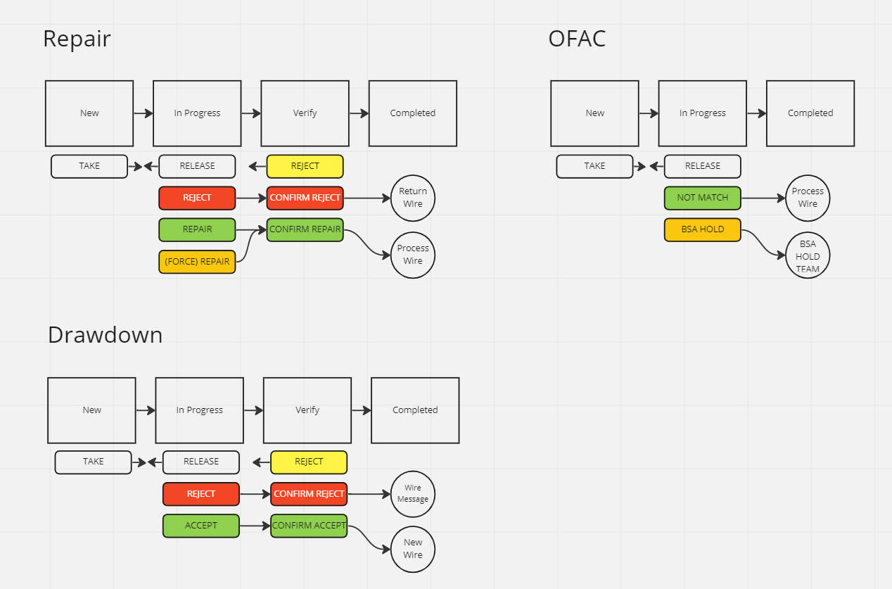
Technical State Mapping
Illustrating the conditional logic for the three most critical “stoppage” points within the Wires MVP.
Illustrating the conditional logic for the three most critical “stoppage” points within the Wires MVP.
Patterns Across Different Payment States
The Wires MVP was more than a standard transaction flow; it had to account for the high-risk exceptions — Repairs, Drawdowns, and OFAC — that occur when a payment is interrupted. Each of these states carries unique regulatory constraints and decision-making stress. My goal as the Experience Architect was to design decision paths that remained clear and consistent, ensuring that bank staff could navigate these “stoppage points” without increasing cognitive load or operational risk.
▶ Repairs
Triggered by input errors (like incorrect account numbers), these interrupt a wire mid-stream. My logic provided guided correction without forcing the user to lose the transaction context.
Triggered by input errors (like incorrect account numbers), these interrupt a wire mid-stream. My logic provided guided correction without forcing the user to lose the transaction context.
▶ OFAC
These represent critical compliance holds that often confuse. I architected precise, transparent messaging to explain exactly why a wire was flagged and what documentation was required to release it.
These represent critical compliance holds that often confuse. I architected precise, transparent messaging to explain exactly why a wire was flagged and what documentation was required to release it.
▶ Drawdowns
These are recipient-initiated transactions that rely on high visibility and clean confirmation before funds are moved. The logic focused on ensuring trust and explicit verification.
These are recipient-initiated transactions that rely on high visibility and clean confirmation before funds are moved. The logic focused on ensuring trust and explicit verification.
A Shared Interaction Language
These complex states reinforced the need for a unified action model within the Wires module. By establishing a shared “Design DNA,” I ensured that status changes, permissions, and recovery paths behaved identically, regardless of the underlying exception.
▶ Consistent Action Placement
I anchored critical decision buttons in the same UI location across all states to reduce wayfinding fatigue.
I anchored critical decision buttons in the same UI location across all states to reduce wayfinding fatigue.
▶ Clear State Transitions
Every transition from “Review” to a potentially “Irreversible Action” was governed by explicit confirmation steps.
Every transition from “Review” to a potentially “Irreversible Action” was governed by explicit confirmation steps.
▶ Precision Messaging
Balancing the rigid requirements of regulatory phrasing with human-centered clarity.
Balancing the rigid requirements of regulatory phrasing with human-centered clarity.
The Result: A robust interaction system that treats complex exceptions as a normal part of bank operations rather than a breakdown in the experience.

Impact + Results:
Turning Manual Work into Measurable ROI
Turning Manual Work into Measurable ROI
The Wires MVP validated that human-centric architecture is a powerful driver of operational ROI. By replacing manual workarounds with a native messaging layer and the QuickNotes engine, we successfully shifted the institutional workflow from a series of “manual hacks” to a high-velocity system of record.
1. The ROI of Efficiency (Forecasted Impact)
Based on industry standards and discovery shadowing, I calculated the efficiency gains of moving from a legacy manual workflow (sticky notes and Word docs) to the PortX integrated system.
Based on industry standards and discovery shadowing, I calculated the efficiency gains of moving from a legacy manual workflow (sticky notes and Word docs) to the PortX integrated system.
The Operational Multiplier
While a typical mid-sized regional bank handles roughly 500–1,000 wires per day, even a conservative volume shows significant returns when extrapolated across a fiscal year:
While a typical mid-sized regional bank handles roughly 500–1,000 wires per day, even a conservative volume shows significant returns when extrapolated across a fiscal year:
▶ Daily Savings
By saving ~28 seconds per wire, an institution processing 500 wires saves ~3.9 hours of manual labor every single day.
By saving ~28 seconds per wire, an institution processing 500 wires saves ~3.9 hours of manual labor every single day.
▶ Annual Impact
This equates to nearly 1,000 hours of manual labor entry recovered per year, per institution, allowing staff to shift focus from mundane “copy-pasting” to high-value fraud prevention and liquidity management.
This equates to nearly 1,000 hours of manual labor entry recovered per year, per institution, allowing staff to shift focus from mundane “copy-pasting” to high-value fraud prevention and liquidity management.
2. Reducing “Compliance Fatigue”
The QuickNotes feature solved more than just speed. It solved the “fear of error” that plagued bank staff.
The QuickNotes feature solved more than just speed. It solved the “fear of error” that plagued bank staff.
▶ Standardized Precision
By embedding compliance-approved responses directly in the UI, we eliminated the risk of “mis-typed” reasons that could lead to federal audit failures.
By embedding compliance-approved responses directly in the UI, we eliminated the risk of “mis-typed” reasons that could lead to federal audit failures.
▶ A Defensible Paper Trail
Communication is now permanently “pinned” to the transaction ID, creating a searchable history that successfully killed the $0.00 wire “chat” hack.
Communication is now permanently “pinned” to the transaction ID, creating a searchable history that successfully killed the $0.00 wire “chat” hack.
3. Eliminating “Information Decay”
This system brings the “quality of life” improvements that transform a compliance tool into a modern productivity engine.
This system brings the “quality of life” improvements that transform a compliance tool into a modern productivity engine.
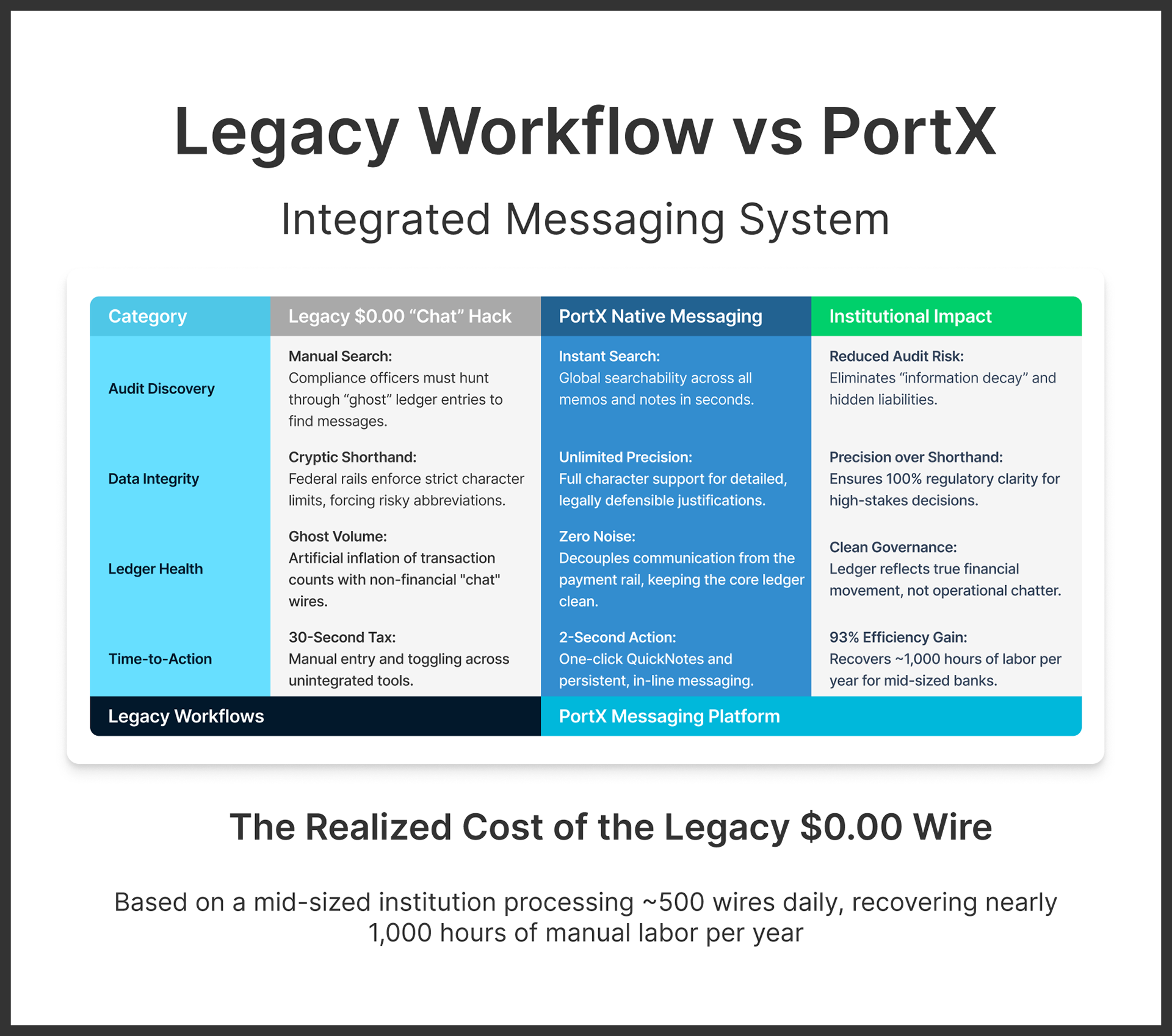
▶ Precision over Shorthand
By removing character limits, we reduced “follow-up friction” — the need for a second phone call or email to clarify a cryptic $0.00 wire memo.
By removing character limits, we reduced “follow-up friction” — the need for a second phone call or email to clarify a cryptic $0.00 wire memo.
▶ Instant Audit Readiness
The searchable nature of the platform transformed the “Sticky Note/Word Doc Database” and fragmented paper trails into a centralized digital asset. This drastically reduces the time and stress associated with federal audits, turning a manual “search and find” mission into a one-click operation.
The searchable nature of the platform transformed the “Sticky Note/Word Doc Database” and fragmented paper trails into a centralized digital asset. This drastically reduces the time and stress associated with federal audits, turning a manual “search and find” mission into a one-click operation.
While the data-driven ROI confirms the efficiency gains, the true shift in operational mindset is best understood by visualizing the contrast between the legacy “data dump” and the new system of record.

Modernizing the Institutional Paper Trail:
Incumbent vs. PortX
Incumbent vs. PortX
By benchmarking the market leader (EWIRE) against our new architecture, we can see exactly how the “Human Glue” of sticky notes and scrap paper was rendered obsolete through intentional, logic-first design.
Callout 1: Communication Architecture (Incumbent vs. PortX)
▶ The Legacy Failure (EWIRE) Fragmented State — Critical communication was offloaded to disconnected, unsearchable pop-up windows, necessitating manual “scrap paper” workarounds.
▶ The XA Solution (PortX): Native Persistence — Establishing a unified system of record by pinning contextual communication directly to the transaction ID for a permanent, searchable audit trail.
Callout 2: Operational Efficiency (Incumbent vs. PortX)
▶ The Legacy Failure (EWIRE) Single-Line Bottleneck — UI constraints rendered the system physically incapable of hosting complete regulatory codes, forcing staff into a loop of external copy-pasting.
▶ The XA Solution (PortX): Integrated Logic — Digitizing legacy “cheat sheets” into a 2-second QuickNotes action, eliminating manual fatigue and reducing time-to-decision by 93%.

Reflections + Future Vision:
Designing for What Comes After MVP
Designing for What Comes After MVP
My involvement concluded around the MVP launch of Payment Manager and Integration Manager as the company navigated a transition toward enterprise-wide cost-cutting and automated, AI-driven operations. However, the early adoption and feedback from Choice Bank confirmed that the messaging system and QuickNotes provided immediate, tangible value.
What I Would Refine Next
As the Founding UX/UI Designer, I viewed the MVP as the start of the conversation, not the end. In this specific Wires messaging example, if the work had continued into the next phase, my roadmap for refinement would have focused on reducing interaction cost:
▶ Continuous Conversation Flow
I would move the chat input out of the modal and anchor it directly to the message pane. This would ensure continuity and allow users to reference transaction data without visual interruption.
I would move the chat input out of the modal and anchor it directly to the message pane. This would ensure continuity and allow users to reference transaction data without visual interruption.
▶ Dynamic QuickNotes Management
I planned to allow users to create, edit, and categorize their own QuickNotes directly within the interface — moving from a static list to a personalized productivity engine.
I planned to allow users to create, edit, and categorize their own QuickNotes directly within the interface — moving from a static list to a personalized productivity engine.
▶ Inline Affordances
Supporting inline edits through simple affordances (like hover-states or edit icons) would allow for rapid adjustments without breaking the user's flow during high-volume periods.
Supporting inline edits through simple affordances (like hover-states or edit icons) would allow for rapid adjustments without breaking the user's flow during high-volume periods.
The Founding Legacy
Beyond these specific UI refinements, I am most proud of the scalable foundation I left behind. By architecting a robust component library and visual language for Wires (and others), I provided PortX with the “Design DNA” needed to rapidly stand up the future products, modules, and tools within the PortX Cloud ecosystem.
The system was designed with this evolution in mind — balancing the immediate need for speed with the long-term requirement for enterprise-grade scalability.
▶ If you’re starting to build from zero, let’s talk about setting your foundation.