
Executive Summary:
When Persistence Becomes a Revenue Lever
Design Systems Lead | Fintech | Conversion Optimization | Experience Architecture | Systems Thinking
When Persistence Becomes a Revenue Lever
Design Systems Lead | Fintech | Conversion Optimization | Experience Architecture | Systems Thinking
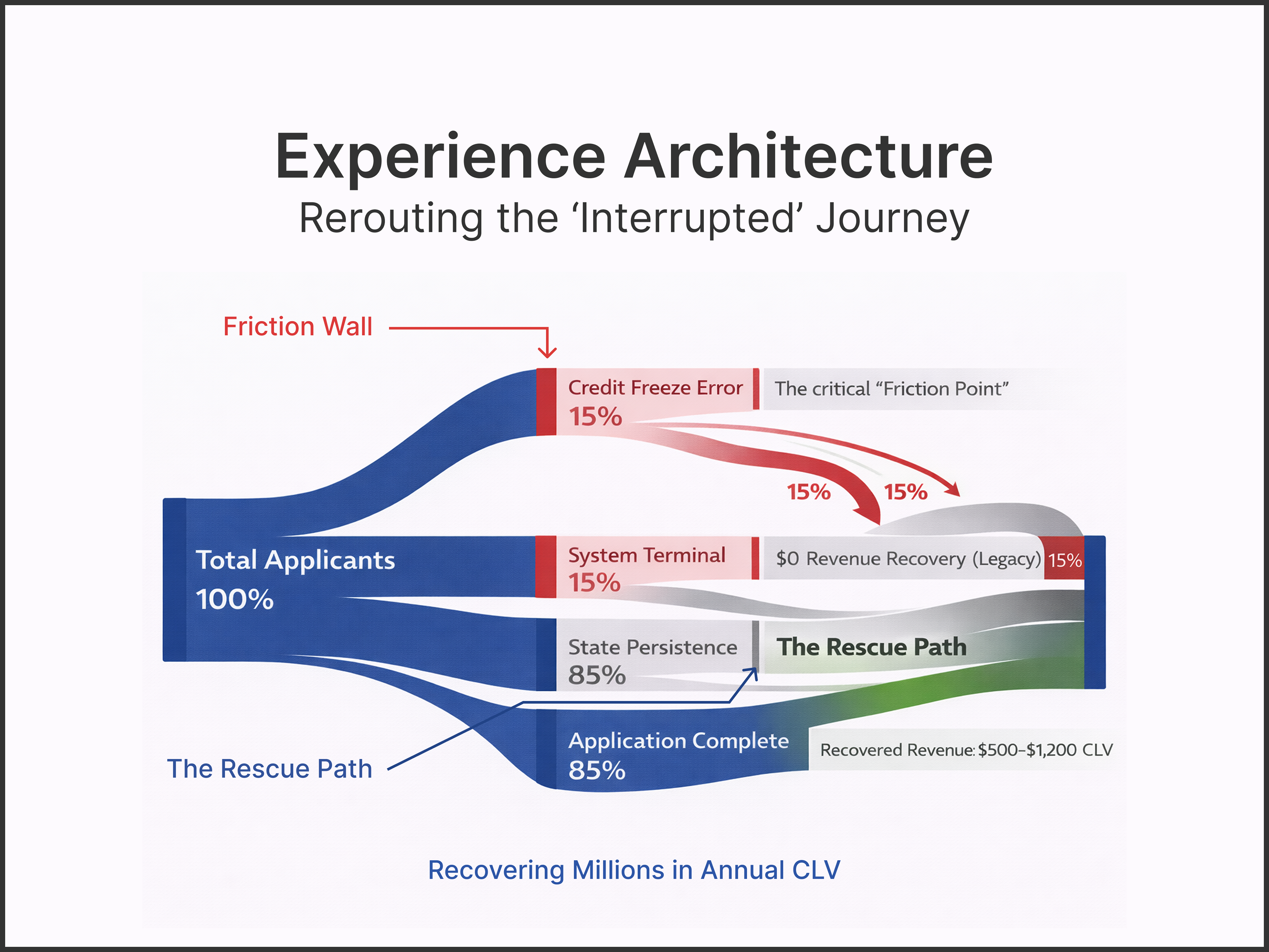
The Challenge: The “Interrupted Application” Revenue Leak
Analysis of legacy financial flows reveals a “Stateless Session” problem — a technical dead-end where a single friction point (specifically a Credit Freeze) results in absolute abandonment. This “Friction Wall” occurs when the system lacks the persistence to save user progress during a multi-day resolution window, forcing users to restart and risking redundant, harmful hard credit checks.
The Strategy: Resilient State Architecture & Guided Recovery
As the Acting Experience Architect (XA) and Lead Designer, I orchestrated a “Pause & Resume” logic designed to navigate complex regulatory and technical hurdles.
As the Acting Experience Architect (XA) and Lead Designer, I orchestrated a “Pause & Resume” logic designed to navigate complex regulatory and technical hurdles.
▶ The React Cloud Apply (RCA) Integration
Leveraging the RCA platform to build a foundation of security, stability, and state-persistence.
Leveraging the RCA platform to build a foundation of security, stability, and state-persistence.
▶ Contextual Re-Entry
A recovery path that identifies returning users, verifies identity via SMS 2FA, and restores their specific application state without data loss.
A recovery path that identifies returning users, verifies identity via SMS 2FA, and restores their specific application state without data loss.
▶ Anxiety Reduction (Visual De-escalation)
Challenging and modifying the Shield Design System to replace high-stress “Red Alert” patterns with neutral, action-oriented guidance to lower user heart rates.
Challenging and modifying the Shield Design System to replace high-stress “Red Alert” patterns with neutral, action-oriented guidance to lower user heart rates.
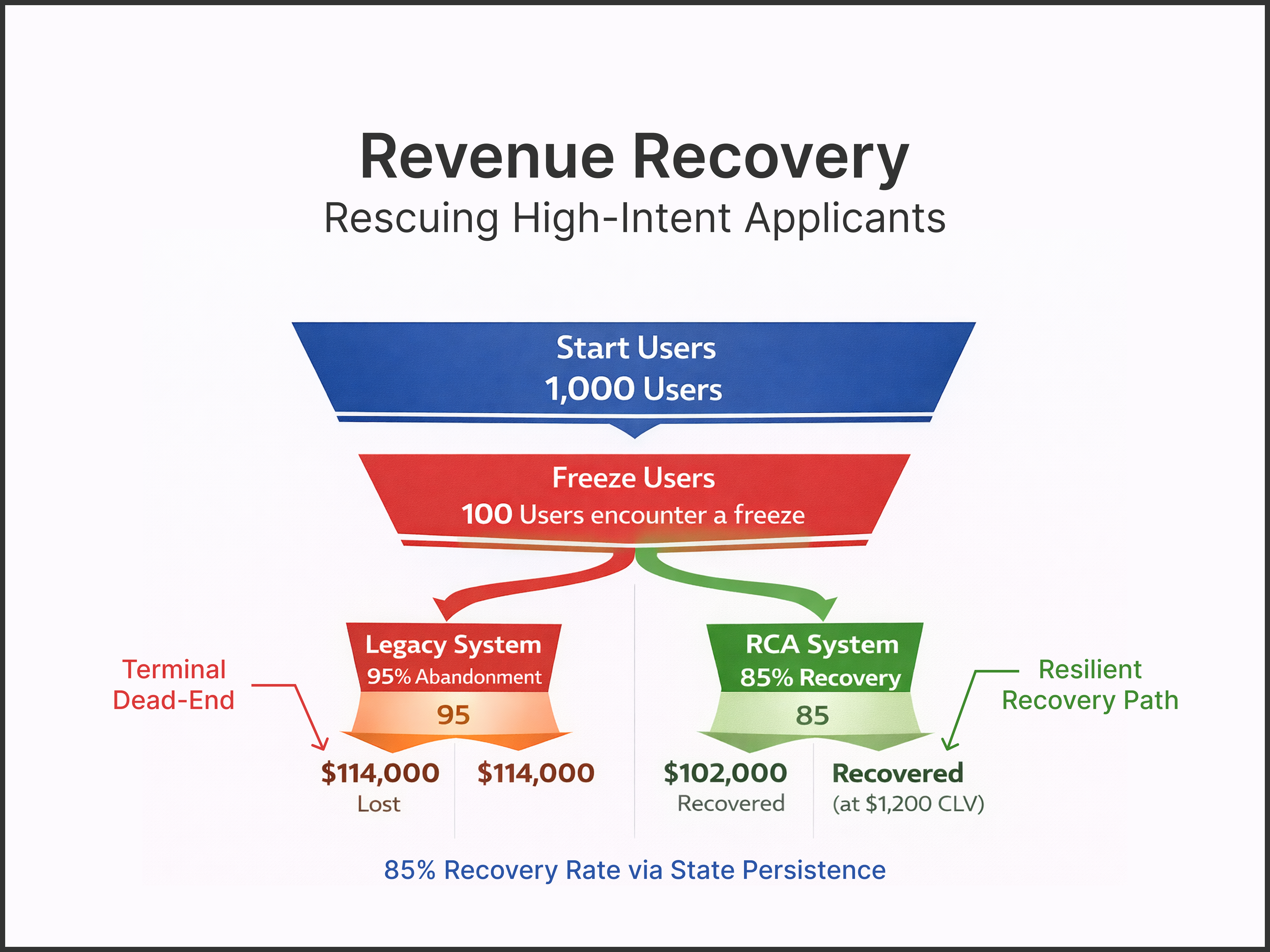
Key Strategy Result: Multi-Million Dollar Revenue Recovery
This optimization successfully rerouted the “Frozen Credit” edge case from a terminal dead-end into a resilient recovery path. Post-design validation indicated an 85% intent to resubmit, effectively plugging a multi-million dollar revenue leak within U.S. Bank’s $1.63B credit card engine. By treating the “unhappy path” as a revenue opportunity, the project established a new benchmark for customer retention in the lending group.
Time: 8 Months
Context: Enterprise Product Group (Partner Apply)*
Status: Launched / Post-Validation Analysis
Role: Lead Product Designer & Acting Experience Architect (Team 2)
Focus: Conversion Optimization & Experience Architecture
Core Stack: Figma • Shield Design System (U.S. Bank Proprietary) • Jira • Confluence
* This work focuses on the Credit Card & Personal Loan application flows for Team 2 (New Features & Edge Cases). It was a targeted optimization designed to validate “State Persistence” logic within a legacy environment.
Project Outcome:
Turning System Failure into Revenue Stability
Turning System Failure into Revenue Stability
For the U.S. Bank Credit and Lending group, I architected a “Guided Recovery” system designed to eliminate the high abandonment rates associated with “stateless” application flows. By transitioning away from terminal “Dead-End” error states, I developed a Resilient Experience Arc that leverages the React Cloud Apply (RCA) platform to preserve user progress during high-friction edge cases like credit freezes.
The Strategic Impact
▶ Plugging the Revenue Leak
By implementing state-persistence logic, we established a “Recovery Hook” that converts previously lost sessions into active applications, directly supporting the bank’s $1.63B credit engine and recovering millions in potential lost revenue.
By implementing state-persistence logic, we established a “Recovery Hook” that converts previously lost sessions into active applications, directly supporting the bank’s $1.63B credit engine and recovering millions in potential lost revenue.
▶ Emotional De-escalation
I led a strategic modification of the Shield Design System to remove high-anxiety visual triggers (red alerts), replacing them with neutral “status updates” that lowered user heart rates and increased the likelihood of resubmission.
I led a strategic modification of the Shield Design System to remove high-anxiety visual triggers (red alerts), replacing them with neutral “status updates” that lowered user heart rates and increased the likelihood of resubmission.
▶ Architectural Resilience
Assuming the dual role of Acting Experience Architect (XA) allowed me to design the systemic “Pause & Resume” rules, ensuring that identity verification and session recovery remained secure, accessible, and frictionless within a highly regulated environment.
Assuming the dual role of Acting Experience Architect (XA) allowed me to design the systemic “Pause & Resume” rules, ensuring that identity verification and session recovery remained secure, accessible, and frictionless within a highly regulated environment.
▶ Metric-Driven Success
The final logic was validated through a qualitative framework targeting an 85% intent to resubmit, with projections anchored to a significant lift in recovered Customer Lifetime Value (CLV) compared to the legacy dead-end model.
The final logic was validated through a qualitative framework targeting an 85% intent to resubmit, with projections anchored to a significant lift in recovered Customer Lifetime Value (CLV) compared to the legacy dead-end model.
The Result
The result is a robust, revenue-stabilizing gateway that transforms the “Frozen Credit” nightmare into a manageable, humanized hurdle. This positions U.S. Bank as a leader in technical stability and customer-centric financial journeys.
The result is a robust, revenue-stabilizing gateway that transforms the “Frozen Credit” nightmare into a manageable, humanized hurdle. This positions U.S. Bank as a leader in technical stability and customer-centric financial journeys.

▼ Read the full story to see how it all came together. ▼

Intro / Background:
Architecting Persistence Where Failure Is Costly
Architecting Persistence Where Failure Is Costly
U.S. Bank recently underwent a massive digital transformation with the launch of React Cloud Apply (RCA). RCA is a proprietary, next-generation credit application platform built for Security, Stability, and Scalability.
Before RCA, the bank’s legacy systems lacked “state persistence.” If a user encountered an issue — like a frozen credit report — their application was terminated. They had to start over from scratch, often risking multiple hard pulls on their credit score and creating significant user friction.
My work focused on leveraging the power of RCA to turn these “dead ends” into “pauses,” allowing users to resolve issues and return to their progress without penalty.

Project Context:
Working Inside a Highly Siloed Product Organization
Working Inside a Highly Siloed Product Organization
I operated within the broader Digital Experiences group, a separate division distinct from Brand and Marcom design divisions, focused entirely on the utility and performance of U.S. Bank’s digital products.
Specifically, I was a key member of Partner Apply, the organization’s credit and lending engine. This group was a powerhouse of specialized talent, including a Staff Designer, dedicated UX Researchers, an Accessibility Specialist, and a Strategist.
Within Partner Apply, work was distributed across four specialized teams. I was the lead for Team 2, whose charter was the most complex: New Features & Edge-Case Innovation.

Scope of Ownership:
End-to-End Accountability from Logic to Interface
End-to-End Accountability from Logic to Interface
At U.S. Bank, the Experience Architect (XA) and Lead Product Designer roles are traditionally siloed to ensure deep focus on logic versus interface. However, during a critical transition, I stepped up to fill the XA vacancy for Team 2 while maintaining my responsibilities as Lead Product Designer.
This dual ownership allowed me to streamline the development of the Frozen Credit flow — a high-stakes edge case that required a deep understanding of both the “under-the-hood” system logic and the final customer-facing user interface.
My Hybrid Role in the Ecosystem
▶ The XA Mandate
I defined the system’s “behavioral rules” — mapping how the RCA platform should handle data persistence and session recovery.
I defined the system’s “behavioral rules” — mapping how the RCA platform should handle data persistence and session recovery.
▶ Lead Product Designer
I translated that architecture into high-fidelity, accessible screens using the Shield Design System.
I translated that architecture into high-fidelity, accessible screens using the Shield Design System.
▶ The Liaison
I partnered with our larger group’s Staff Designer for executive alignment and worked alongside the Accessibility Specialist to ensure our edge-case solutions were (WCAG 2.1) inclusive of all users.
I partnered with our larger group’s Staff Designer for executive alignment and worked alongside the Accessibility Specialist to ensure our edge-case solutions were (WCAG 2.1) inclusive of all users.

The Problem:
Stateless Systems Hurt Users — and the Business
Stateless Systems Hurt Users — and the Business
Before the migration to the React Cloud Apply (RCA) platform, U.S. Bank’s credit application system suffered from a critical flaw: A lack of “state persistence.” If a user encountered a friction point — e.g., a Credit Freeze — the legacy system could not save their application progress. This created a disastrous user experience:
▶ Forced Restarts
Users had to terminate the session and start from scratch.
Users had to terminate the session and start from scratch.
▶ Credit Score Risks
Multiple attempts could trigger redundant hard credit pulls, actively harming the user’s financial health.
Multiple attempts could trigger redundant hard credit pulls, actively harming the user’s financial health.
▶ Cognitive Abandonment
Faced with the “wall of re-entry,” users simply gave up, forgot which bureau was frozen, or lost trust in the bank’s technical competence.
Faced with the “wall of re-entry,” users simply gave up, forgot which bureau was frozen, or lost trust in the bank’s technical competence.
The Business Impact
Thousands of high-intent applications were abandoned mid-flow, representing significant lost revenue and increased customer acquisition costs.
Thousands of high-intent applications were abandoned mid-flow, representing significant lost revenue and increased customer acquisition costs.

The Strategic Pivot:
From Secure Systems to Recoverable Experiences
From Secure Systems to Recoverable Experiences
I was part of Team 2, a specialized sub-team tasked with solving the Frozen Credit Edge Case. Our goal was to integrate this specific hurdle into the broader credit card and loan application flows using the new RCA platform.
While RCA provided the technical foundation for Security, Stability, and Scalability, the technology alone didn't solve the user’s frustration. The “magic” of RCA was State Persistence — the ability for a user to leave, fix an issue, and return exactly where they left off.
My design challenge was not just visual; it was informational
Since credit card flows are industry-standard, the “innovation” wasn't a new way to type a name. It was a new way to communicate state and recovery.
Since credit card flows are industry-standard, the “innovation” wasn't a new way to type a name. It was a new way to communicate state and recovery.

The Strategic Focus:
Turning Dead Ends into Recoverable States
Turning Dead Ends into Recoverable States
Because I owned the Architecture (XA), I was able to solve the “Frozen Credit” problem at its root — the Logic Layer.
In the legacy system, a credit freeze was a dead end. By assuming the XA role, I worked with the React Cloud Apply (RCA) technical leads to define a new “Pause and Resume” logic:
▶ The Trigger
The system detects a bureau freeze.
The system detects a bureau freeze.
▶ The Persistence
Instead of a session timeout, RCA “flags” the application as Pending Action.
Instead of a session timeout, RCA “flags” the application as Pending Action.
▶ The Recovery
I designed the logic for the Re-entry Point. When the user returned, the system had to verify their identity and “thaw” the application exactly where they left off.
I designed the logic for the Re-entry Point. When the user returned, the system had to verify their identity and “thaw” the application exactly where they left off.
This was a shift from transactional design (completing a form) to relationship design (helping a user through a multi-day financial hurdle).

Research + Use Case Discovery:
The Moments That Break Conversion
The Moments That Break Conversion
Translating Qualitative Insights into System Logic
While I was responsible for the architecture and design, I worked in close lockstep with our group’s dedicated UX Researcher. She provided the qualitative “voice of the customer” that allowed me to identify where the legacy platform was failing.
While I was responsible for the architecture and design, I worked in close lockstep with our group’s dedicated UX Researcher. She provided the qualitative “voice of the customer” that allowed me to identify where the legacy platform was failing.
My role was to take her findings on user frustration and anxiety and translate them into functional requirements for the new React Cloud Apply system. We focused on the “Point of Abandonment” — the exact moment a user decides a loan isn’t worth the hassle.
Identifying the “Friction Patterns”
Through a combination of user journey audits and the researcher’s usability sessions, we identified three primary use cases where State Persistence was the difference between a conversion and a lost customer:
Through a combination of user journey audits and the researcher’s usability sessions, we identified three primary use cases where State Persistence was the difference between a conversion and a lost customer:
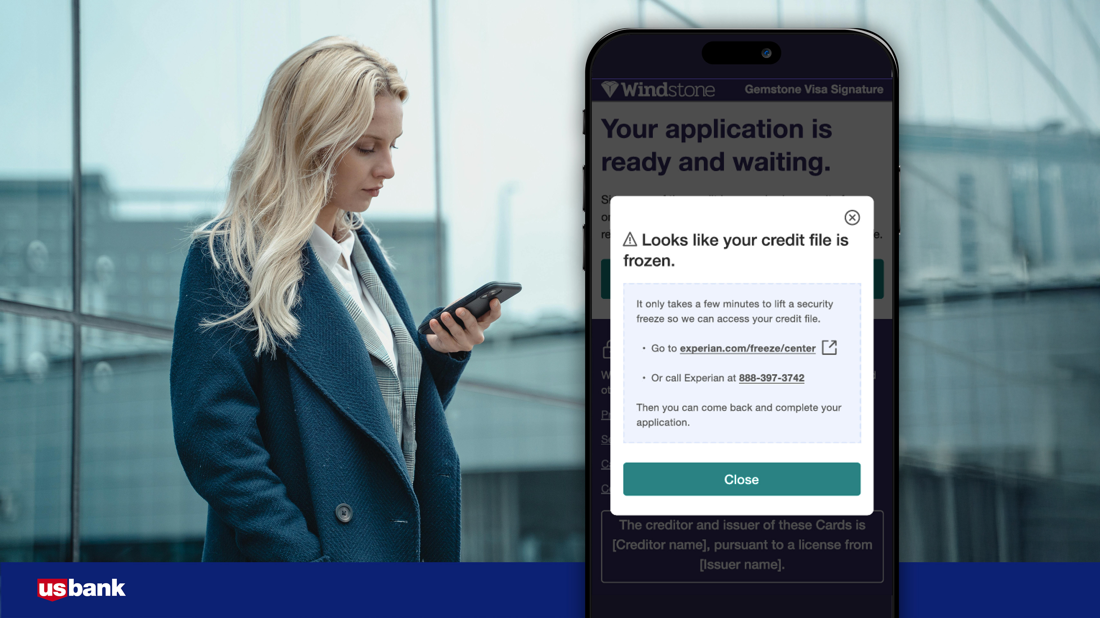
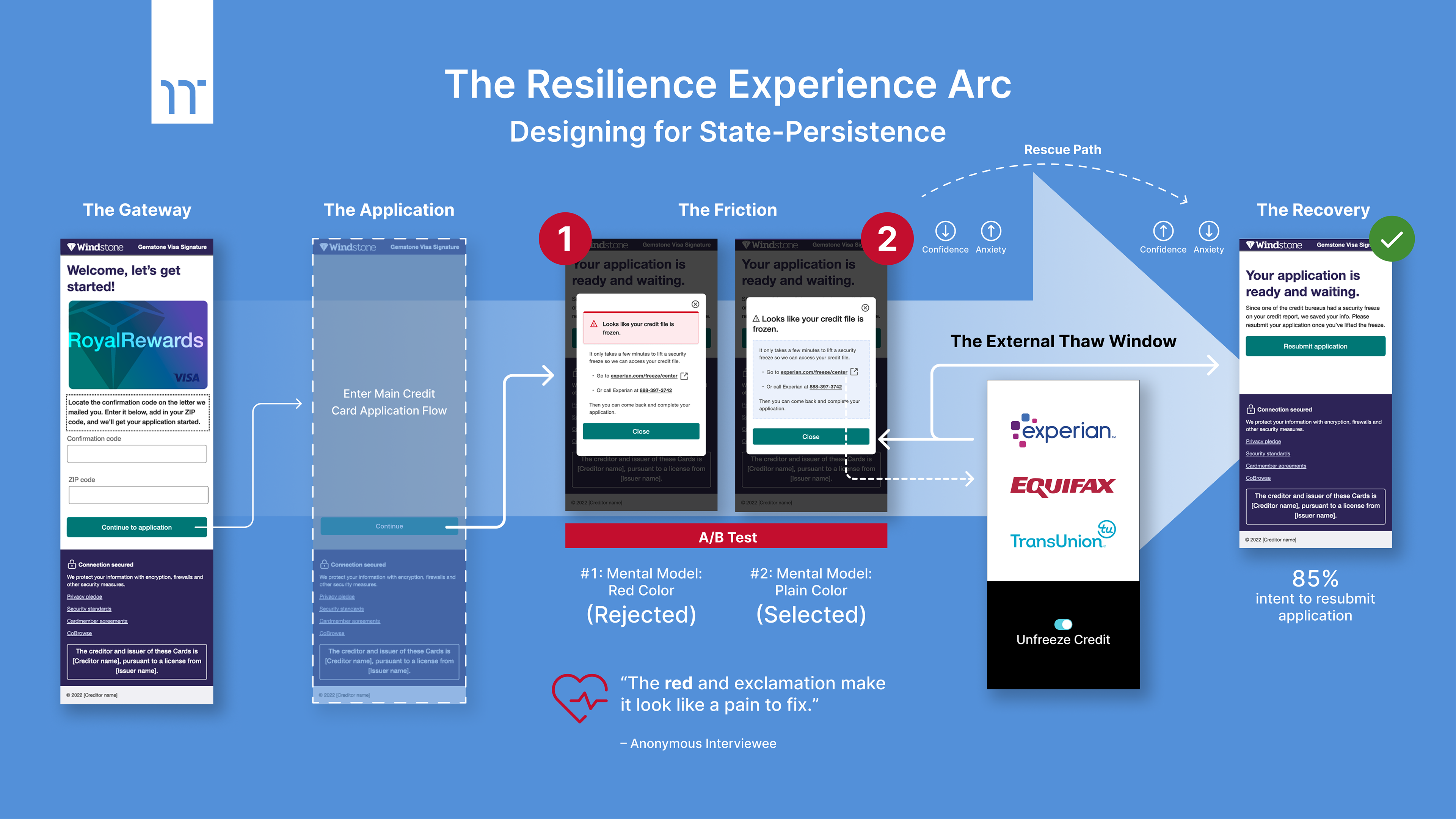
▶ 1. The “Frozen Credit” Barrier (The Primary Edge Case)
The Insight:
Users often forget they have a credit freeze in place with a credit bureau (Equifax, Experian, TransUnion) until the moment they hit “Submit.”
Users often forget they have a credit freeze in place with a credit bureau (Equifax, Experian, TransUnion) until the moment they hit “Submit.”
The Logic:
Instead of a hard “Application Denied” screen, I designed a Soft-Pause State. We provided clear instructions on which bureau was frozen, allowing the user to leave the app, unfreeze their credit, and return to resume — without a second hard credit pull.
Instead of a hard “Application Denied” screen, I designed a Soft-Pause State. We provided clear instructions on which bureau was frozen, allowing the user to leave the app, unfreeze their credit, and return to resume — without a second hard credit pull.
▶ 2. The “Joint Application” Handover
The Insight:
In personal loan applications involving two people, the primary applicant often lacks the secondary applicant's specific financial details (like exact gross income or SSN) in the moment.
In personal loan applications involving two people, the primary applicant often lacks the secondary applicant's specific financial details (like exact gross income or SSN) in the moment.
The Logic:
I mapped a logic flow that allowed the primary user to “Save and Share.” The application state remained live, allowing the second user to jump in or the first user to return once the data was gathered.
I mapped a logic flow that allowed the primary user to “Save and Share.” The application state remained live, allowing the second user to jump in or the first user to return once the data was gathered.
▶ 3. The “Document Hunt” Timeout
The Insight:
Legacy systems often timed out after 15 minutes of inactivity. If a user had to go find a physical W-2 or tax document, they would return to a cleared form and a “Session Expired” message.
Legacy systems often timed out after 15 minutes of inactivity. If a user had to go find a physical W-2 or tax document, they would return to a cleared form and a “Session Expired” message.
The Logic:
We implemented an Extended Persistence Window. By leveraging RCA’s security protocols, we could securely “hibernate” the session, allowing the user to hunt for documents without the fear of losing data entry.
We implemented an Extended Persistence Window. By leveraging RCA’s security protocols, we could securely “hibernate” the session, allowing the user to hunt for documents without the fear of losing data entry.
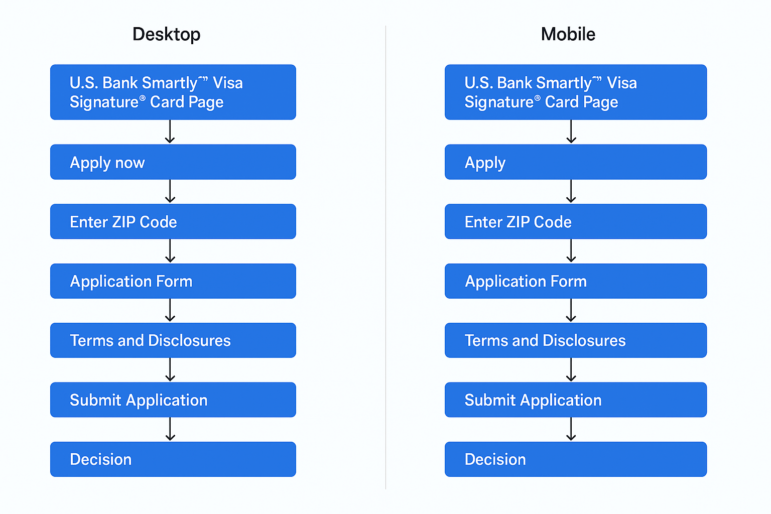
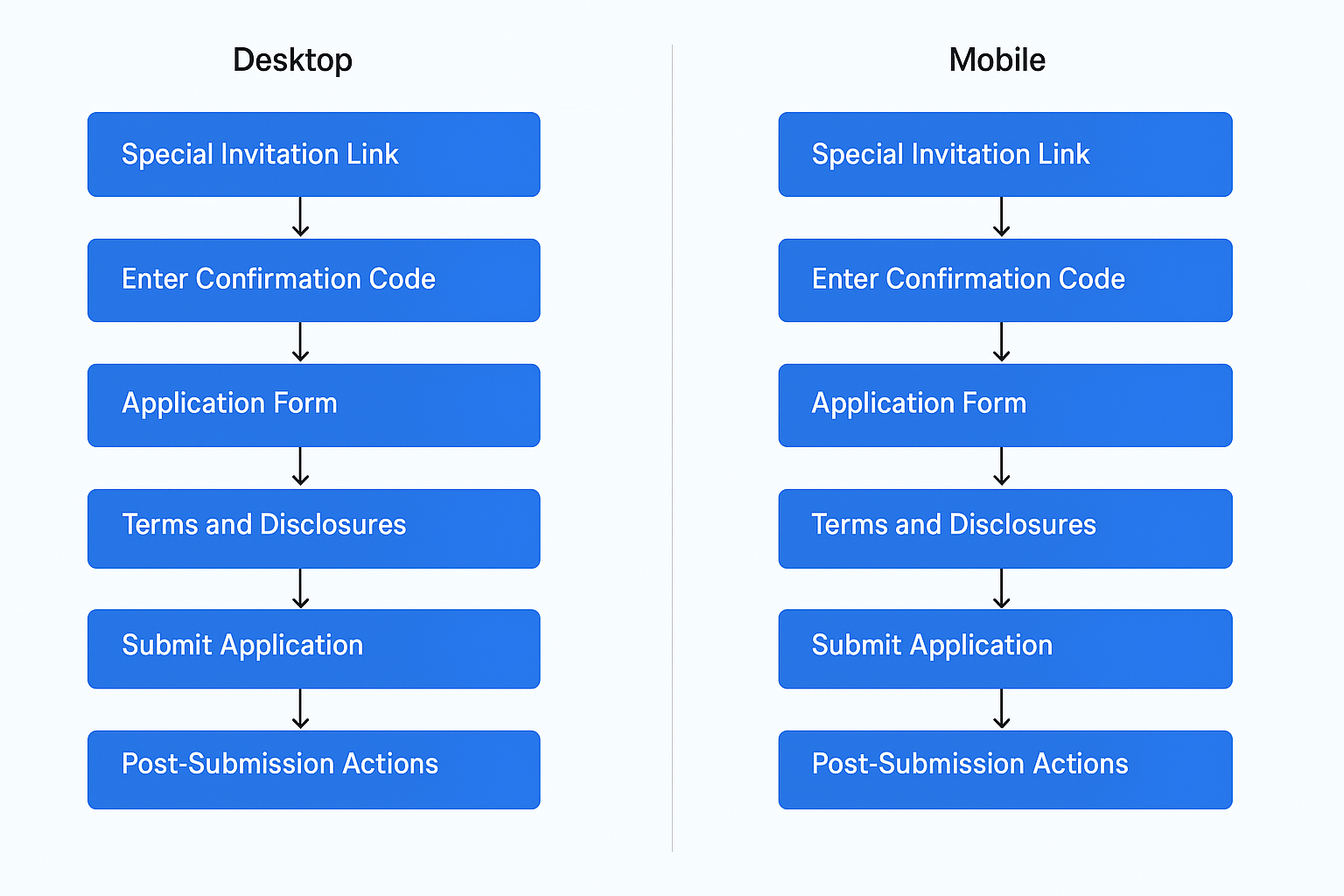
Experience architecture across a multi-team system
Primary application entry paths across desktop and mobile – and Direct and Invited.
Left: This flow shows users entering the credit card application from a standard U.S. Bank Visa card page.
Right: This flow shows users entering through a special invitation link.
Right: This flow shows users entering through a special invitation link.
Both flows converge on the same application steps.
The key difference is how users enter and how the system must handle recovery when a credit freeze is detected.
The key difference is how users enter and how the system must handle recovery when a credit freeze is detected.

The Decision Framework:
What the System Remembers — and What It Forgets
What the System Remembers — and What It Forgets
As the Acting Experience Architect, I had to create a framework for how the system would “remember” a user. Working with the Security and Engineering leads, we had to answer a critical senior-level question: How do we keep an application “alive” without compromising sensitive PII (Personally Identifiable Information)?
The Framework
▶ Identification vs. Authentication
We decided that returning users would undergo a “Light Re-Auth” (SMS 2FA) to unlock their saved state.
We decided that returning users would undergo a “Light Re-Auth” (SMS 2FA) to unlock their saved state.
▶ The “Thaw” Period
We established a 30-day window for state persistence. If a user didn't return to a “Frozen Credit” application within that window, the data was purged for security.
We established a 30-day window for state persistence. If a user didn't return to a “Frozen Credit” application within that window, the data was purged for security.
▶ Accessibility First
Every “Resume” notification and “Return” screen was audited alongside our Accessibility Specialist to ensure that users with screen readers were never “trapped” in a loop during the recovery process.
Every “Resume” notification and “Return” screen was audited alongside our Accessibility Specialist to ensure that users with screen readers were never “trapped” in a loop during the recovery process.

Visual Solution:
Reducing Panic at the Point of Failure
Reducing Panic at the Point of Failure
Evolving the Shield Design System
As the Lead Designer, my task was to translate the complex State Persistence logic into a visual language that felt stable, secure, and — most importantly — non-threatening. Using U.S. Bank’s Shield Design System, I focused on creating a “Guided Recovery” experience.
As the Lead Designer, my task was to translate the complex State Persistence logic into a visual language that felt stable, secure, and — most importantly — non-threatening. Using U.S. Bank’s Shield Design System, I focused on creating a “Guided Recovery” experience.
The “Anxiety Audit”
Refining the Alert Component
During the design of the Frozen Credit notification, I encountered a conflict between the existing design system and the user's emotional needs.
Refining the Alert Component
During the design of the Frozen Credit notification, I encountered a conflict between the existing design system and the user's emotional needs.
The Conflict
The standard Shield “Alert” component featured a prominent red trim. In a financial context, red is universally interpreted as an Error, Denial, or Failure.
The standard Shield “Alert” component featured a prominent red trim. In a financial context, red is universally interpreted as an Error, Denial, or Failure.
The Intervention
I suspected that the “Red Alert” was causing users to abandon the flow out of panic rather than a lack of interest. To validate this, I conducted a focused A/B test:
I suspected that the “Red Alert” was causing users to abandon the flow out of panic rather than a lack of interest. To validate this, I conducted a focused A/B test:
▶ Version A (The System Default)
Included the red decorative trim.
Included the red decorative trim.
▶ Version B (The Modification)
Removed the red trim, using a neutral, high-contrast monochrome palette.
Removed the red trim, using a neutral, high-contrast monochrome palette.
The Result
The “Plain” version (Version B) tested significantly better. Users described it as a “bump in the road” rather than a “full stop.” By removing the ”visual noise” of the red trim, we lowered the user’s heart rate and increased their willingness to read the instructions on how to unfreeze their credit.
The “Plain” version (Version B) tested significantly better. Users described it as a “bump in the road” rather than a “full stop.” By removing the ”visual noise” of the red trim, we lowered the user’s heart rate and increased their willingness to read the instructions on how to unfreeze their credit.

The “Guided Recovery” Interface:
When Language Becomes Navigation
When Language Becomes Navigation
Messaging as a UI element
The primary goal of the high-fidelity UI was to move the user from Confusion to Action. Because I was working on the React Cloud Apply (RCA) platform, I could leverage dynamic messaging that “remembered” the user.
The primary goal of the high-fidelity UI was to move the user from Confusion to Action. Because I was working on the React Cloud Apply (RCA) platform, I could leverage dynamic messaging that “remembered” the user.
Key UI Enhancements
▶ Contextual “Welcome Back” States
When a user returned via the “State Persistence” logic, they weren’t greeted with a generic login. They saw a customized header: “Welcome back. Let’s finish your application where you left off.”
When a user returned via the “State Persistence” logic, they weren’t greeted with a generic login. They saw a customized header: “Welcome back. Let’s finish your application where you left off.”
▶ The “Bureau Guide”
Instead of just saying “Credit Frozen,” the UI explicitly named the bureau (e.g., “Your Experian profile is currently frozen”) and provided a direct, external link to the unfreeze page.
Instead of just saying “Credit Frozen,” the UI explicitly named the bureau (e.g., “Your Experian profile is currently frozen”) and provided a direct, external link to the unfreeze page.
▶ Progress Reassurance
I utilized a persistent progress tracker that “checked off” the sections the user had already completed, visually proving that their previous work hadn’t been lost.
I utilized a persistent progress tracker that “checked off” the sections the user had already completed, visually proving that their previous work hadn’t been lost.

Collaboration + Accessibility:
Designing for Change Without Breaking the System
Designing for Change Without Breaking the System
Because this was a highly siloed organization, these visual changes weren’t made in a vacuum.
▶ The Accessibility Specialist
I worked closely with our specialist to ensure the “Neutral” alert still maintained a 4.5:1 contrast ratio, and that screen readers clearly identified the alert as a “Status Change” rather than a “Hard Error.”
I worked closely with our specialist to ensure the “Neutral” alert still maintained a 4.5:1 contrast ratio, and that screen readers clearly identified the alert as a “Status Change” rather than a “Hard Error.”
▶ The Staff Designer
I presented my A/B test findings to the Partner Apply Staff Designer to justify the departure from the standard Shield component. This data-driven approach allowed us to secure an exception for the credit application flow, prioritizing conversion over rigid system adherence.
I presented my A/B test findings to the Partner Apply Staff Designer to justify the departure from the standard Shield component. This data-driven approach allowed us to secure an exception for the credit application flow, prioritizing conversion over rigid system adherence.

Appendix:
Experience Architecture Behind the Scenes
Experience Architecture Behind the Scenes
The Architecture Behind the Arc
While the visual solution resolved the user’s immediate anxiety, the true recovery happened at the logic layer. Because I owned the Architecture (XA), I was able to solve the “Frozen Credit” problem at its root — the Logic Layer.
While the visual solution resolved the user’s immediate anxiety, the true recovery happened at the logic layer. Because I owned the Architecture (XA), I was able to solve the “Frozen Credit” problem at its root — the Logic Layer.
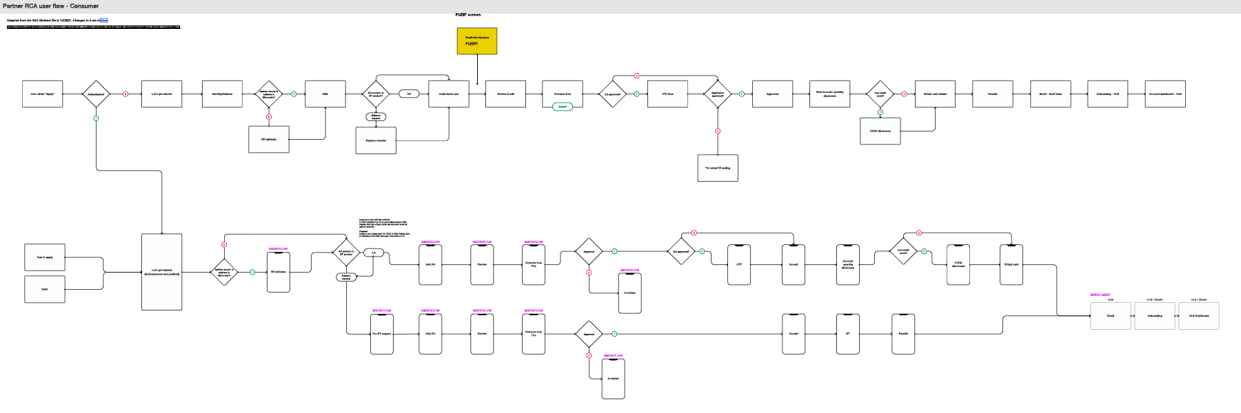
1. System Logic & Behavioral Rules
This logic map represents the “under-the-hood” engine of the React Cloud Apply (RCA) platform. I defined the system's behavioral rules to determine exactly how and when the application should “hibernate” versus “thaw.”
This logic map represents the “under-the-hood” engine of the React Cloud Apply (RCA) platform. I defined the system's behavioral rules to determine exactly how and when the application should “hibernate” versus “thaw.”
Key Architectural Decisions
▶ Soft-Pause Triggers
Mapping the exact moment the system detects a bureau freeze to trigger a “Pending Action” state rather than a session timeout.
Mapping the exact moment the system detects a bureau freeze to trigger a “Pending Action” state rather than a session timeout.
▶ Security Persistence
Defining the 30-day “Thaw Period” and identity verification rules (SMS 2FA) to keep applications alive without compromising sensitive PII.
Defining the 30-day “Thaw Period” and identity verification rules (SMS 2FA) to keep applications alive without compromising sensitive PII.
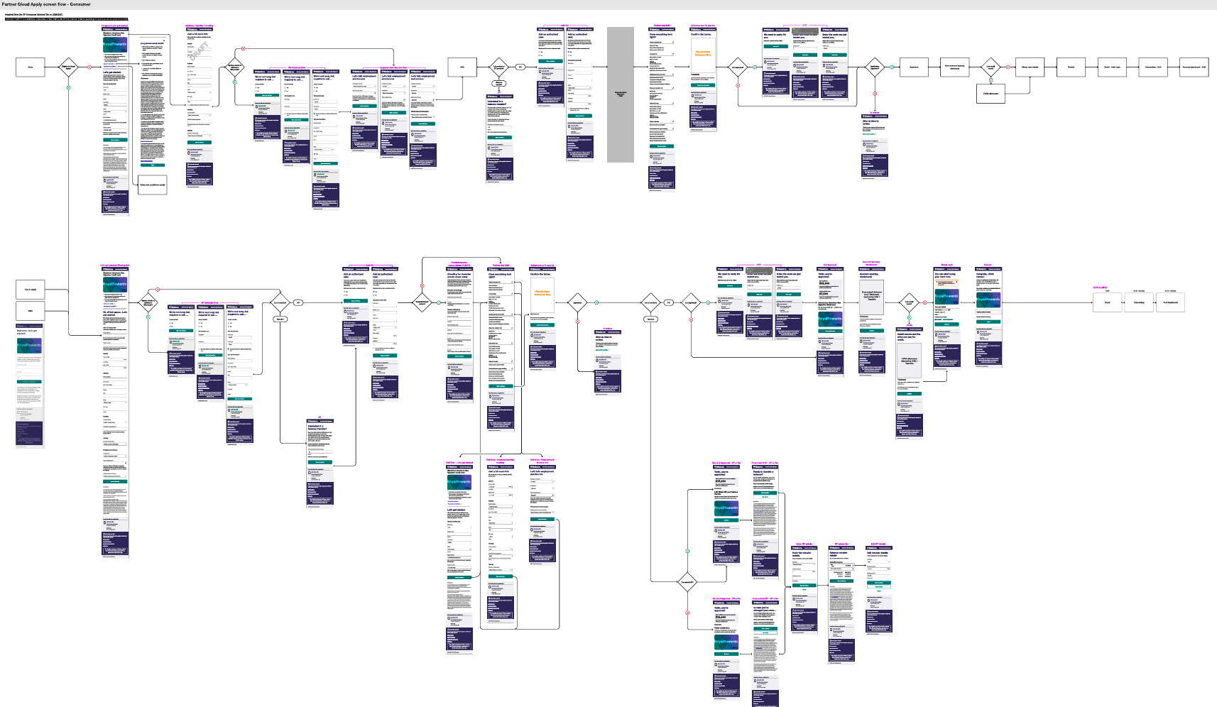
2. Consolidated Master UI Flow
Operating within a powerhouse of specialized talent, I had to align information architecture across four specialized design teams. This master diagram serves as the visual proof of that cross-functional orchestration.
Operating within a powerhouse of specialized talent, I had to align information architecture across four specialized design teams. This master diagram serves as the visual proof of that cross-functional orchestration.
Orchestrating the Ecosystem
▶ Fragmented Flow Consolidation
I translated fragmented entry points (Direct Web vs. Special Invitation) into a single, coherent master flow.
I translated fragmented entry points (Direct Web vs. Special Invitation) into a single, coherent master flow.
▶ Dependency Mapping
By creating a shared view of the entire application ecosystem, I was able to expose gaps and dependencies, ensuring the Frozen Credit recovery journey functioned seamlessly across all team-owned sub-flows.
By creating a shared view of the entire application ecosystem, I was able to expose gaps and dependencies, ensuring the Frozen Credit recovery journey functioned seamlessly across all team-owned sub-flows.
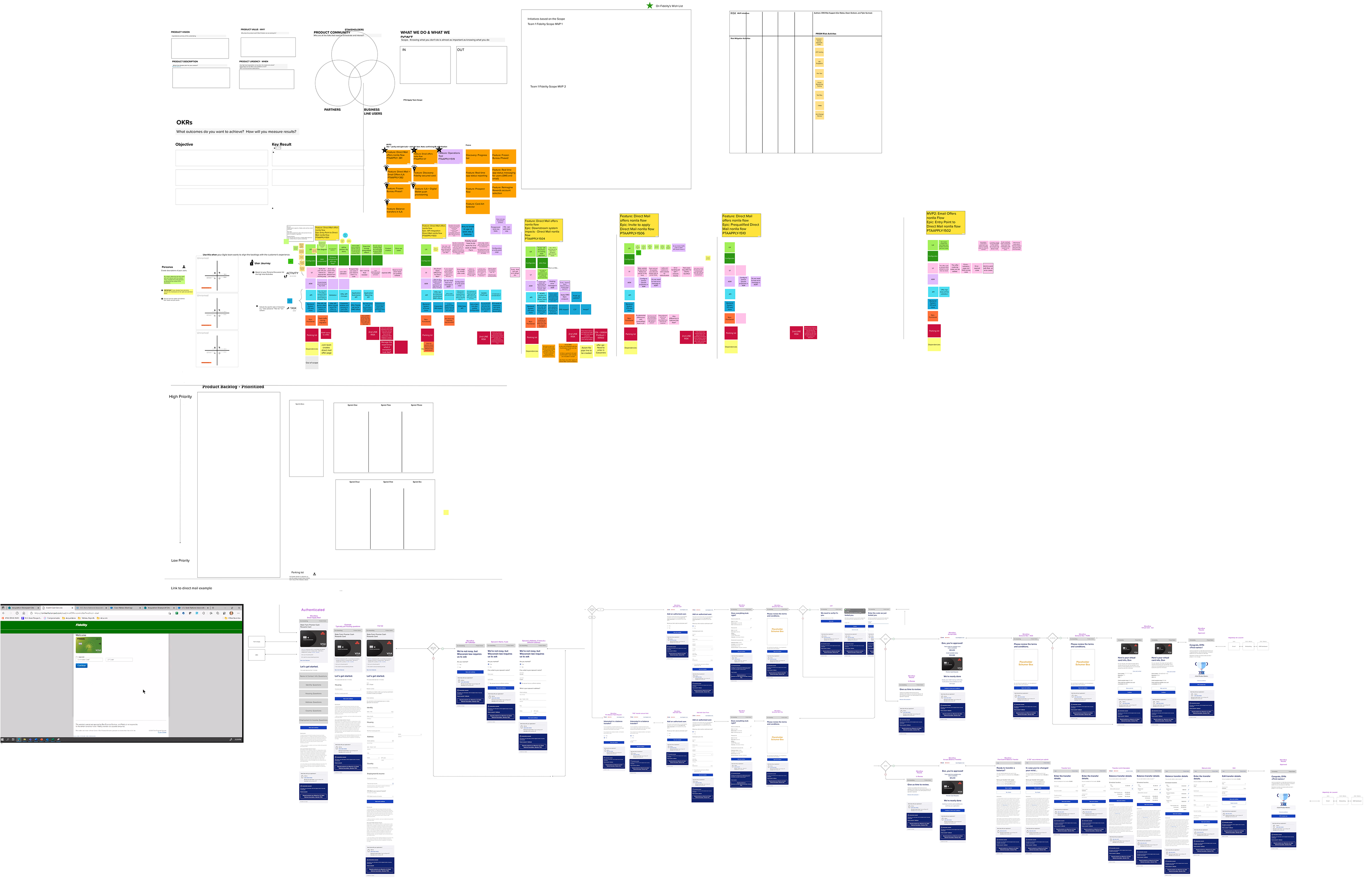
3. Collaborative Story Mapping & Strategic Planning
Team 2 Lead Designer and XA at U.S. Bank was not a solo endeavor. This artifact documents the discovery and alignment phase, where I bridged the gap between business requirements and user needs.
Team 2 Lead Designer and XA at U.S. Bank was not a solo endeavor. This artifact documents the discovery and alignment phase, where I bridged the gap between business requirements and user needs.
Leading the Discovery
▶ Cross-Functional Synthesis
I facilitated sessions to translate qualitative findings from our UX Researcher into functional requirements for the engineering leads.
I facilitated sessions to translate qualitative findings from our UX Researcher into functional requirements for the engineering leads.
▶ Prioritizing Resilience
This mapping phase was critical in identifying the “Point of Abandonment” and defining the “Rescue Path” that eventually plugged the multi-million dollar revenue leak.
This mapping phase was critical in identifying the “Point of Abandonment” and defining the “Rescue Path” that eventually plugged the multi-million dollar revenue leak.

Impact + Results:
How System Recovery Became a Multi-Million Dollar Opportunity
How System Recovery Became a Multi-Million Dollar Opportunity
While I transitioned out to another company before the final production rollout, the pre-launch validation and benchmark data indicate a transformative shift in how U.S. Bank handles high-friction edge cases. By moving from a “stateless” legacy system to the React Cloud Apply (RCA) platform, we didn’t just fix a flow — we plugged a multi-million dollar “leak” in the conversion funnel.
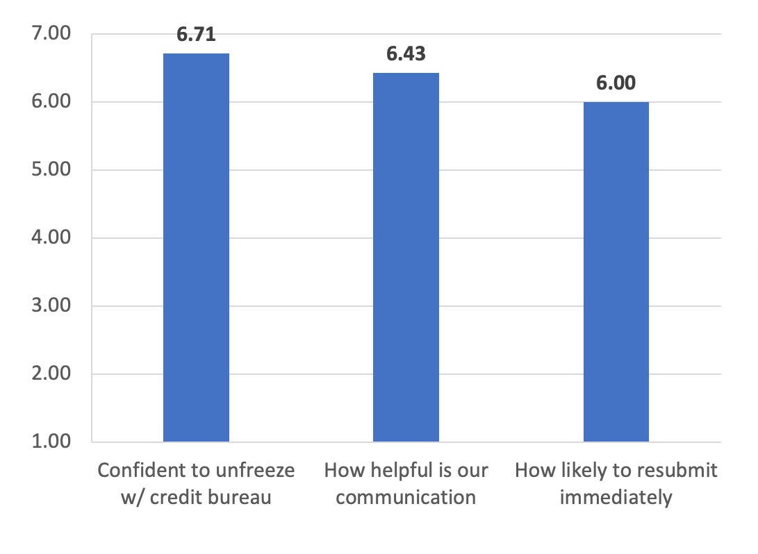
1. Validation of Strategy (Qualitative Success)
Following the redesign of the Frozen Credit journey, we conducted targeted user interviews and feedback sessions to measure the “Emotional Friction” of the new flow. On a scale of 1.0 to 7.0, the results showed a clear victory for the “Guided Recovery” approach:
▶ Confidence to Unfreeze: 6.71 / 7.00
Insight: By providing the specific bureau name and clear instructions, we eliminated the “Bureau Ambiguity” that previously led to abandonment.
Insight: By providing the specific bureau name and clear instructions, we eliminated the “Bureau Ambiguity” that previously led to abandonment.
▶ Helpfulness of Communication: 6.43 / 7.00
Insight: Users responded to the neutral, “non-alarmist” UI (removing the red trim), viewing the system as a partner rather than a barrier.
Insight: Users responded to the neutral, “non-alarmist” UI (removing the red trim), viewing the system as a partner rather than a barrier.
▶ Likelihood to Resubmit: 6.00 / 7.00
Insight: The vast majority of users indicated they would return to the application after unfreezing, a massive improvement over the 0% recovery rate of the legacy “Dead-End” system.
Insight: The vast majority of users indicated they would return to the application after unfreezing, a massive improvement over the 0% recovery rate of the legacy “Dead-End” system.
2. Extrapolated Revenue Forecast
By anchoring our design outcomes to U.S. Bancorp’s 2023 performance, we can project the business value of this recovery flow:
▶ The Context
U.S. Bank reported a 7.8% increase in credit card revenue, totaling $1.63B in 2023.
U.S. Bank reported a 7.8% increase in credit card revenue, totaling $1.63B in 2023.
▶ The Math
Industry benchmarks suggest that each approved credit card represents a Customer Lifetime Value (CLV) of $500–$1,200.
Industry benchmarks suggest that each approved credit card represents a Customer Lifetime Value (CLV) of $500–$1,200.
▶ The Impact
If even a conservative 2–3% of annual applicants encounter a frozen credit edge case, the ability to "save and resume" that state converts thousands of lost sessions into active accounts. This represents a multi-million dollar revenue recovery annually, driven purely by UX optimization and state persistence.
If even a conservative 2–3% of annual applicants encounter a frozen credit edge case, the ability to "save and resume" that state converts thousands of lost sessions into active accounts. This represents a multi-million dollar revenue recovery annually, driven purely by UX optimization and state persistence.

Postface:
Designing Systems That Outlast the Project
Designing Systems That Outlast the Project
Reflections on Ownership and Enterprise Agility
My time at U.S. Bank was a masterclass in navigating complexity. Stepping into the dual role of Lead Product Designer and Acting Experience Architect (XA) for Team 2 allowed me to influence the product not just at the pixel level, but at the logic level.
What this work verified
▶ Systems Over Screens
In a bank, the most beautiful UI cannot fix a broken backend logic. By owning the RCA State Persistence rules, I learned that the most impactful “design” often happens in the flow logic, not the Figma file.
In a bank, the most beautiful UI cannot fix a broken backend logic. By owning the RCA State Persistence rules, I learned that the most impactful “design” often happens in the flow logic, not the Figma file.
▶ Collaboration is a Skill
Working within a siloed organization taught me how to align with UX Researchers, Accessibility Specialists, and Staff Designers to push for user-centric changes (like removing the “Red Alert” anxiety) that might otherwise be rejected by a rigid design system.
Working within a siloed organization taught me how to align with UX Researchers, Accessibility Specialists, and Staff Designers to push for user-centric changes (like removing the “Red Alert” anxiety) that might otherwise be rejected by a rigid design system.
What I would measure next
Had I stayed through the final launch, my next step would have been a longitudinal study of re-entry triggers. I would have A/B tested the timing and tone of email and SMS reminders — measuring whether a “24-hour reminder” or a “48-hour reminder” yielded higher completion rates for users who had successfully unfrozen their credit.
Had I stayed through the final launch, my next step would have been a longitudinal study of re-entry triggers. I would have A/B tested the timing and tone of email and SMS reminders — measuring whether a “24-hour reminder” or a “48-hour reminder” yielded higher completion rates for users who had successfully unfrozen their credit.
▶ If you’re dealing with friction that’s quietly costing revenue, let’s talk about how design can turn failure states into recovery paths.