
Project Overview:
A Research-Driven Narrative Delivered Without Margin for Error
Presentation Design | Data Storytelling | Webinar Communication | High-Stakes Delivery
A Research-Driven Narrative Delivered Without Margin for Error
Presentation Design | Data Storytelling | Webinar Communication | High-Stakes Delivery
The problem
At Signifyd, a high-visibility State of Commerce webinar was approaching fast. The content was dense, research-heavy, and still in draft form.
At Signifyd, a high-visibility State of Commerce webinar was approaching fast. The content was dense, research-heavy, and still in draft form.
With the event days away and limited access to stakeholders, the challenge was not just execution.
It was interpretation. Complex data needed to become a clear, credible narrative and be delivered quickly for a global audience.
It was interpretation. Complex data needed to become a clear, credible narrative and be delivered quickly for a global audience.
Time + Team
Duration: ~10 days, fixed event deadline
Freelance Presentation Designer (me) • Creative Director (limited availability)
Duration: ~10 days, fixed event deadline
Freelance Presentation Designer (me) • Creative Director (limited availability)
My role
I served as the freelance presentation designer, owning visual storytelling end-to-end.
I translated dense research into structured slides, data visualizations, and narrative flow while operating with minimal feedback and high autonomy.
I also designed a 30-page report in PDF to accompany the presentation.
▼ Read the full story to see how it all came together. ▼

Intro / Background:
Communicating with Confidence Under Pressure
Communicating with Confidence Under Pressure
Signifyd operates at the intersection of risk, trust, and global ecommerce. During the height of the pandemic, the company set out to publish its State of Commerce. The webinar examined how global buying behavior was shifting in real time.
The timing was unforgiving. The event was days away. The in-house designer was unexpectedly unavailable. The Creative Director was out. The content existed only as early drafts and raw research.
I was brought in to bridge the gap.
My role was to quickly interpret Signifyd’s brand. I synthesized complex data and turned incomplete inputs into a clear, credible narrative. The work demanded speed without shortcuts. The presentation needed to translate numbers into insight and land with confidence.

The Problem:
Delivering Clarity in the Absence of Oversight
Delivering Clarity in the Absence of Oversight
At Signifyd, the team entered full crunch mode. A high-visibility State of Commerce webinar was days away, and the content was dense, research-driven, and still evolving.
The challenge was not simply execution. It was interpretation. The work required quickly making sense of complex data, establishing narrative structure, and delivering a presentation that felt polished, credible, and ready for a global audience. Compounding the pressure, collaboration windows were limited. With key stakeholders unavailable, design decisions had to be made independently while remaining faithful to Signifyd’s brand and message.
Core constraints
▶ Compressed timeline
Fewer than seven days to design and finalize a 30-slide webinar deck.
Fewer than seven days to design and finalize a 30-slide webinar deck.
▶ High-data complexity
Research-heavy content required clear hierarchy, visual structure, and narrative flow.
Research-heavy content required clear hierarchy, visual structure, and narrative flow.
▶ Limited to no access to stakeholders
Minimal feedback cycles demanded confident, autonomous decision-making.
Minimal feedback cycles demanded confident, autonomous decision-making.
The problem was clear. Dense data had to be visualized and shaped into a cohesive narrative under extreme time pressure, with no loss of clarity or credibility.

My Role + Scope
I served as the sole presentation designer, leading visual design end-to-end.
My responsibilities included:
▶ Led visual storytelling, slide structure, and data visualization for a research-heavy presentation
▶ Created a 30-page, data-heavy report in PDF to accompany the presentation
▶ Translated dense content into a clear narrative with strong hierarchy and pacing
▶ Applied Signifyd’s brand standards across typography, color, and layout
▶ Made independent design decisions during limited collaboration windows
▶ Coordinated remotely with the Creative Director before and after PTO
Tools used:
PowerPoint • InDesign • Photoshop • Illustrator • Word • Excel • Acrobat
PowerPoint • InDesign • Photoshop • Illustrator • Word • Excel • Acrobat
The Solution:
Converting Data into Signal and Momentum
Converting Data into Signal and Momentum
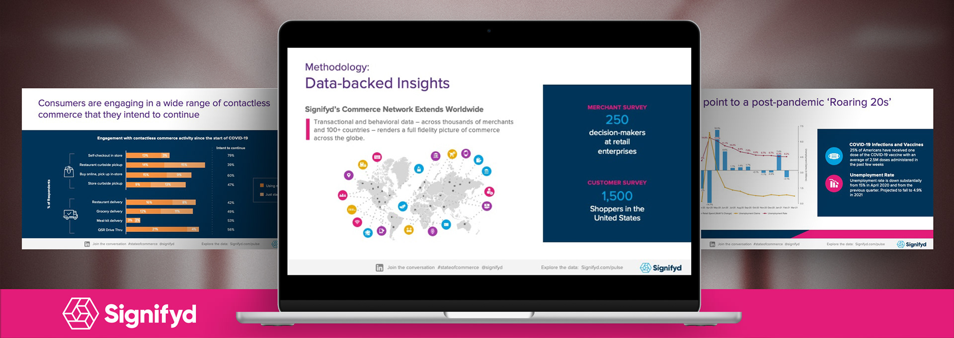
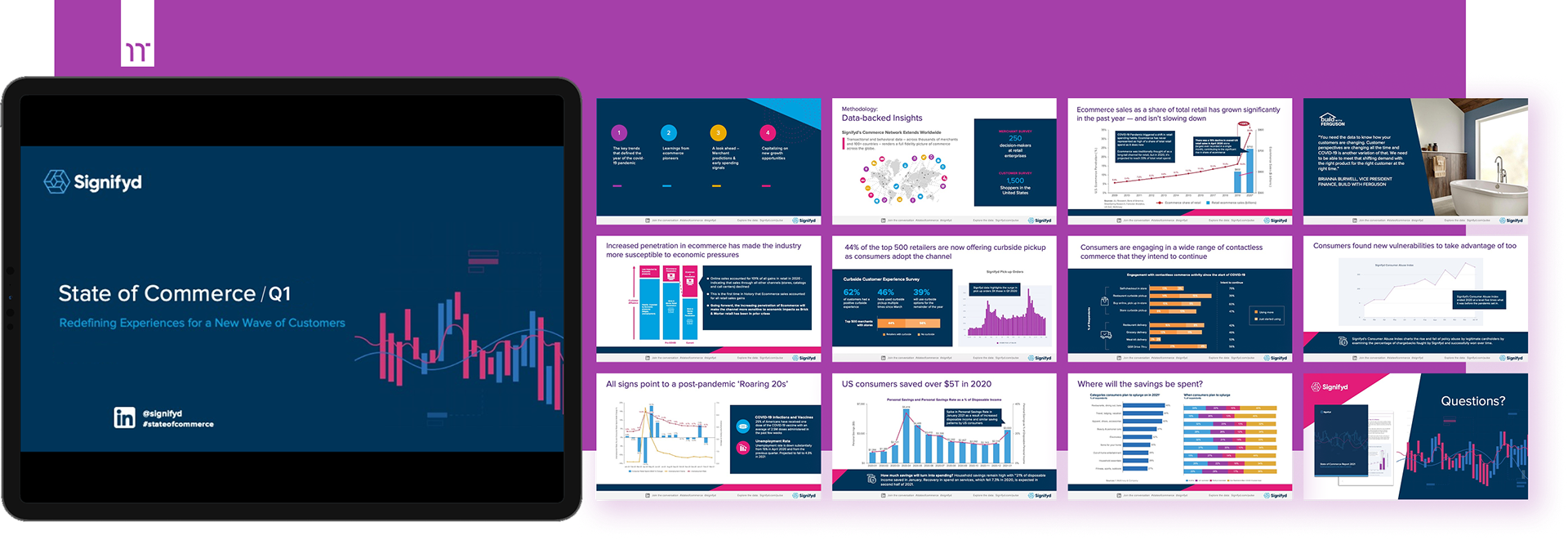
Note: Selected screenshots represent key moments, not the full narrative or pacing of the presentation. Confidential data has been removed or altered.
The solution focused on transforming dense research into a clear, story-driven experience. I began by auditing the raw content to identify the narrative spine: What the data was actually saying, and in what order it needed to be understood.
From there, I designed a lightweight visual system built on hierarchy and restraint. Charts were restructured into infographics that emphasized insight over volume. Each section opened with a framing slide to establish context before introducing supporting data.
Because the deck was designed for a live webinar, clarity at scale was non-negotiable. Slides were optimized for large screens, short text blocks, and pacing that supported the speaker’s delivery rather than competing with it.
The result was a presentation that translated research into signal. It was clean, legible, and credible, allowing Signifyd to deliver a clear point of view without overwhelming the audience.
Extending the Narrative:
The State of Commerce Report
The State of Commerce Report
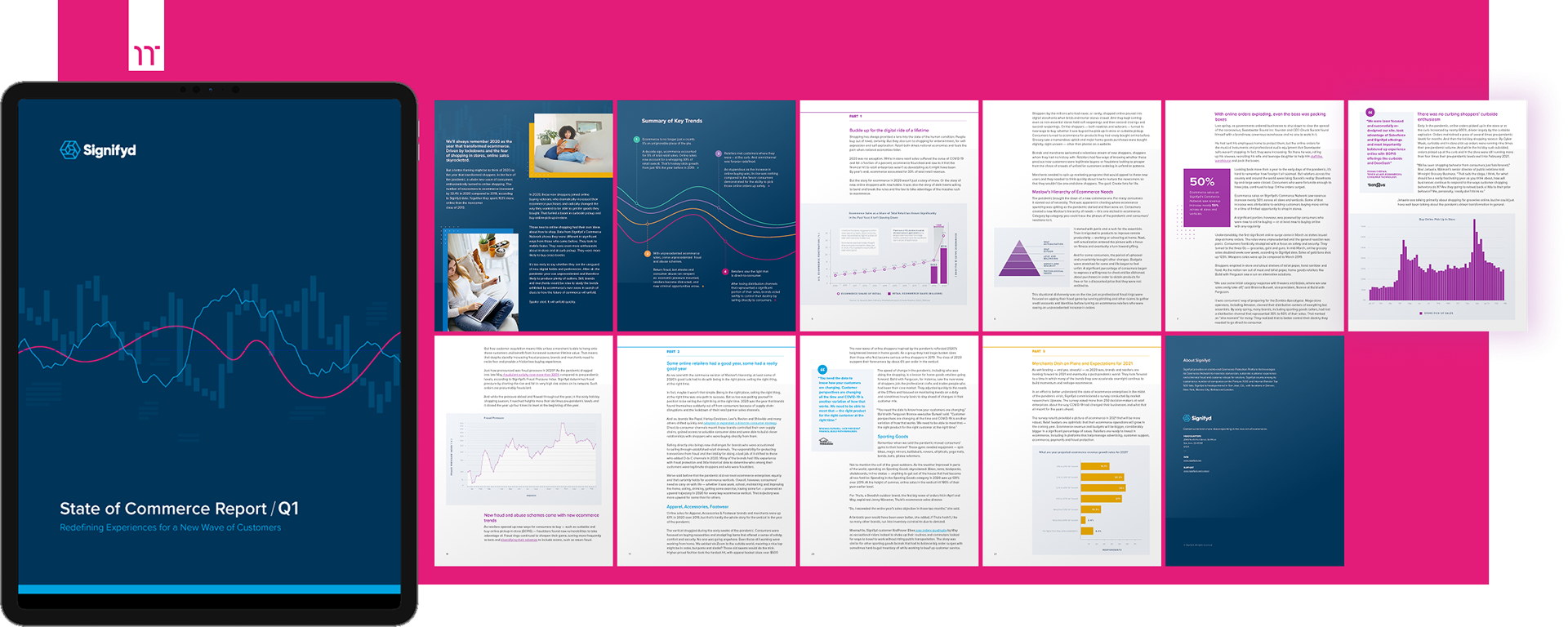
To maximize the impact of the live webinar, the visual narrative was extended into a comprehensive 30-page PDF collateral piece. This “State of Commerce Report” served as the high-value leave-behind for attendees, ensuring that the insights shared during the presentation remained accessible and actionable long after the session ended. By maintaining a strict minimalist aesthetic and cohesive brand identity across both formats, I helped Signifyd deliver a unified multi-channel experience.
▶ Multi-Channel Continuity
I translated the presentation’s core visual language into a long-form editorial layout, ensuring the brand’s voice remained consistent from the webinar screen to the 30-page downloadable report.
I translated the presentation’s core visual language into a long-form editorial layout, ensuring the brand’s voice remained consistent from the webinar screen to the 30-page downloadable report.
▶ Narrative Data Visualization
I transformed complex pandemic-era trends — such as the 33% jump in ecommerce’s share of total retail — into scannable, high-impact charts that prioritized clarity for executive readers.
I transformed complex pandemic-era trends — such as the 33% jump in ecommerce’s share of total retail — into scannable, high-impact charts that prioritized clarity for executive readers.
▶ Editorial Information Hierarchy
Using minimalist design principles, I organized dense subject matter — ranging from fraud pressure indices to vertical-specific breakdowns — into a digestible structure that allowed for quick navigation and deep-dive reading.
Using minimalist design principles, I organized dense subject matter — ranging from fraud pressure indices to vertical-specific breakdowns — into a digestible structure that allowed for quick navigation and deep-dive reading.
▶ Functional Design Systems
I leveraged the existing design system to create a professional, “white-paper” feel that balanced Signifyd’s authoritative data with a clean, modern aesthetic suitable for B2B decision-makers.
I leveraged the existing design system to create a professional, “white-paper” feel that balanced Signifyd’s authoritative data with a clean, modern aesthetic suitable for B2B decision-makers.

Challenges + Learnings:
Design Judgement Under Full Autonomy
Design Judgement Under Full Autonomy
The work required near-total independence. With limited access to stakeholders and no time for iterative feedback, decisions had to be made quickly and stand on their own. Familiarity with the brand had to be built in parallel with execution, relying on experience rather than process overhead.
This constraint reinforced the role of visual hierarchy as a decision-making tool. When all information appears equally important, design becomes responsible for setting the pace, focus, and emphasis. Clarity was not a byproduct of polish. It was the primary deliverable.
The key learning was direct: under pressure, strong hierarchy and rhythm matter as much as color or type. They are what turn volume into signal and allow a story to hold together when time and guidance are limited.

Impact + Results:
Signal Over Noise; Alignment Without Drag
Signal Over Noise; Alignment Without Drag
The work delivered immediate value for a high-visibility moment at Signifyd.
Results
▶ Delivered a fully polished, research-heavy presentation under a compressed timeline
▶ Enabled clear, human-centered communication of complex data for a global audience
▶ Earned strong feedback from the Creative Director for clarity, balance, and independent execution
▶ Strengthened trust with the client, leading to continued collaboration
The impact went beyond a single webinar. Reliable execution under pressure reinforced design as a trusted partner. It proved dependable when speed, clarity, and judgment mattered most.
Interested? Let’s connect.