
Project Overview
Global Navigation System | PortX Cloud | SaaS Platform (Integration, Payment, Data Managers) | MVP Launch
Global Navigation System | PortX Cloud | SaaS Platform (Integration, Payment, Data Managers) | MVP Launch
Role:
Founding UX/UI Designer • IA & Navigation Strategy • Prototype & System Design
Founding UX/UI Designer • IA & Navigation Strategy • Prototype & System Design
Timeline:
8-week strategic research + design project (developed in parallel with ongoing sprint work)
8-week strategic research + design project (developed in parallel with ongoing sprint work)
Summary:
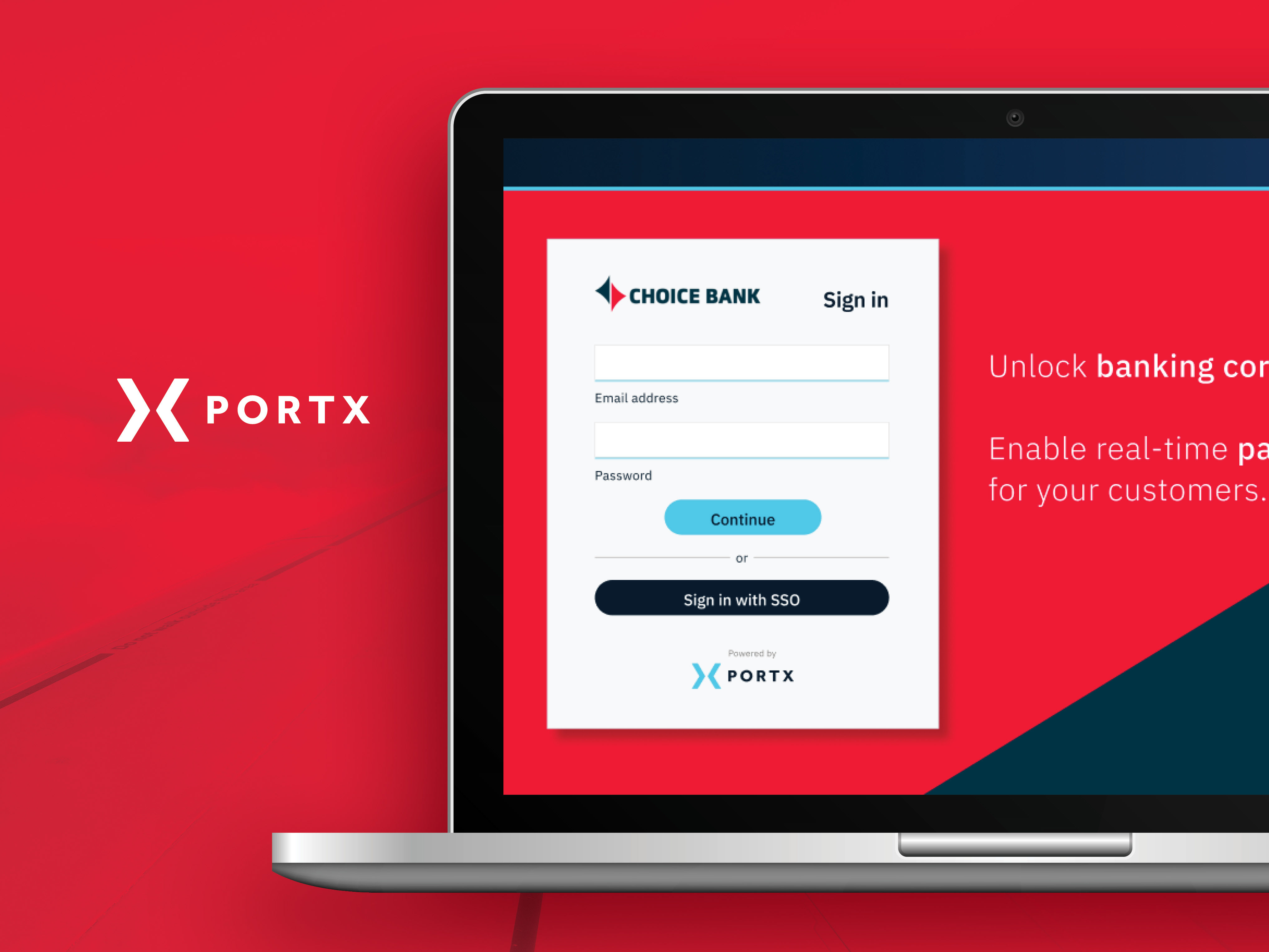
PortX Cloud bundled multiple standalone SaaS products (Integration Manager, Payment Manager, Data Manager) under one platform. As each product had its own navigation structure, the overall experience became fragmented and unpredictable. I led the redesign and implementation of a unified global navigation system to bring consistency, clarity, and scalability. The redesign aimed to make cross-product transitions seamless for users, improve product discoverability, and support long-term growth of the platform.
PortX Cloud bundled multiple standalone SaaS products (Integration Manager, Payment Manager, Data Manager) under one platform. As each product had its own navigation structure, the overall experience became fragmented and unpredictable. I led the redesign and implementation of a unified global navigation system to bring consistency, clarity, and scalability. The redesign aimed to make cross-product transitions seamless for users, improve product discoverability, and support long-term growth of the platform.
Problem:
Users struggled with inconsistent navigation across products. Some relied on hidden menus (e.g., cascading, 9-dot, accordions), others used custom or inconsistent patterns. This resulted in usability problems: Low discoverability, unpredictable navigation paths, and poor perceived cohesion across the product suite. For demos or stakeholder presentations, the lack of visible navigation made the breadth of the platform seem smaller than it was and hurting perceived value.
Users struggled with inconsistent navigation across products. Some relied on hidden menus (e.g., cascading, 9-dot, accordions), others used custom or inconsistent patterns. This resulted in usability problems: Low discoverability, unpredictable navigation paths, and poor perceived cohesion across the product suite. For demos or stakeholder presentations, the lack of visible navigation made the breadth of the platform seem smaller than it was and hurting perceived value.
Solution:
Developed a scalable global navigation framework that:
➡️ Standardized layout patterns, iconography, menu hierarchy, and navigation behavior across all PortX Cloud products.
➡️ Prioritized clear labels and intuitive grouping to match users’ mental models and minimize cognitive load.
➡️ Designed a 3-column system for main navigation that surfaces product-level and sub-product items/tools at a glance, thereby improving recognition over recall.
➡️ Absorbed future sub-products, modules, or third-party apps without requiring redesign.
Impact:
✅ Navigation became consistent and predictable across all PortX Cloud modules, reducing user confusion and friction.
✅ Improved discoverability of features across products — users and stakeholders can immediately see the breadth of the platform.
✅ Created a scalable foundation: all future sub-products or modules can plug into the same navigation system without restructuring.
✅ Strengthened internal alignment across product teams by enforcing a shared UX pattern — reducing design debt and conflicting UX approaches.
Key Contributions + Achievements:
➡️ Mapped out existing navigation inconsistencies and gaps through internal audits and stakeholder interviews
➡️ Designed IA, navigation flows, and global menu structure that would scale for all current and future products
➡️ Developed prototypes and design specifications to hand off to engineering for implementation
➡️ Established iconography, labeling, and hierarchical guidelines to maintain clarity and consistency across modules
➡️ Applied best-practice navigation principles and UX heuristics to balance functionality, usability, and scalability
⬇️ Read the full story to see how it all came together. ⬇️

Intro / Background
PortX is building a digital banking platform called PortX Cloud, home to three main products: Integration Manager, Payment Manager, and Data Manager. Each product includes its own layers. For example, Payment Manager supports Wires, ACH, and FedNow, while Integration Manager includes Design, Development, and Deployment tools.
As these products evolved toward MVP launch, navigation became a growing challenge. Each team was solving it differently, which made the experience inconsistent. This case study looks at how I unified navigation across the PortX Cloud suite.
The core question:
How can one consistent framework make switching between tools easier, reduce friction, and improve productivity?
How can one consistent framework make switching between tools easier, reduce friction, and improve productivity?

The Problem
Working in silos, each PortX Cloud product team had designed its own navigation. There was no shared model for how users should move between tools. This led to a fragmented experience and added friction. Early fixes included placing all products in a dropdown, tree view, or accordion menu. But testing showed these menus were hidden and inconvenient, especially when the cursor wasn’t near that part of the screen.
From a business perspective, the CEO also raised another concern. The platform’s full value wasn’t visible. During sales demos, hiding products behind a 9-dot or hamburger menu made the suite feel smaller than it actually was. The goal was to create one scalable system that worked across all products, balanced business and usability needs, and could evolve with the platform.
The key challenges or pain points were:
❌ Inconsistent navigation: Different products followed different patterns.
❌ Low discoverability: Menus were hidden, requiring extra clicks.
❌ Poor visibility in demos: The suite’s breadth wasn’t immediately obvious.
❌ Low discoverability: Menus were hidden, requiring extra clicks.
❌ Poor visibility in demos: The suite’s breadth wasn’t immediately obvious.

Research Goals + Methodologies
While this wasn’t a large research initiative, understanding user behaviors and team workflows was key. I focused on quick discovery methods:
✅ Reviewed and mapped navigation patterns across all products
✅ Observed how users moved between tools during real tasks
✅ Tested early prototypes through A/B sessions and short surveys
✅ Observed how users moved between tools during real tasks
✅ Tested early prototypes through A/B sessions and short surveys

My Role
➡ Sole UX/UI designer
➡ Conducted internal interviews with product, engineering, and leadership teams
➡ Mapped inconsistencies across the suite and identified opportunities for unification
➡ Designed a scalable navigation system for cross-product switching and growth
➡ Created and tested Figma prototypes for feedback and iteration
➡ Led usability testing and short user surveys to validate final concepts
➡ Tools used: Figma, Miro, Jira, PowerPoint, Zoom
Note: Given the fast-paced MVP launch and my role as sole designer supporting three product teams, I focused on medium-fidelity wireframes to validate core user flows quickly. At this stage, usability and alignment took priority over visual polish. This ensured the team could build, test, and iterate efficiently. The final visual refinement and UI system were planned for post-MVP phases once feedback and stability allowed.
Challenges + Learnings
Supporting three major product teams as the only designer meant managing multiple sprints and priorities at once. Without a shared system, maintaining consistency depended on close coordination and clear documentation.
Supporting three major product teams as the only designer meant managing multiple sprints and priorities at once. Without a shared system, maintaining consistency depended on close coordination and clear documentation.
The solution needed to be modular and flexible enough to support new products without redesigning the entire framework. This reinforced one of my strengths: Keeping the big picture in focus while solving immediate needs. Grounding the design in usability principles was essential:
✅ A three-column layout improved recognition over recall by showing all tiers at once
✅ Consistent structure built predictability for enterprise users managing complex workflows
✅ Icon-only reduced column size, real estate needs, and visual noise
✅ Consistent structure built predictability for enterprise users managing complex workflows
✅ Icon-only reduced column size, real estate needs, and visual noise
Not every idea made it through. My preferred dynamic, hover-triggered menu was cut for engineering reasons. It was a reminder that great UX isn’t about perfection. It’s about balancing ambition with feasibility and knowing where to push.

Impact + Results
✅ Improved discoverability across all products through unified navigation
✅ Created a shared model adopted by every product team for future releases
✅ Reduced navigation time and friction when switching between tools
✅ Strengthened consistency across the PortX Cloud platform
✅ Created a shared model adopted by every product team for future releases
✅ Reduced navigation time and friction when switching between tools
✅ Strengthened consistency across the PortX Cloud platform

Postface:
I transitioned out of PortX shortly after the MVP launch due to company changes. Although the new navigation system shipped in a solid MVP state, there was still meaningful refinement ahead of it. Had I stayed longer, my next focus would have been validating and elevating the navigation system and experience. If given the opportunity to iterate further, I would have:
➡️ Conducted usability testing:
Not just Product and Engineering, but the users at the banks, support teams, and even less technical users. This would help uncover navigation blind spots, mental-model mismatches, and areas where the system created unnecessary friction.
Not just Product and Engineering, but the users at the banks, support teams, and even less technical users. This would help uncover navigation blind spots, mental-model mismatches, and areas where the system created unnecessary friction.
➡️ Evaluated the clarity of product naming through information-scent testing:
I wanted to validate whether sub-product names/titles/labels were immediately clear, or whether users hesitated because the names felt too broad or ambiguous. Methods like tree testing, closed card sorting, and first-click testing would have measured whether people knew where to go without second-guessing.
I wanted to validate whether sub-product names/titles/labels were immediately clear, or whether users hesitated because the names felt too broad or ambiguous. Methods like tree testing, closed card sorting, and first-click testing would have measured whether people knew where to go without second-guessing.
➡️ Brought back the motion design work planned for the original concept:
The MVP version removed the micro-interactions and motion cues I had designed — such as column expansion, sliding transitions, animated focus states, and hover reveals. These interactions weren’t “nice-to-haves”; they improved wayfinding and reduced cognitive load. I would have pushed to restore these elements once engineering had more bandwidth.
The MVP version removed the micro-interactions and motion cues I had designed — such as column expansion, sliding transitions, animated focus states, and hover reveals. These interactions weren’t “nice-to-haves”; they improved wayfinding and reduced cognitive load. I would have pushed to restore these elements once engineering had more bandwidth.
➡️ Continued refining hierarchy and discoverability as the platform evolved:
PortX was growing quickly, and new features were already on the roadmap. My next step would have been ensuring the navigation system could scale gracefully without overwhelming users or creating deeper nested levels.
PortX was growing quickly, and new features were already on the roadmap. My next step would have been ensuring the navigation system could scale gracefully without overwhelming users or creating deeper nested levels.
Even with these constraints, the delivered MVP significantly improved consistency and orientation across PortX Cloud. With further iteration, it had the potential to become a fully scalable design foundation for all future PortX and third-party products.
Interested? Let’s connect.