

TLDR | Project Overview:
A global toolkit to support blood donation during COVID-19
Digital Toolkit | Global Partner Enablement | Visual Communication at Scale | Brand Systems
A global toolkit to support blood donation during COVID-19
Digital Toolkit | Global Partner Enablement | Visual Communication at Scale | Brand Systems
The challenge
During the COVID-19 pandemic, Facebook needed to support “World Blood Donor Day” without amplifying fear or fatigue.
The issue was not awareness.
It was tone, clarity, and consistency across a global partner network.
The issue was not awareness.
It was tone, clarity, and consistency across a global partner network.
Partners needed ready-to-use materials that worked in a screen-first world, respected local context, and communicated empathy without pressure.
Time + Team
Breakdown: 2 weeks (my design contribution)
Visual Design Lead & Creative Director (me) • Program Manager • Copywriter
Breakdown: 2 weeks (my design contribution)
Visual Design Lead & Creative Director (me) • Program Manager • Copywriter
My role
I led creative direction and visual design for a global, digital-first social media toolkit.I designed and produced the ebook end-to-end.
I collaborated with the program manager for feedback and approval and delivered all assets independently under a compressed timeline.
I led creative direction and visual design for a global, digital-first social media toolkit.I designed and produced the ebook end-to-end.
I collaborated with the program manager for feedback and approval and delivered all assets independently under a compressed timeline.
My approach
I designed a widescreen, digital-native toolkit optimized for clarity, speed, and adaptability.
The visual system followed Facebook’s brand standards while emphasizing warmth, accessibility, and calm reassurance.
I designed a widescreen, digital-native toolkit optimized for clarity, speed, and adaptability.
The visual system followed Facebook’s brand standards while emphasizing warmth, accessibility, and calm reassurance.
A consistent structure across pages made the toolkit easy to scan, adapt, and deploy without additional design support.
This allowed partners to act quickly and confidently.
This allowed partners to act quickly and confidently.
Why it matters
This work demonstrates how design can enable empathy at scale.
The toolkit reduced friction and ambiguity at a moment when clarity mattered most.
It enabled partners to communicate responsibly while staying aligned with Facebook’s voice and values.
This work demonstrates how design can enable empathy at scale.
The toolkit reduced friction and ambiguity at a moment when clarity mattered most.
It enabled partners to communicate responsibly while staying aligned with Facebook’s voice and values.
Core question
How can thoughtful, system-driven design help large organizations empower partners to communicate clearly, empathetically, and consistently — especially when it matters most?
How can thoughtful, system-driven design help large organizations empower partners to communicate clearly, empathetically, and consistently — especially when it matters most?
▼ Read the full story to see how it all came together. ▼

Intro / Background:
Empowering partners to communicate with empathy at scale
Empowering partners to communicate with empathy at scale
Facebook’s Community Partnerships team supports “World Blood Donor Day” by equipping global partners with tools to promote blood donation and local drives. I worked as part of the internal design team responsible for creating a digital toolkit that partners could adapt and deploy quickly.
This work happened during the COVID-19 pandemic.
Daily life had changed, but the need for blood donations had not.
The challenge was not awareness. It was tone.
Messaging needed to acknowledge uncertainty and fatigue without becoming heavy or alarmist. It needed to encourage action while remaining human, respectful, and hopeful.
The ebook became the central tool.
It served as a practical, ready-to-use guide that partners could rely on without additional design support. It included adaptable visuals, messaging guidance, and templates designed to work across regions, languages, and channels.
It served as a practical, ready-to-use guide that partners could rely on without additional design support. It included adaptable visuals, messaging guidance, and templates designed to work across regions, languages, and channels.
This case study focuses on one goal:
How can design help large organizations empower partners to communicate clearly, empathetically, and consistently during a global moment of uncertainty?
How can design help large organizations empower partners to communicate clearly, empathetically, and consistently during a global moment of uncertainty?

The Problem:
Defining the constraints for global partner communication
Defining the constraints for global partner communication
The Community Partnerships team needed a toolkit that worked in a screen-first world.
It had to be easy to share, easy to adapt, and easy to use without direct design support.
Earlier materials were built for print or static PDFs.
They did not translate well to digital channels or fast-moving social platforms used by partners worldwide.
They did not translate well to digital channels or fast-moving social platforms used by partners worldwide.
At the same time, the message carried weight.
Promoting blood donation during a global pandemic required care. The tone needed to be encouraging without pressure, reassuring without minimizing reality. Visuals had to feel human, hopeful, and aligned with Facebook’s values of connection and community.
Promoting blood donation during a global pandemic required care. The tone needed to be encouraging without pressure, reassuring without minimizing reality. Visuals had to feel human, hopeful, and aligned with Facebook’s values of connection and community.
Time added another constraint.
This work moved quickly, with limited room for iteration. Decisions had to be clear, intentional, and ready to scale from the start.
This work moved quickly, with limited room for iteration. Decisions had to be clear, intentional, and ready to scale from the start.
Key constraints
▶ Tone and sensitivity
Messaging needed to balance empathy and action while staying consistent with Facebook’s voice.
Messaging needed to balance empathy and action while staying consistent with Facebook’s voice.
▶ Digital-first execution
The toolkit had to work across screens, platforms, and regions without relying on print formats.
The toolkit had to work across screens, platforms, and regions without relying on print formats.
▶ Compressed timelines
The design needed to land correctly with minimal revision and no follow-up support.
The design needed to land correctly with minimal revision and no follow-up support.
This work required clarity under pressure.
The solution had to be flexible enough for global partners, yet precise enough to maintain trust and consistency.
The solution had to be flexible enough for global partners, yet precise enough to maintain trust and consistency.

My Role + Scope
I led creative direction and visual design for this project.
My responsibilities included:
▶ Defining the layout, color, typography, and overall visual system for the ebook
▶ Designing and producing the full digital toolkit end to end
▶ Collaborating with the program manager to incorporate feedback and secure final approval
▶ Delivering all assets independently within a compressed timeline
▶ Designing and producing the full digital toolkit end to end
▶ Collaborating with the program manager to incorporate feedback and secure final approval
▶ Delivering all assets independently within a compressed timeline
Tools used:
Word • Photoshop • Illustrator • InDesign • Acrobat • Zoom
Word • Photoshop • Illustrator • InDesign • Acrobat • Zoom
Beyond the ebook, I also supported the broader campaign through presentations, social ads (static and animated), icon design, microsites, webpages, motion graphics, and supporting collateral.
The Solution:
A digital toolkit built for clarity and global scale
A digital toolkit built for clarity and global scale
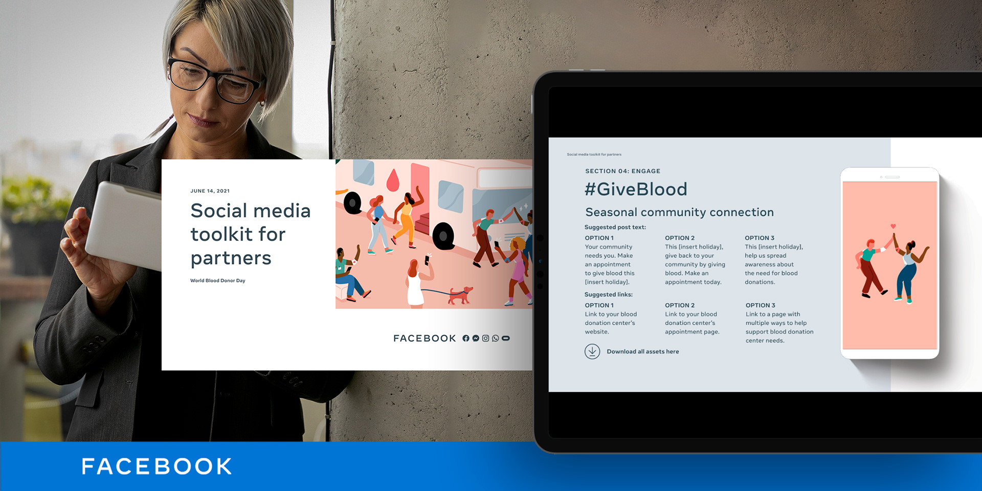
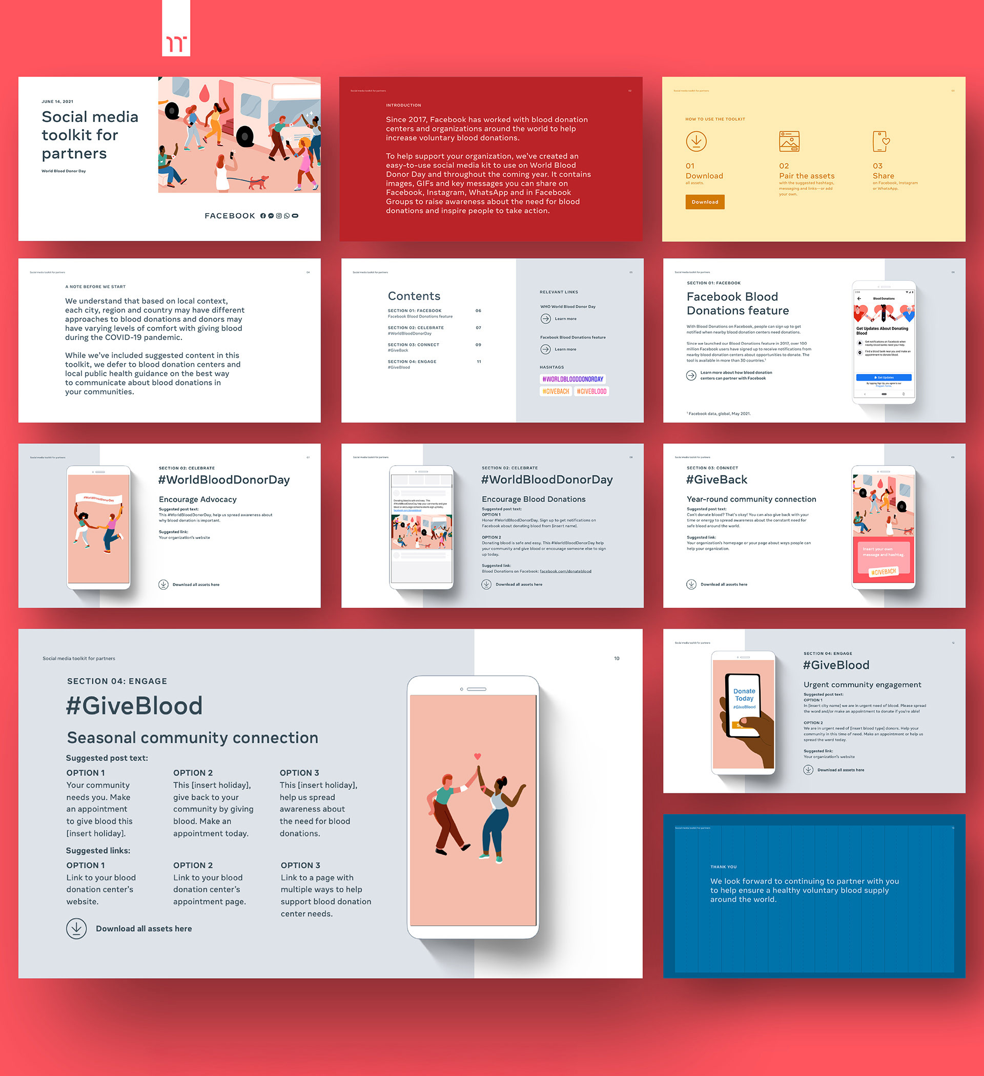
The solution was a social media toolkit designed to work across regions, languages, and partner capabilities. It preserved warmth and clarity at scale.
I designed a widescreen 16:9 layout. It was optimized for desktop and full-screen viewing. The content was easy to scan, visually balanced, and ready for digital distribution.
This format matched how partners actually work. It replaced print assumptions with modern, flexible usage.
The visual system followed Facebook's brand guidelines. I used generous white space. I created a clear typographic hierarchy. I used large, accessible type to support readability across devices and audiences.
Every layout decision prioritized clarity and speed. Partners would reference and adapt the content under tight timelines.
I paired a neutral color foundation with Facebook's Memphis-style illustrations in full color. This balance kept the toolkit optimistic and human. The illustrations conveyed energy and community. The restrained layout kept the message focused and respectful.
The campaign launched during COVID. The copy reassured rather than alarmed. Safety messaging emphasized calm guidance and collective care. It encouraged participation without pressure.
Each page followed a consistent structure: headline, illustration, supporting copy, and partner call-to-action. Organizations could quickly understand how to use the content. They could deploy it with confidence.
Why this mattered
This toolkit was an enablement system.
The design made the content clear, adaptable, and emotionally appropriate. This empowered global partners to act quickly. They could communicate responsibly and stay aligned with Facebook's voice during a sensitive moment.
The result: a cohesive, digital-ready toolkit that felt professional and trustworthy. It gave partners exactly what they needed to mobilize their communities.

Challenges + Learnings:
What this work reinforced about precision under pressure
What this work reinforced about precision under pressure
This work moved fast and demanded accuracy from the start.
There was no runway for broad exploration or multiple visual directions.
Decisions had to be clear, resolved, and ready for production on the first pass.
Decisions had to be clear, resolved, and ready for production on the first pass.
Speed alone was not the risk. Tone was.
Promoting blood donation during a global health crisis required restraint.
The visuals needed to feel caring and optimistic without applying pressure or emotional weight.
Small choices mattered. Spacing, typography, and color had to support calm, clarity, and trust.
The visuals needed to feel caring and optimistic without applying pressure or emotional weight.
Small choices mattered. Spacing, typography, and color had to support calm, clarity, and trust.
This reinforced a core principle.
When time is limited, strong fundamentals carry the work.
Thoughtful visual decisions can shape how a message is received, even when the window to get it right is small.
When time is limited, strong fundamentals carry the work.
Thoughtful visual decisions can shape how a message is received, even when the window to get it right is small.

Impact + Results:
What this work supported
What this work supported
This work delivered a practical, ready-to-use toolkit for global partners during a sensitive moment.
It emphasized clarity, empathy, and consistency without requiring ongoing design support.
Outcomes
▶ Launched and distributed to partners through Facebook’s Community platform
▶ Enabled consistent, on-brand communication across regions and channels
▶ Received positive feedback from the program manager for clarity, freshness, and brand alignment
▶ Helped reinforce trust and credibility in partner-facing materials during a period of uncertainty
This work succeeded by removing friction for partners and giving them tools they could use with confidence.
Interested? Let’s connect.